
Overview
Rankings are a pervasive part of modern life, especially for big decisions – like shelling out thousands of dollars for an education. Indeed, college rankings are amongst the most widely cited rankings in existence. Students, parents, and college administrators fret about where their school lands along these highly debated spectrums. But does it really matter in terms of future earnings potential? While an education is more than a simple “means to an end”, making a decent living is amongst the reasons why students pull all-nighters, work terrible summer jobs, and do everything they can to position themselves for a lucrative, meaningful career. Accordingly, this post will focus on the following topics:
🤓 The relationship between Mid Career Pay and College Ranking after accounting for external variables (e.g., % of STEM degrees conferred each year)
🤓 Understand which variables exhibit the strongest relationship with pay
🤓 Identify which college’s graduates over/under earn relative to our predictions
Since I’m a big fan of Learning-by-doing, I’ve included all of the code used to answer these questions. If you are simply interested in the answers, click here
Data Collection
We’ll leverage the following data sources for our analysis:
2018 Payscale Data of Median Mid Career Earnings By College (with additional data about each college)
2017 Forbes Undergraduate College Rankings
2018 Cost of Living Index by State
Let’s start by collecting the earnings and rankings data. The reticulate package allows us to call the two python functions (outlined below) to scrape this data and return it as a DataFrame back into R. For the sake of simplicity, all of the scripts referenced herein exist in the same folder as the .R script. The pacman package will do the heavy lifting here, loading all previously installed packages and installing all referenced but uninstalled packages.
library(pacman)
pacman::p_load('readr',
               'reshape',
               'dplyr',
               'janitor',
               'ggplot2',
               'broom',
               'rvest',
               'reticulate',
               'glue',
               'caret',
               'kableExtra',
               'artyfarty',
               'patchwork',
               'sjPlot',
               'purrr',
               'stringr',
               'tibble'
               )
# set plotting theme to black & white
theme_set(theme_bw())

# set plotting colors
color_pal = pal("five38")

# set custom plotting theme
# source('my_plot_theme.R')
We’ve loaded/installed the relevant packages, set our working directory, and loaded our custom plotting theme (see here for theme. Next we’ll tell R which version of Python to use.
reticulate::use_python('/anaconda/envs/py36/bin/python', required = TRUE)Let’s source (i.e., bring the Python functions into our R environment) with the following command:
reticulate::source_python('rankings_earnings_post_functions.py')We now have access to the two functions described below – collect_payscale_info and college_college_ranks.Each will scrape data from the web, convert the results into a Pandas DataFrame, and then return the final result back as an R DataFrame.
import pandas as pd
import urllib3
from bs4 import BeautifulSoup
import re
import ast
HTTP = urllib3.PoolManager()
#
# Function to scrape payscale information
#
def collect_payscale_info():
    base_url = 'https://www.payscale.com/college-salary-report/bachelors?page=101'
    page = HTTP.request('GET', base_url)
    soup = BeautifulSoup(page.data, 'lxml')
    all_colleges = (str(soup)
                    .split("var collegeSalaryReportData = ")[1]
                    .split('},{')
                    )
    college_list = []
    for i in all_colleges:
        try:
            college_list.append(ast.literal_eval("{" + i.replace("[{", "") + "}"))
        except Exception as e:
            print(e)
    college_df = pd.DataFrame(college_list)
    return(college_df)
#
# Function to scrape college rankings information
#
def collect_college_ranks(college_names_list):
    base_url = 'https://www.forbes.com/colleges/'
    rank_list = []
    for college_name in college_names_list:
        print(str(round(count/float(len(college_names_list)) * 100, 2)) + '% Complete')
        try:
            tmp_url = base_url + college_name.lower().replace(" ", "-") + "/"
            page = HTTP.request('GET', base_url)
            soup = BeautifulSoup(page.data, 'lxml')
            college_rank = (re.search(r'class="rankonlist">#(.*?) <a href="/top-colleges/list/"',
                                      str(soup))
                              .group(1)
                           )
            rank_list.append([college_name, college_rank])
        except Exception as e:
            rank_list.append([college_name, None])
            print(e)
        count += 1
    rank_df = pd.DataFrame(rank_list)
    rank_df = rank_df.rename(columns={rank_df.columns[0]: "college_name",
                                      rank_df.columns[1]: "rank"
                                  })
    return(rank_df)
Let’s start by collecting data about each college. We’ll gather the following fields:
- Percent_Female: Percentage of the student body that is female
- Percent_Stem: Percentage of students majoring in a Science, Technology, Engineering, or Math field
- Undergraduate_Enrollment: Number of students enrolled as undergraduate students
- School_Sector: If the College if Public or Private
- Rank: 2017 Forbe’s undergraduate college rankings
- COL_Index: Cost of Living index at the state level
- Mid_Career_Median_Pay: Median Salary for alumni with 10+ years of experience
college_salary_df = collect_payscale_info() %>%
  clean_names() %>%
  select(friendly_name,
         state,
         percent_female,
         percent_stem,
         undergraduate_enrollment,
         school_sector,
         mid_career_median_pay
         ) %>%
  rename(college_name = friendly_name)
Below we’ll have a glimpse at the first few rows of data pertinent to each college.
| college_name | state | percent_female | percent_stem | undergraduate_enrollment | school_sector | mid_career_median_pay |
|---|---|---|---|---|---|---|
| Harvey Mudd College | California | 0.46 | 0.85 | 831 | Private not-for-profit | 155800 |
| Princeton University | New Jersey | 0.48 | 0.47 | 5666 | Private not-for-profit | 147800 |
| Massachusetts Institute of Technology | Massachusetts | 0.46 | 0.69 | 4680 | Private not-for-profit | 147000 |
| SUNY Maritime College | New York | 0.1 | 0.35 | 1817 | Public | 145100 |
| United States Military Academy | New York | 0.19 | 0.43 | 4536 | Public | 144300 |
| United States Naval Academy | Maryland | 0.23 | 0.6 | 4535 | Public | 143800 |
| California Institute of Technology | California | 0.39 | 0.97 | 1034 | Private not-for-profit | 142500 |
| Babson College | Massachusetts | 0.48 | 0 | 2211 | Private not-for-profit | 141700 |
| Harvard University | Massachusetts | 0.5 | 0.19 | 14128 | Private not-for-profit | 140700 |
| Stanford University | California | 0.48 | 0.49 | 8302 | Private not-for-profit | 140400 |
| Dartmouth College | New Hampshire | 0.49 | 0.32 | 4695 | Private not-for-profit | 140300 |
| Williams College | Massachusetts | 0.51 | 0.33 | 2233 | Private not-for-profit | 138400 |
| United States Air Force Academy | Colorado | 0.23 | 0.49 | 4112 | Public | 138300 |
| Webb Institute | New York | 0.19 | 1 | 91 | Private not-for-profit | 138200 |
| Samuel Merritt University | California | 0.81 | 0 | 851 | Private not-for-profit | 138100 |
| Colgate University | New York | 0.56 | 0.27 | 2991 | Private not-for-profit | 137700 |
| Stevens Institute of Technology | New Jersey | 0.29 | 0.8 | 3076 | Private not-for-profit | 136900 |
| Colorado School of Mines | Colorado | 0.28 | 0.94 | 4821 | Public | 136100 |
| United States Merchant Marine Academy | New York | 0.17 | 0.54 | 908 | Public | 135900 |
| University of Pennsylvania | Pennsylvania | 0.53 | 0.22 | 13096 | Private not-for-profit | 134800 |
Looks good! Next, we’ll pass the college names as an argument into our collect_college_ranks function. We’ll iterate through each college and extract its ranking, which ranges from 1 to 650.
college_rankings_df = collect_college_ranks(college_salary_df$college_name) %>%
  clean_names() %>%
  filter(is.na(rank) == FALSE) %>%
  arrange(rank)
Our last piece of data is the Cost of Living for each college’s state of residence. College graduates frequently work in the same state they attend college, and Cost of Living is related to how much companies pay their employees. By accounting for such expenses, we’ll have better estimates of the impact of rankings on pay This data is housed on a website that publishes current Cost of Living estimates by state. We’ll switch back to R and use the rvest package for web scraping.
table_path = '/html/body/div[5]/div/table'
url = "https://www.missourieconomy.org/indicators/cost_of_living/"

col_table = url %>%
  read_html() %>%
  html_nodes(xpath = table_path) %>%
  html_table(header = TRUE)

# note: col_index = cost of living index
col_df = data.frame(col_table[[1]])[,c(1, 3)] %>%
  setNames(., c('state', 'col_index')) %>%
  slice(2:(n() - 1)) %>%
  mutate(col_index = as.numeric(col_index)) %>%
  arrange(desc(col_index))

print(head(col_df, 10))
## state col_index
## 1 Hawaii 188.9
## 2 District of Columbia 161.0
## 3 California 137.2
## 4 New York 134.0
## 5 Connecticut 133.0
## 6 Alaska 130.5
## 7 Oregon 129.4
## 8 Maryland 129.3
## 9 Massachusetts 129.2
## 10 New Jersey 122.3Having lived on the West Coast for the past three years, these numbers check out! The next step is to confirm that we can join our Cost of Living data with college salaries. A simple left join will identify any inconsistencies between our key (state) that are we using to merge our datasets.
college_salary_df %>%
  select(state) %>%
  distinct() %>%
  left_join(col_df, by = 'state') %>%
  filter(is.na(col_index) == TRUE)
## # A tibble: 4 x 2
## state col_index
## <chr> <dbl>
## 1 District of Columbia NA
## 2 Puerto Rico NA
## 3 Guam NA
## 4 <NA> NAThe only mismatch within the United States is the District of Columbia. We’ll reformat the state names and then join all three data sources – salary, rankings, and Cost of Living – to complete our final data set.
final_df = college_salary_df %>%
  inner_join(college_rankings_df, by = 'college_name') %>%
  inner_join(col_df %>%
             mutate(state = ifelse(state == 'District of    Columbia',
                                            'District of Columbia',
                                             state
                                   )
                                  ),
                    by = 'state'
                    ) %>%
  arrange(rank) %>%
  select(-state) %>%
  select(rank, everything()) %>%
  mutate(percent_stem = as.numeric(percent_stem),
         percent_female = as.numeric(percent_female),
         undergraduate_enrollment =  as.numeric(undergraduate_enrollment),
         school_sector = factor(if_else(school_sector == 'Public', 1, 0))
                ) %>%
  na.omit() %>%
data.frame()| rank | college_name | percent_female | percent_stem | undergraduate_enrollment | school_sector | mid_career_median_pay | col_index |
|---|---|---|---|---|---|---|---|
| 1 | Harvard University | 0.50 | 0.19 | 14128 | 0 | 140700 | 129.2 |
| 2 | Stanford University | 0.48 | 0.49 | 8302 | 0 | 140400 | 137.2 |
| 3 | Yale University | 0.51 | 0.23 | 7150 | 0 | 132100 | 133.0 |
| 4 | Princeton University | 0.48 | 0.47 | 5666 | 0 | 147800 | 122.3 |
| 5 | Massachusetts Institute of Technology | 0.46 | 0.69 | 4680 | 0 | 147000 | 129.2 |
| 6 | California Institute of Technology | 0.39 | 0.97 | 1034 | 0 | 142500 | 137.2 |
| 7 | University of Pennsylvania | 0.53 | 0.22 | 13096 | 0 | 134800 | 98.4 |
| 8 | Duke University | 0.49 | 0.26 | 7253 | 0 | 134400 | 94.5 |
| 9 | Brown University | 0.54 | 0.39 | 7214 | 0 | 132000 | 120.8 |
| 10 | Pomona College | 0.50 | 0.43 | 1677 | 0 | 114100 | 137.2 |
| 11 | Claremont McKenna College | 0.48 | 0.14 | 1359 | 0 | 130800 | 137.2 |
| 12 | Dartmouth College | 0.49 | 0.32 | 4695 | 0 | 140300 | 106.6 |
| 13 | Williams College | 0.51 | 0.33 | 2233 | 0 | 138400 | 129.2 |
| 14 | Columbia University in the City of New York | 0.47 | 0.30 | 8623 | 0 | 124700 | 134.0 |
| 15 | Cornell University | 0.51 | 0.43 | 14656 | 0 | 123900 | 134.0 |
| 16 | University of Chicago | 0.48 | 0.20 | 6046 | 0 | 117000 | 95.7 |
| 17 | Amherst College | 0.50 | 0.27 | 1921 | 0 | 122800 | 129.2 |
| 18 | Harvey Mudd College | 0.46 | 0.85 | 831 | 0 | 155800 | 137.2 |
| 19 | Swarthmore College | 0.50 | 0.34 | 1606 | 0 | 126200 | 98.4 |
| 20 | United States Naval Academy | 0.23 | 0.60 | 4535 | 1 | 143800 | 129.3 |
| 21 | Georgetown University | 0.56 | 0.12 | 8719 | 0 | 129500 | 161.0 |
| 22 | Rice University | 0.47 | 0.50 | 4051 | 0 | 130200 | 91.4 |
| 23 | Bowdoin College | 0.50 | 0.35 | 1952 | 0 | 115500 | 115.9 |
| 24 | United States Military Academy | 0.19 | 0.43 | 4536 | 1 | 144300 | 134.0 |
| 25 | Haverford College | 0.52 | 0.38 | 1305 | 0 | 119500 | 98.4 |
| 26 | University of Notre Dame | 0.48 | 0.26 | 8626 | 0 | 127900 | 90.0 |
| 27 | Vanderbilt University | 0.50 | 0.22 | 7046 | 0 | 116000 | 89.4 |
| 28 | Northwestern University | 0.51 | 0.19 | 10611 | 0 | 113300 | 95.7 |
| 29 | University of California-Berkeley | 0.52 | 0.34 | 29591 | 1 | 130100 | 137.2 |
| 30 | Johns Hopkins University | 0.55 | 0.33 | 8152 | 0 | 112200 | 129.3 |
| 31 | Washington and Lee University | 0.49 | 0.21 | 1867 | 0 | 131700 | 101.1 |
| 32 | Tufts University | 0.51 | 0.24 | 5697 | 0 | 120200 | 129.2 |
| 33 | Wesleyan University | 0.55 | 0.22 | 3091 | 0 | 117700 | 133.0 |
| 34 | Davidson College | 0.51 | 0.24 | 1928 | 0 | 111400 | 94.5 |
| 35 | Bates College | 0.50 | 0.26 | 1903 | 0 | 125000 | 115.9 |
| 36 | Washington University in St Louis | 0.54 | 0.31 | 8440 | 0 | 113400 | 88.6 |
| 37 | Carleton College | 0.52 | 0.40 | 2093 | 0 | 113800 | 103.2 |
| 38 | University of Michigan-Ann Arbor | 0.49 | 0.38 | 29124 | 1 | 104600 | 90.2 |
| 39 | Middlebury College | 0.53 | 0.18 | 3849 | 0 | 113200 | 117.2 |
| 40 | University of Virginia-Main Campus | 0.55 | 0.21 | 18930 | 1 | 118400 | 101.1 |
| 41 | United States Air Force Academy | 0.23 | 0.49 | 4112 | 1 | 138300 | 107.3 |
| 42 | Colgate University | 0.56 | 0.27 | 2991 | 0 | 137700 | 134.0 |
| 43 | Scripps College | 1.00 | 0.24 | 1023 | 0 | 96700 | 137.2 |
| 44 | University of Southern California | 0.50 | 0.24 | 20543 | 0 | 119300 | 137.2 |
| 45 | Carnegie Mellon University | 0.44 | 0.64 | 6869 | 0 | 126400 | 98.4 |
| 47 | Wellesley College | 0.95 | 0.29 | 2644 | 0 | 100900 | 129.2 |
| 48 | University of California-Los Angeles | 0.56 | 0.31 | 31906 | 1 | 114800 | 137.2 |
| 49 | Boston College | 0.53 | 0.11 | 10297 | 0 | 115300 | 129.2 |
| 50 | Vassar College | 0.57 | 0.27 | 2625 | 0 | 98900 | 134.0 |
| 51 | United States Merchant Marine Academy | 0.17 | 0.54 | 908 | 1 | 135900 | 134.0 |
| 52 | New York University | 0.57 | 0.17 | 30000 | 0 | 117000 | 134.0 |
| 53 | Oberlin College | 0.56 | 0.23 | 3042 | 0 | 107600 | 93.0 |
| 54 | Barnard College | 1.00 | 0.19 | 2669 | 0 | 103700 | 134.0 |
| 55 | Bucknell University | 0.52 | 0.37 | 3721 | 0 | 124700 | 98.4 |
| 56 | Lafayette College | 0.49 | 0.41 | 2541 | 0 | 123800 | 98.4 |
| 57 | Grinnell College | 0.55 | 0.36 | 1774 | 0 | 96200 | 91.5 |
| 58 | College of William and Mary | 0.57 | 0.20 | 6890 | 1 | 111900 | 101.1 |
| 59 | Pitzer College | 0.57 | 0.13 | 1094 | 0 | 91100 | 137.2 |
| 60 | Wake Forest University | 0.52 | 0.14 | 4966 | 0 | 118400 | 94.5 |
| 61 | Colby College | 0.53 | 0.28 | 2055 | 0 | 104200 | 115.9 |
| 62 | Cooper Union for the Advancement of Science and Art | 0.34 | 0.54 | 942 | 0 | 124200 | 134.0 |
| 63 | Kenyon College | 0.55 | 0.17 | 1764 | 0 | 110400 | 93.0 |
| 64 | Santa Clara University | 0.50 | 0.30 | 5759 | 0 | 134500 | 137.2 |
| 65 | Hamilton College | 0.52 | 0.28 | 2036 | 0 | 107000 | 134.0 |
| 66 | Emory University | 0.58 | 0.21 | 7764 | 0 | 109800 | 91.6 |
| 67 | Lehigh University | 0.44 | 0.52 | 5325 | 0 | 133900 | 98.4 |
| 68 | University of North Carolina at Chapel Hill | 0.58 | 0.18 | 19312 | 1 | 96000 | 94.5 |
| 69 | University of Illinois at Urbana-Champaign | 0.44 | 0.37 | 34687 | 1 | 109600 | 95.7 |
| 70 | Reed College | 0.55 | 0.26 | 1491 | 0 | 103900 | 129.4 |
| 71 | Smith College | 1.00 | 0.23 | 2603 | 0 | 98400 | 129.2 |
| 72 | University of Maryland-College Park | 0.46 | 0.32 | 31050 | 1 | 107100 | 129.3 |
| 73 | Villanova University | 0.54 | 0.23 | 7871 | 0 | 114700 | 98.4 |
| 74 | Babson College | 0.48 | 0.00 | 2211 | 0 | 141700 | 129.2 |
| 75 | Yeshiva University | 0.45 | 0.13 | 2949 | 0 | 122300 | 134.0 |
| 76 | Colorado College | 0.54 | 0.28 | 2322 | 0 | 97000 | 107.3 |
| 77 | Occidental College | 0.57 | 0.25 | 2178 | 0 | 107700 | 137.2 |
| 78 | Whitman College | 0.58 | 0.38 | 1562 | 0 | 107700 | 109.3 |
| 79 | University of Washington-Seattle Campus | 0.52 | 0.32 | 34486 | 1 | 108800 | 109.3 |
| 80 | University of Florida | 0.55 | 0.27 | 36703 | 1 | 97800 | 99.1 |
| 81 | Georgia Institute of Technology-Main Campus | 0.35 | 0.78 | 16694 | 1 | 128700 | 91.6 |
| 82 | University of Richmond | 0.55 | 0.14 | 3910 | 0 | 106600 | 101.1 |
| 83 | University of California-Santa Barbara | 0.52 | 0.28 | 21897 | 1 | 118800 | 137.2 |
| 84 | Trinity College | 0.48 | 0.18 | 2434 | 0 | 108700 | 133.0 |
| 85 | University of Rochester | 0.51 | 0.32 | 6821 | 0 | 107400 | 134.0 |
| 86 | Boston University | 0.60 | 0.23 | 22685 | 0 | 113500 | 129.2 |
| 87 | University of Wisconsin-Madison | 0.51 | 0.32 | 33400 | 1 | 98400 | 96.8 |
| 88 | George Washington University | 0.56 | 0.14 | 12039 | 0 | 115900 | 161.0 |
| 89 | College of the Holy Cross | 0.50 | 0.22 | 2759 | 0 | 119700 | 129.2 |
| 90 | Trinity University | 0.52 | 0.22 | 2298 | 0 | 101600 | 91.4 |
| 91 | The University of Texas at Austin | 0.52 | 0.26 | 42193 | 1 | 107400 | 91.4 |
| 92 | Franklin and Marshall College | 0.53 | 0.21 | 2417 | 0 | 112400 | 98.4 |
| 93 | University of California-San Diego | 0.47 | 0.54 | 27918 | 1 | 124900 | 137.2 |
| 94 | Skidmore College | 0.61 | 0.21 | 2798 | 0 | 97300 | 134.0 |
| 95 | Bryn Mawr College | 1.00 | 0.19 | 1430 | 0 | 89900 | 98.4 |
| 96 | Furman University | 0.56 | 0.16 | 2887 | 0 | 104000 | 97.8 |
| 97 | University of Miami | 0.52 | 0.22 | 12243 | 0 | 92400 | 99.1 |
| 98 | Southern Methodist University | 0.50 | 0.20 | 6866 | 0 | 108500 | 91.4 |
| 99 | Brandeis University | 0.57 | 0.26 | 3852 | 0 | 114200 | 129.2 |
| 100 | Macalester College | 0.60 | 0.33 | 2238 | 0 | 97700 | 103.2 |
| 101 | St Olaf College | 0.57 | 0.32 | 3122 | 0 | 98700 | 103.2 |
We have a total of 578 colleges with complete data. Let’s get moving on our analysis!
Analysis
We’ll first start by examining the relationship between our two main variables of interest: College Rank and Mid Career Pay.
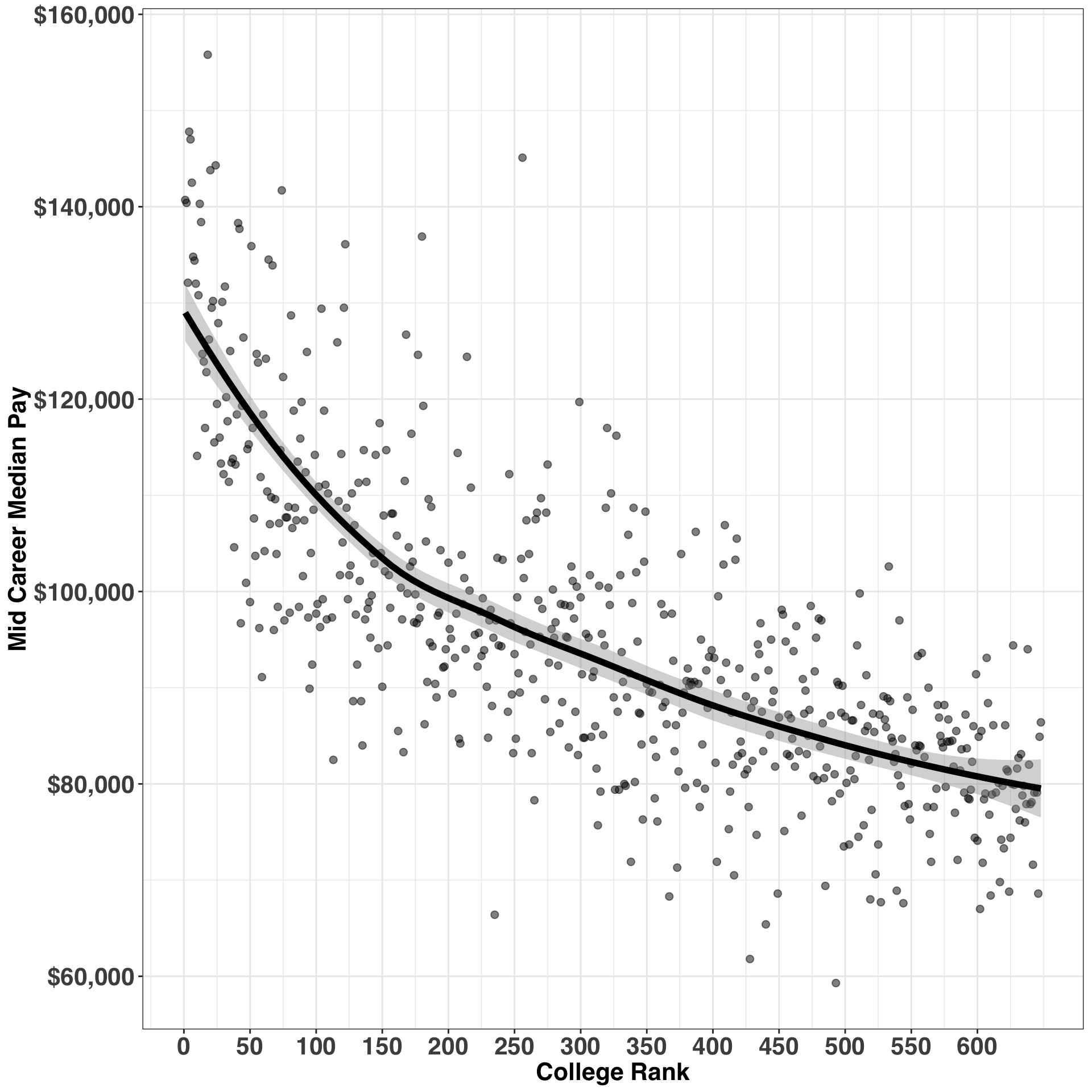
Earnings drop much quicker for highly ranked colleges relative to lower ranked colleges. Let’s break this out by bucketing the ranks and examining the slopes for each bucket – that is, the expected change in salary as our ranking decreases by one.
final_df = final_df %>%
  mutate(rank_bucket = case_when(rank >= 1 & rank <= 50 ~ '1 - 50',
                                 rank >= 51 & rank <= 100 ~ '51 - 100',
                                 rank > 100 & rank <= 200 ~ '101 - 200',
                                 rank > 200 & rank <= 400 ~ '201 - 400',
                                 rank > 400 ~ '> 400'
                                 )
         )

rank_bucket_est = final_df %>%
  group_by(rank_bucket) %>%
  do(tidy(lm(mid_career_median_pay ~ rank, data=.))) %>%
  select(rank_bucket, term, estimate) %>%
  reshape::cast(rank_bucket ~ term, value = 'estimate') %>%
  clean_names() %>%
  dplyr::rename(rank_coeff = rank) %>%
  data.frame() %>%
arrange(rank_coeff)| rank_bucket | intercept | rank_coeff |
|---|---|---|
| 1 - 50 | 140453.6 | -599.28741 |
| 51 - 100 | 127265.4 | -219.40936 |
| 101 - 200 | 115381.3 | -79.85206 |
| 201 - 400 | 110338.7 | -55.96746 |
| > 400 | 102147.0 | -35.61756 |
While the relationship between earnings and rank is non-linear, this provides a rough estimate of what we originally noticed in the first scatterplot. Specifically, for colleges that fall in the 1- 50 bucket, a one-unit reduction in rank is associated with a decrease in pay of ~$600. In contrast, for those in the > 400 bucket, a one-unit reduction results only in a ~$36 reduction in pay. Let’s bring this concept to life by visualizing the relationship with our grouped ranking variable.
rank_bucket_est %>%
  inner_join(final_df, by = 'rank_bucket') %>%
  mutate(predicted_income = rank * rank_coeff + intercept) %>%
  mutate(rank_bucket = factor(rank_bucket,
                              levels = c('1 - 50',
                                         '51 - 100',
                                         '101 - 200',
                                         '201 - 400',
                                         '> 400'
                                         )
                              )
         ) %>%
  ggplot(aes(x = rank, y = predicted_income, color = rank_bucket)) +
    geom_point() +
    geom_line() +
    geom_point(data = final_df, aes(x = rank,
                                    y = mid_career_median_pay),
               alpha = 0.25
               ) +
    my_plot_theme() +
    ylab("Predicted Mid Career Pay") +
    scale_y_continuous(labels=scales::dollar) +
    scale_x_continuous(breaks = seq(0, max(final_df$rank), by = 50)) +
    labs(color = 'Rank Bucket') +
    scale_color_manual(values = pal("five38"))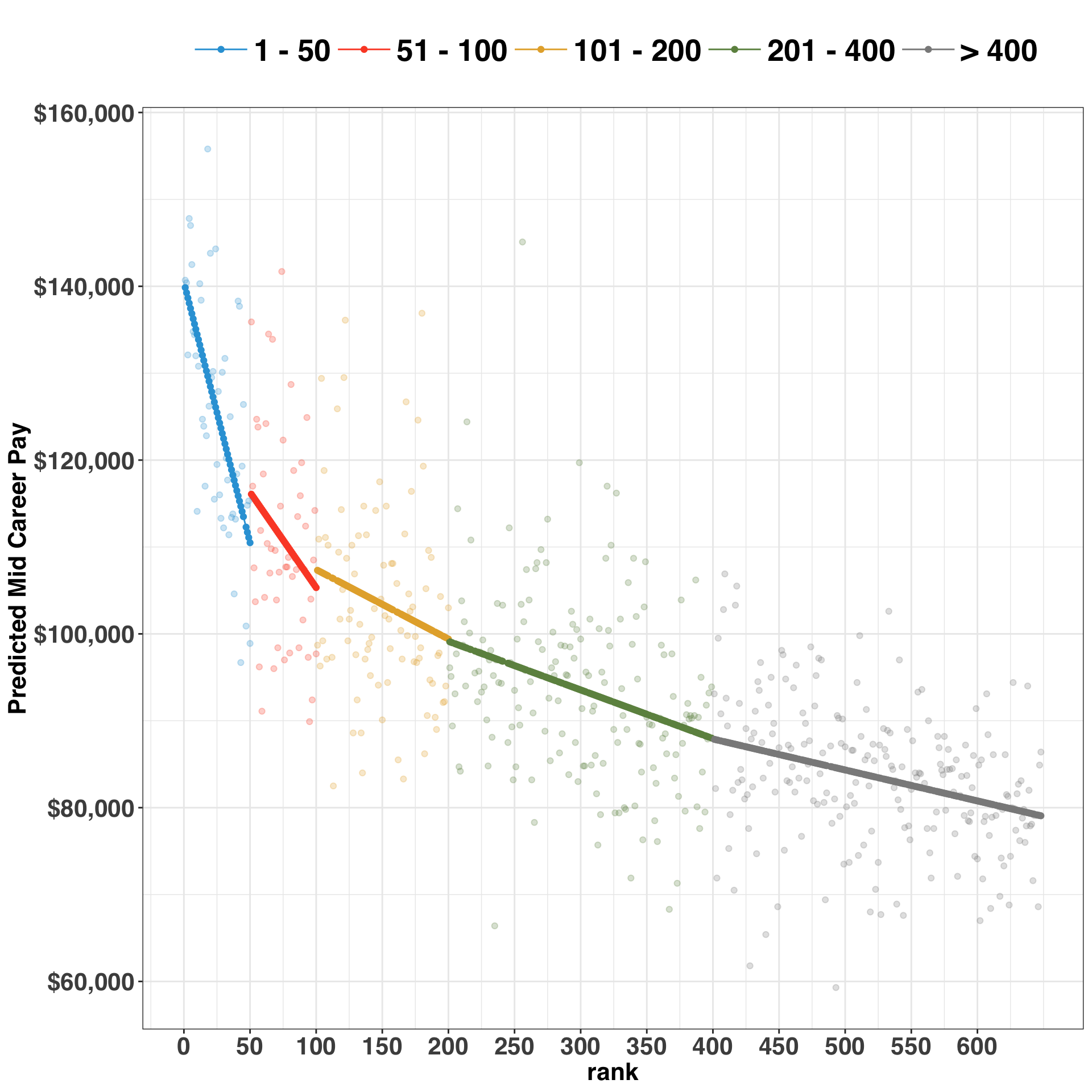
At this point, we’ve established that (1) rank is a good predictor of earnings, and (2) the nature of this relationship varies by the level of the rank, indicating that a modeling approach that handles non-linearity would likely perform better than our current linear model. Accordingly, we’ll try out three separate models – Linear Regression, General Additive Model, and Random Forest – to see which performs best on a holdout set. Once we identify the best approach (from a modeling perspective), we’ll start considering the role of the other variables as well.
row.names(final_df) = final_df$college_name
final_df = final_df %>%
  select(-rank_bucket, -college_name)

y_var = 'mid_career_median_pay'
x_var = setdiff(names(final_df), y_var)
model_form = as.formula(paste0(y_var,
                               " ~ ",
                               paste0(x_var, collapse = " + ")
                               )
                        )
print(model_form)
## mid_career_median_pay ~ rank + percent_female + percent_stem +
## undergraduate_enrollment + school_sector + col_indexNow that we’ve established our model formula, let’s do a quick quality check on our data. We’ll first consider the presence of variables with near zero variance. Such variables all have the same value (e.g., 0) or are highly unbalanced (e.g., 10000 zeros and 1 one). This can be problematic for certain modeling approaches, in that the model won’t fit properly. Second, we’ll explore the bi-variate correlations amongst our predictors. Highly correlated variables can interfere with interpretability and lead to incorrect parameter estimates. If you’ve ever done a linear regression and the direction or size of the resulting coefficients don’t make sense, this might be the reason. We’ll check for both of these issues below.
# identifies any variables with near zero variance, which can lead to model instability
near_zero_vars = nearZeroVar(final_df[x_var])
# identifies any vavriables with absolute correlation > .7
correlated_vars = findCorrelation(cor(final_df[x_var[x_var != 'school_sector']]),
                                  cutoff = .7
                                  )

print(c(paste0("N correlated Vars: ", length(correlated_vars)),
        paste0("N low variance Vars: ", length(near_zero_vars))
        )
      )
## [1] "N correlated Vars: 0" "N low variance Vars: 0"Looks good. Let’s compare our three models and select the one that provides the best out-of-sample performance using the caret package. We’ll use 10-fold cross validation and repeat the validation process five times.
control = trainControl(method = 'repeatedcv',
                      number = 10,
                      repeats = 5
                      )

set.seed(1)
model_lm = train(model_form,
                 data=final_df,
                 method="lm",
                 trControl=control
                 )

set.seed(1)
model_gam = train(model_form,
                  data=final_df,
                  method="gam",
                  trControl=control
                  )
set.seed(1)
model_rf = train(model_form,
                 data=final_df,
                 method="rf",
                 trControl=control,
                 ntree = 100
                 )
Model performance is based on Root Mean Square Error (RMSE), R-squared, and Mean Absolute Error (MAE). While performance across these metrics will be related, each tells a different story. For example, RMSE squares each of the errors before they are averaged, while MAE simply takes the absolute value. RMSE puts a larger penalty on models with big errors relative to MAE. Thus, if reliability and consistency are particularly important, RMSE might be the better metric. In the current context, we aren’t concerned with this tradeoff – and obviously it’s easiest when all metrics point to the same model!
model_perf = resamples(list(LM=model_lm,
                            GAM=model_gam,
                            RF=model_rf)
                       )$values %>%
  clean_names() %>%
  select(-resample) %>%
  reshape::melt() %>%
  as_tibble()

model_perf$model_metric = model_perf$variable %>%
  map(function(x) str_split(pattern = "_", x))

model_perf$model = model_perf$model_metric %>%
  map(function(x) x[[1]][1]) %>%
  unlist()

model_perf$metric =
  model_perf$model_metric %>%
  map(function(x) x[[1]][2]) %>%
  unlist()

model_perf = model_perf %>%
  select(-variable, -model_metric)
Let’s visualize the performance of each model across 50 trials (10 folds X 5 repeats) with a boxplot.
ggplot(model_perf, aes(x = model, y = value, color = model)) +
  geom_boxplot() +
  facet_grid(metric ~ ., scales = 'free') +
  my_plot_theme() +
  scale_color_manual(values = color_pal) +
  ylab("Metric Value") +
  xlab("Model")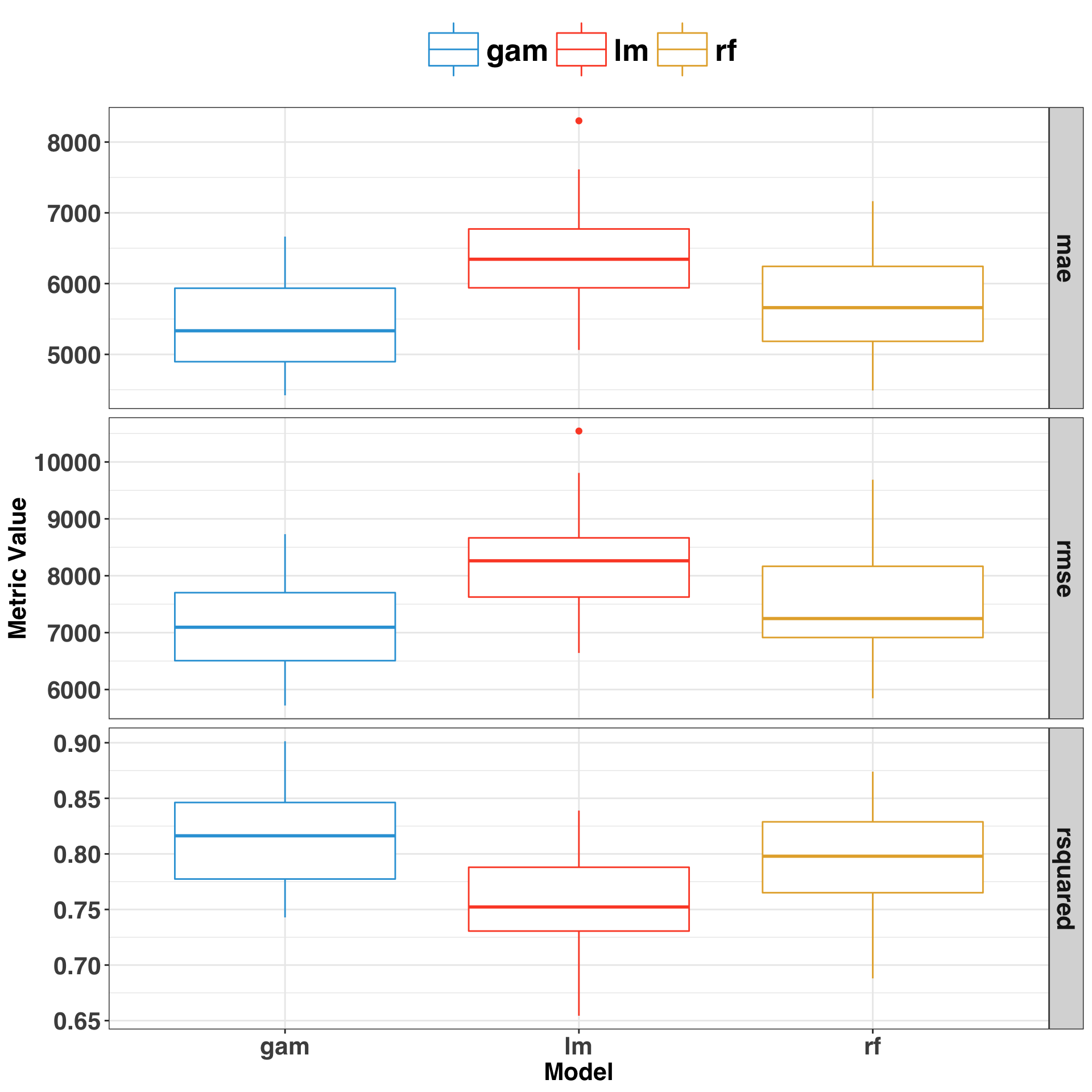
The GAM performed best, following by the Random Forest and Linear Regression Model. Let’s do a quick review of each by considering the in-sample errors – that is, when we make predictions against the same dataset we trained our model on. A simple approach is to plot the fitted (predicted) values against the errors (residuals).
insample_predictions = final_df %>%
  mutate(lm_pred = as.vector(predict(model_lm, final_df)),
         gam_pred = as.vector(predict(model_gam, final_df)),
         rf_pred = as.vector(predict(model_rf, final_df))
         ) %>%
  select(y_var, ends_with('_pred')) %>%
  reshape::melt(y_var) %>%
  dplyr::rename(predicted_earnings = value,
                actual_earnings = mid_career_median_pay,
                model = variable
                ) %>%
  mutate(residual = actual_earnings - predicted_earnings)
ggplot(insample_predictions,
aes(x = predicted_earnings,
y = residual,
color = model
)) +
geom_point(alpha = 0.5, size = 2) +
facet_grid(model ~ .) +
geom_abline(intercept = 0, slope = 0) +
stat_smooth(size = 2, se = FALSE) +
scale_color_manual(values = pal("five38")[c(1, 3, 2)]) +
my_plot_theme() +
xlab("Predicted Earnings") +
ylab("Residual")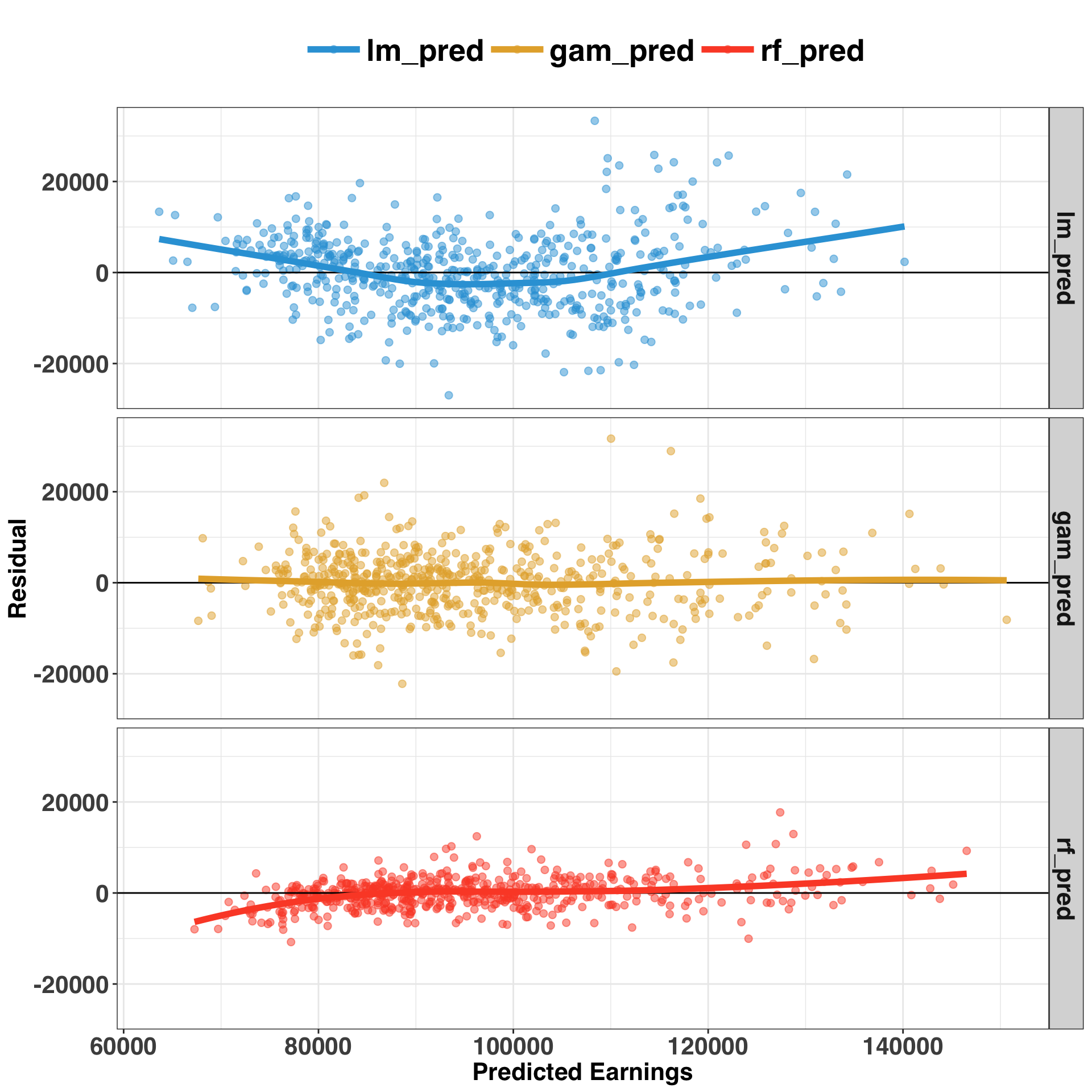
A few takeaways from this visual. First, it’s apparent that a non-linear model (e.g., GAM or RF) performs best on this dataset, based on the pattern of residuals associated with the linear model. Second, the GAM performed best in terms of limiting bias across the entire prediction range. This means we are just as likely to over- or under-predict across the range of values, whereas RF and LM are biased at the tails of the range. Third, RF performs much better in-sample than out-of-sample, as is indicated by the close spread of the errors around zero. This indicates that the RF model is likely overfitting, which we could address by (1) acquiring more data, and/or (2) changing some of the model parameters to encourage a simpler, more robust model – a process referred to as regularization. However, interpretability is a key component of our analysis, and GAM models have this quality in spades. Let’s move forward with the GAM and rank the overall importance of each variable.
var_imp = varImp(model_gam)$importance %>%
  dplyr::rename(importance = Overall) %>%
  rownames_to_column(var = 'variable')
ggplot(var_imp, aes(x = reorder(variable, importance), y = importance)) +
geom_bar(stat = 'identity',
fill = pal("five38")[1],
color = 'black') +
coord_flip() +
my_plot_theme() +
xlab("") +
ylab("Importance")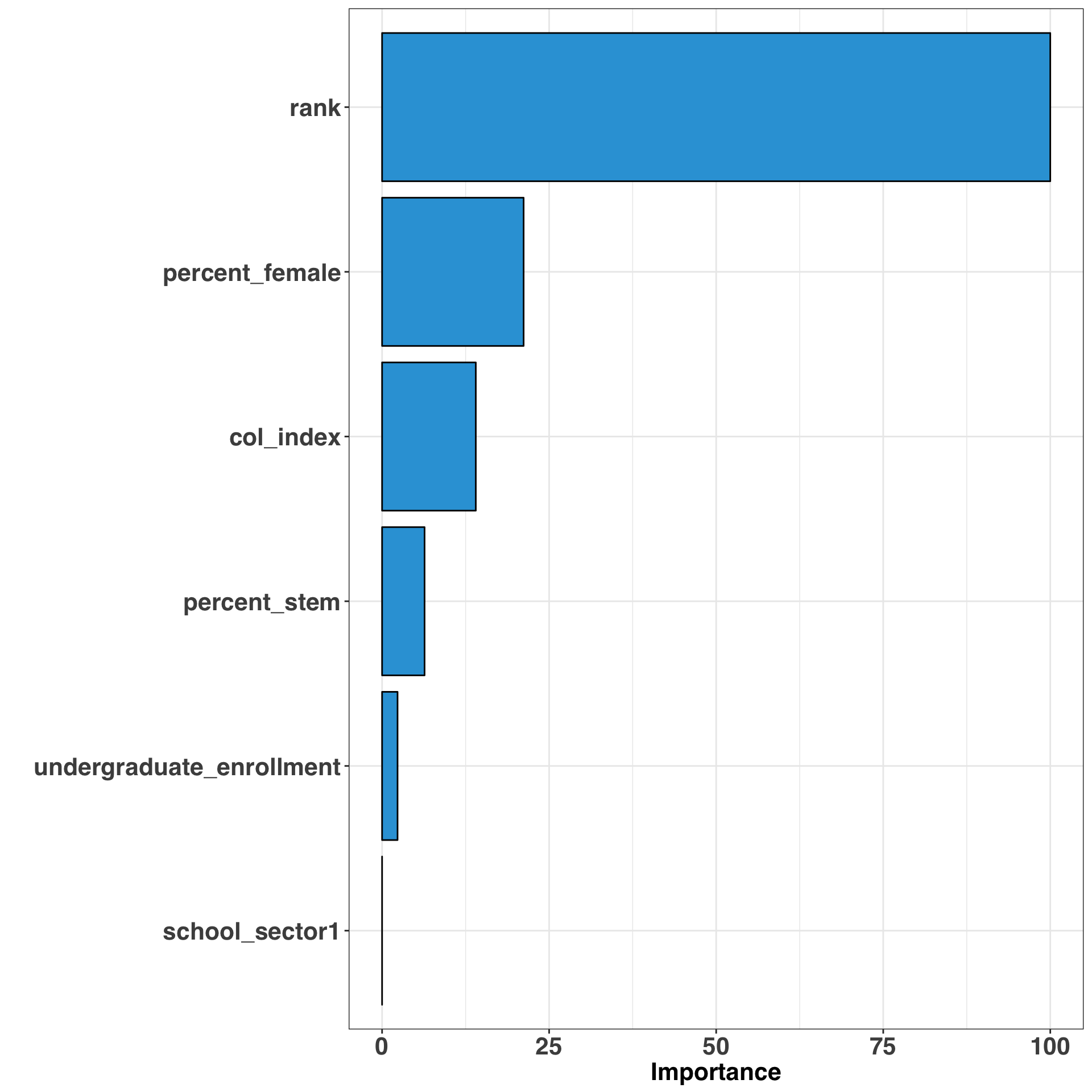
This provides a global measure of importance for all of our variables. Let’s take this a step further and examine the marginal effects of the top four most important variables.
x_var_plot = x_var[!x_var %in% c('undergraduate_enrollment', 'school_sector')]
marginal_effects_plots = list()
for(var in x_var_plot){
  tmp_effects_plot = plot_model(model_gam$finalModel,
                                 type = "pred",
                                 terms = var
                                )
  tmp_effects_plot = tmp_effects_plot +
    ggtitle(glue::glue("Predicted Pay by {var}")) +
    xlab(glue::glue("{var}")) +
    ylab("Mid Career Median Pay") +
    theme_bw() +
    my_plot_theme() +
    scale_y_continuous(labels=scales::dollar)

  marginal_effects_plots[[var]] = tmp_effects_plot
}
Below we’ll take our four separate plots and organize them nicely into a single, unified plot via the patchwork package.
(marginal_effects_plots$rank +
  marginal_effects_plots$percent_female +
  marginal_effects_plots$percent_stem +
  marginal_effects_plots$col_index +
  patchwork::plot_layout(ncol = 2)
)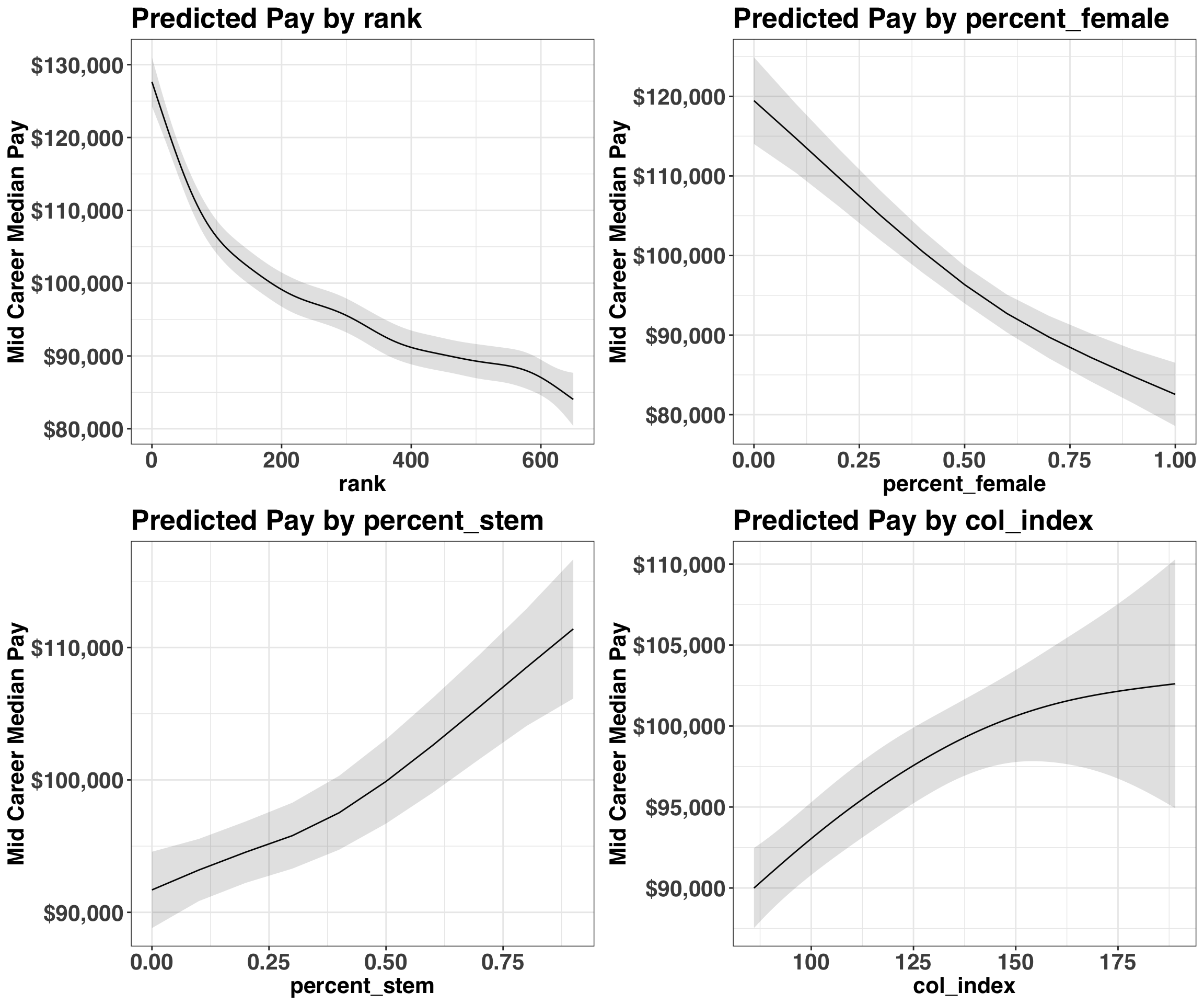
Most of these findings aren’t too surprising: Those who attend top-ranked colleges, in a state with a high cost of living, and likely majored in a STEM subject tend to have the highest pay. However, pay as a percentage of female graduates was unexpected. While the earnings discrepency between men and women has been well documented, it was surprising to see that the gender distribution of a college was a stronger predictor of earnings than cost of living or major. While I’d put less faith in the predictions at the extreme ranges (i.e., all-male or all-female colleges), it is unfortunate to see such a discrepancy.
Over and Under Performers
The last question to consider is which college’s graduates over/under perform their expected pay. Looking at where your model goes wrong is a great way to identify missing variables. Let’s have a look at the top and bottom 10 colleges based on the largest positive and negative residual values.
final_df$college_name = row.names(final_df)
final_df$predicted_pay = as.vector(predict(model_gam, final_df))
final_df$residual_pay = final_df$mid_career_median_pay - final_df$predicted_pay
top10_over_under = bind_rows(
  final_df %>%
  arrange(desc(residual_pay)) %>%
  head(10) %>%
  mutate(earnings_group = 'More Than Expected'),
  final_df %>%
  arrange(residual_pay) %>%
  head(10) %>%
  mutate(earnings_group = 'Less Than Expected')
                            )
ggplot(top10_over_under,
aes(x = reorder(college_name, residual_pay),
y = residual_pay,
fill = earnings_group
)
) +
geom_bar(stat = 'identity', color = 'black') +
coord_flip() +
my_plot_theme() +
ylab("Error") +
xlab("") +
scale_fill_manual(values = color_pal) +
theme(legend.title=element_blank(),
legend.text = element_text(size = 15)
)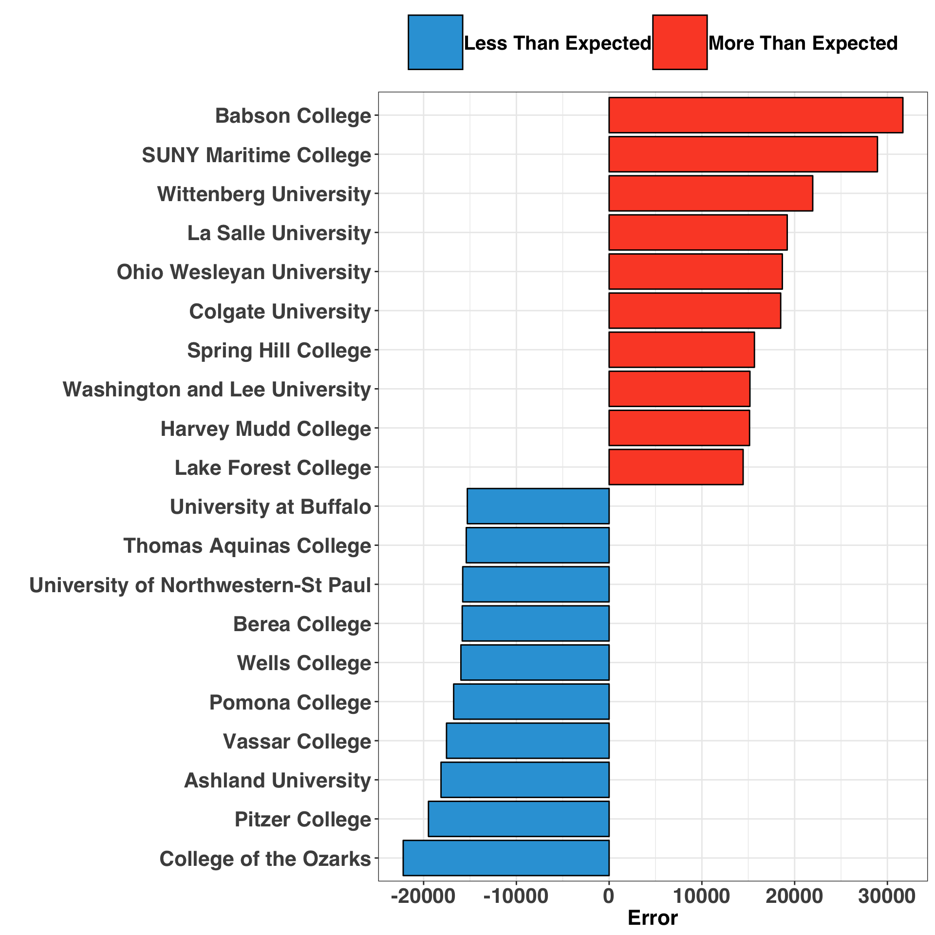
It is interesting to note that Babson and SUNY Maritime are the top two over-performers, meaning that their graduates have higher pay than expected. A quick google search reveals what these two colleges have in common: They both emphasize specialization in lucrative fields. Babson focuses exclusively on entrepreneurship and business, while SUNY Maritime prepares graduates for what I believe to be lucrative careers around boats?

In contrast, the only pattern that emerges amongst the under-performers is that most are small, private, liberal arts colleges. While our model accounted for school sector (private vs. public) and undergraduate enrollment, it is possible that including a factor indicating if a college emphasizes a liberal arts education could be valuable. Indeed, the vocational emphasis of the two top over-performers suggests that our model would likely improve with the addition of a feature that captures if a college has a Liberal Arts vs. Vocational focus.
Conclusion: Does Rank Matter?
It’s important to note that our outcome variable – Median Mid Career Pay – is a summary statistic. Thus, we do not know how much information each college contributed to our estimates, as the raw data (i.e., the individual responses associated with each college) are not available. However, these findings seem directionally correct. Even after considering the aforementioned caveat, it is apparent that where you attend college is strongly associated with how much you earn later in life. This is especially true for top ranked colleges. The difference between attending a college ranked in the top 10 relative to the top 100 has substantial pay implications, while this difference is less important amongst lower ranked colleges.
Hopefully you enjoyed the post. I’d love to hear your feedback, so feel free to comment below!
Appendix
my_plot_theme = function(){
  font_family = "Helvetica"
  font_face = "bold"
  return(theme(
    axis.text.x = element_text(size = 16, face = font_face, family = font_family),
    axis.text.y = element_text(size = 16, face = font_face, family = font_family),
    axis.title.x = element_text(size = 16, face = font_face, family = font_family),
    axis.title.y = element_text(size = 16, face = font_face, family = font_family),
    strip.text.y = element_text(size = 16, face = font_face, family = font_family),
    plot.title = element_text(size = 20, face = font_face, family = font_family),
    plot.caption = element_text(size = 11, face = "italic", hjust = 0),

    legend.position = "top",
    legend.title = element_text(size = 16,
                                face = font_face,
                                family = font_family),
    legend.text = element_text(size = 20,
                               face = font_face,
                               family = font_family),
    legend.key = element_rect(size = 3),
    legend.key.size = unit(3, 'lines'),
    legend.title=element_blank()
  ))
}