
Overview
The Internet of Things (IOT) has enabled data collection on a moment-by-moment basis. Some examples include smart-thermostats that store power readings from millions of homes every minute or sensors within a machine that capture part vibration readings every second. The granular nature of these data streams provides opportunites to leverage more advanced forecasting methodologies that can better model non-linearities and higher-order interactions. Accordingly, the goal of this post is to provide an end-to-end overview of how to generate a forecast using neural nets with a classic IOT dataset – hourly electricity consumption from commercial buildings.
Forecasting Power Consumption
Nothing gets me more charged up than forecasting electricity consumption, so the data we’ll use here is a time series of consumption for an anonymized commercial building from 2012. Measurements were recorded for a single year at five-minute intervals, so each hour has 12 readings, and each day has 288 readings. Our goal is to train a model on several months of consumption data and then produce a 24-hour ahead forecast of consumption. Let’s get started by downloading the data and examining the first few rows.
libs = c('data.table','h2o','forecast',
         'lubridate','forcats',
          'ggforce', 'ggplot2',
          'reshape', 'knitr',
         'kableExtra', 'tidyquant',
         'stringr', 'dplyr',
         'doParallel', 'foreach',
         'janitor', 'timetk',
         'tidyquant', 'stringr'
         )
lapply(libs, require, character.only = TRUE)
data_source = 'https://open-enernoc-data.s3.amazonaws.com/anon/csv/401.csv'
df_elec = fread(data_source,
data.table = FALSE)| timestamp | dttm_utc | value | estimated | anomaly |
|---|---|---|---|---|
| 1325376300 | 2012-01-01 00:05:00 | 10.6253 | 0 | |
| 1325376600 | 2012-01-01 00:10:00 | 10.1194 | 0 | |
| 1325376900 | 2012-01-01 00:15:00 | 10.6253 | 0 | |
| 1325377200 | 2012-01-01 00:20:00 | 9.6134 | 0 | |
| 1325377500 | 2012-01-01 00:25:00 | 10.6253 | 0 | |
| 1325377800 | 2012-01-01 00:30:00 | 9.6134 | 0 | |
| 1325378100 | 2012-01-01 00:35:00 | 10.6253 | 0 | |
| 1325378400 | 2012-01-01 00:40:00 | 9.6134 | 0 | |
| 1325378700 | 2012-01-01 00:45:00 | 11.6373 | 0 | |
| 1325379000 | 2012-01-01 00:50:00 | 12.1433 | 0 | |
| 1325379300 | 2012-01-01 00:55:00 | 13.6612 | 0 | |
| 1325379600 | 2012-01-01 01:00:00 | 14.1671 | 0 | |
| 1325379900 | 2012-01-01 01:05:00 | 12.1433 | 0 | |
| 1325380200 | 2012-01-01 01:10:00 | 13.1552 | 0 | |
| 1325380500 | 2012-01-01 01:15:00 | 12.6492 | 0 |
We only need the date-time and consumption values, so we’ll filter out several variables and extract the date information from the timestamps.
df_elec = df_elec %>%
  dplyr::select(-anomaly, -timestamp) %>%
  dplyr::rename(date_time = dttm_utc) %>%
         mutate(date_only = as.Date(date_time)) %>%
         mutate(month = lubridate::month(date_time, label = TRUE),
                week = as.factor(lubridate::week(date_time)),
                hour = lubridate::hour(date_time),
                day = lubridate::day(date_time))
To keep things simple, we’ll model the average reading per hour instead of every five minutes, meaning there will be 24 readings per day instead of 288.
df_hourly = df_elec %>%
         group_by(date_only, month, hour) %>%
         summarise(value = mean(value)) %>%
         ungroup() %>%
         mutate(hour = ifelse(nchar(as.character(hour)) == 1,
                              paste0("0", as.character(hour)),
                              hour)) %>%
         mutate(hour = paste(hour, "00", "00", sep = ":")) %>%
         mutate(date_time = lubridate::ymd_hms(paste(date_only, hour))) %>%
         dplyr::select(date_time, month, value) %>%
         mutate(week = as.factor(lubridate::week(date_time)),
                day = lubridate::wday(date_time, label = TRUE),
                hour = lubridate::hour(date_time)
                )
Next, we’ll filter the timeframe to only a few months to speed up the eventual training time and break our dataset into training, validation, and testing segments. The 2nd to last week is held out for validation and the last week for testing. The validation and testing segments contain a total of 168 observations (24 per day).
df_hourly = df_hourly %>%
            filter(month %in% c('Feb','Mar', 'Apr', 'May', 'Jun')) %>%
            dplyr::select(-month)
# daily period (24 hours)
daily_p = 24
# weekly period (7 days)
weekly_p = 7
# period length
period_length = daily_p * weekly_p
# create train, validation, and testing
train_df = head(df_hourly, (nrow(df_hourly) - period_length * 2))
validation_df = head(tail(df_hourly, period_length * 2), period_length)
test_df = tail(df_hourly, period_length)
Let’s start by creating a high level view of the entire time series and load up a custom plotting theme.
my_plot_theme = function(){
    font_family = "Helvetica"
    font_face = "bold"
    return(theme(
    axis.text.x = element_text(size = 14, face = font_face, family = font_family),
    axis.text.y = element_text(size = 14, face = font_face, family = font_family),
    axis.title.x = element_text(size = 14, face = font_face, family = font_family),
    axis.title.y = element_text(size = 14, face = font_face, family = font_family),
    strip.text.y = element_text(size = 14, face = font_face, family = font_family),
    plot.title = element_text(size = 18, face = font_face, family = font_family),
    legend.position = "top",
    legend.title = element_text(size = 16,
    face = font_face,
    family = font_family),
    legend.text = element_text(size = 14,
    face = font_face,
    family = font_family)
))
}

bind_rows(train_df %>%
            mutate(part = "train"),
          validation_df %>%
            mutate(part = "validation"),
          test_df %>%
            mutate(part = "test")) %>%
  dplyr::select(date_time, part, value) %>%
  ggplot(aes(x = date_time, y = value, color = part)) +
  geom_line() +
  facet_zoom(x = date_time %in% c(validation_df$date_time,
                                  test_df$date_time)) +
  theme_bw() +
  my_plot_theme() +
  xlab("Date-Time") +
  ylab("Value") +
  theme(legend.title=element_blank())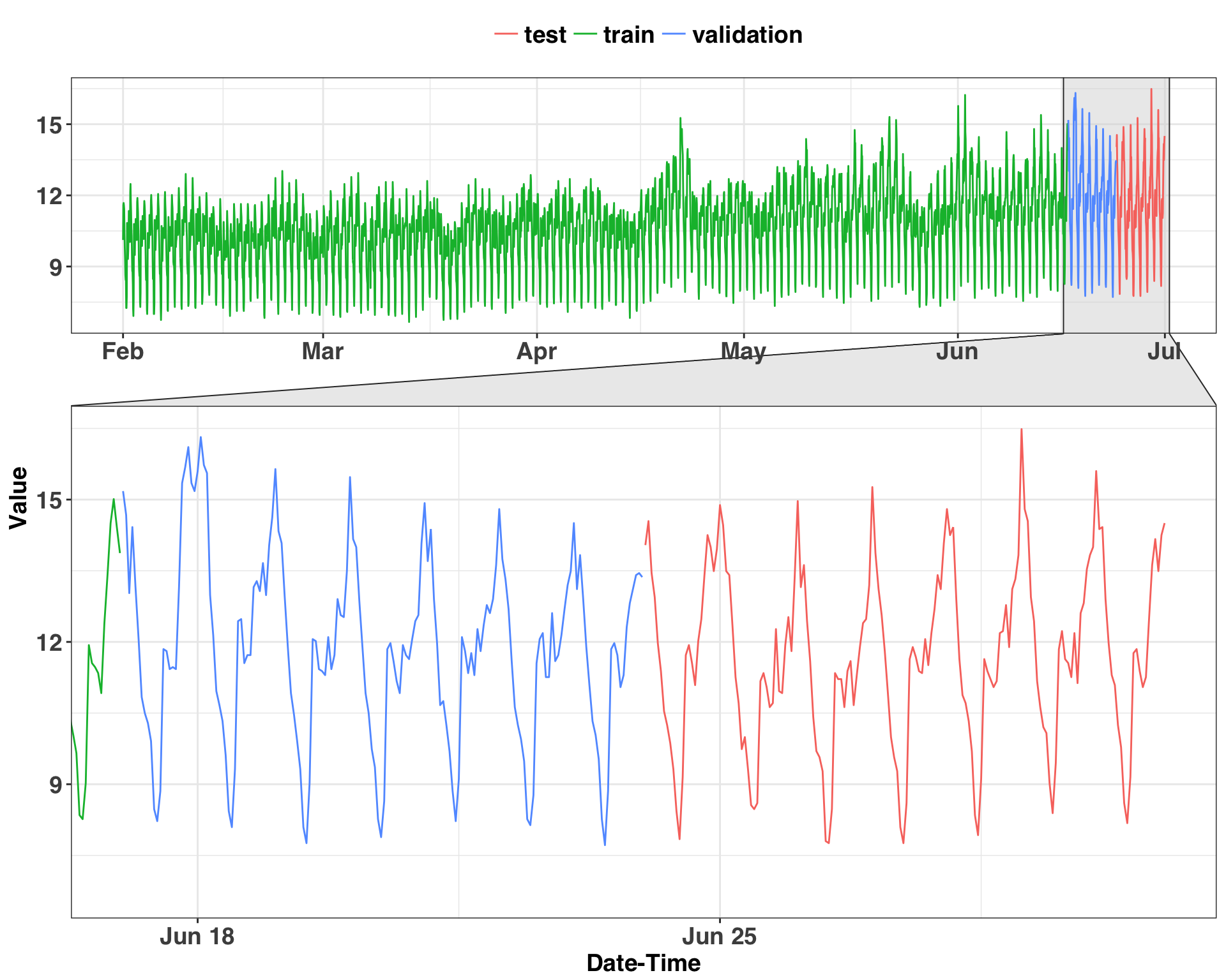
There is clear seasonality in the data – and that’s what we’ll focus on next. The measurements are at the hourly level, so a periodicity (or seasonality) of 24 is likely. However, we have no idea what kind of business we’re working with (since all the data is anonymized) and can’t make any assumptions about the nature of consumption throughout the week. Rather than assuming these patterns exist, it helps to sample some days and plot them out. If there is a pattern amongst the sampled values, then there’s a signal we can leverage to make a forecast. Let’s examine how consumption varies throughout the day and week for a random sample of 100 days.
set.seed(123)
sample_size = 100
sample_days = train_df %>%
  dplyr::select(week, day) %>%
  distinct() %>%
  sample_n(sample_size) %>%
  inner_join(train_df) %>%
  mutate(day_of_week = lubridate::wday(date_time,
                                       label = TRUE))
ggplot(sample_days, aes(x = hour, y = value, color = day_of_week)) +
geom_point() +
geom_jitter() +
stat_smooth(se = FALSE, size = 2) +
theme_bw() +
my_plot_theme() +
xlab("Hour") +
ylab("Value") +
facet_grid(day_of_week ~ .) +
theme(legend.position = "none",
axis.text.y = element_text(size = 13))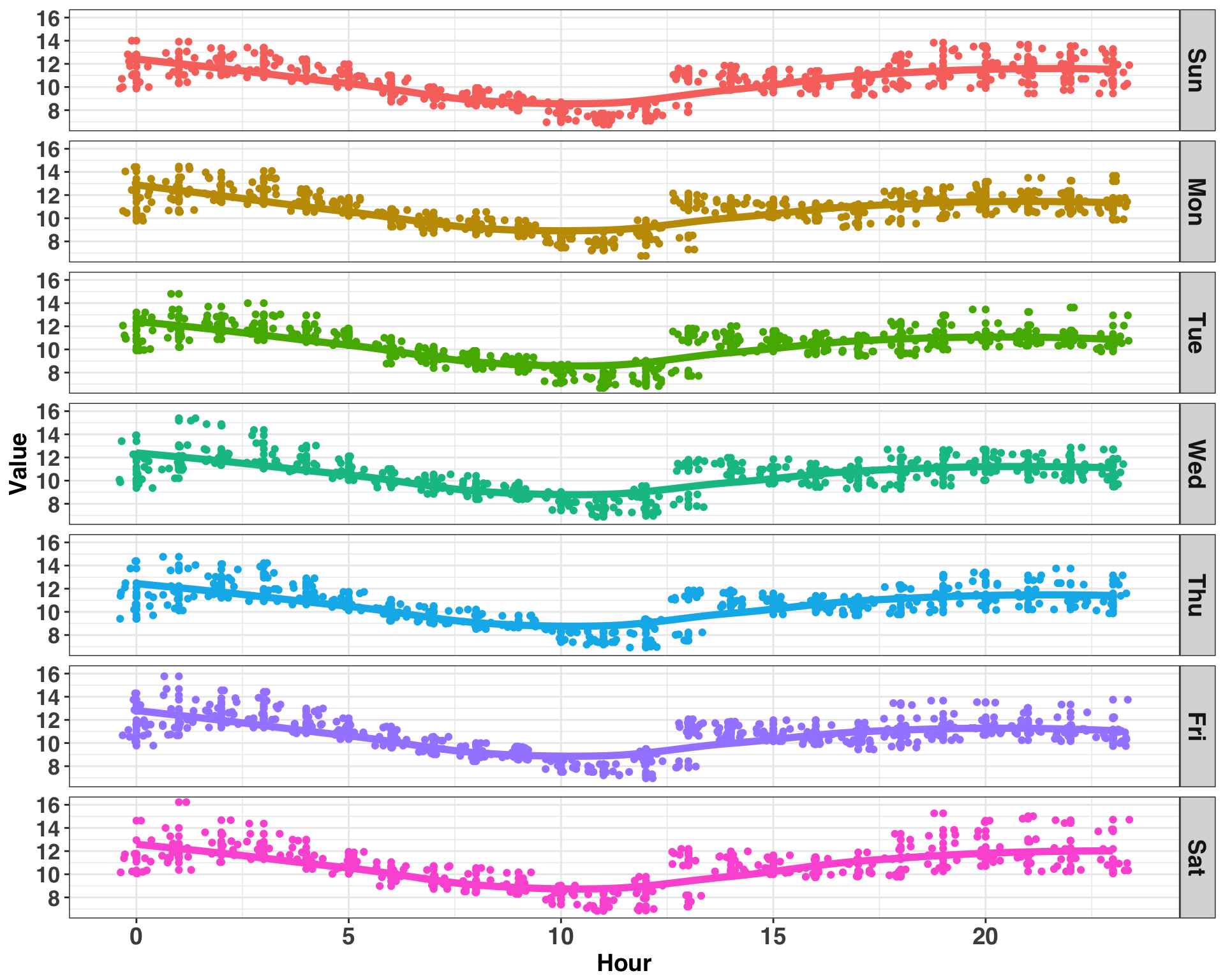
Consumption follows a similar pattern for each day of the week, peaking around midnight and reaching a minimum around noon. Thus, the pattern of consumption is stable across weekday but varies by hour within each day, indicating an hourly periodicity. We can confirm this by examining the lagged correlation values. Note much of the code in this section is adapted from here.
k = 1:period_length
col_names = paste0("lag_", k)
consumption_lags = train_df %>%
tq_mutate(
select = value,
mutate_fun = lag.xts,
k = 1:period_length,
col_rename = col_names
)
consumption_auto_cor = consumption_lags %>%
gather(key = "lag", value = "lag_value", -c(date_time, value, week, day, hour)) %>%
mutate(lag = str_sub(lag, start = 5) %>% as.numeric) %>%
group_by(lag) %>%
summarize(
abs_cor = abs(cor(x = value, y = lag_value, use = "pairwise.complete.obs"))
) %>%
mutate(lag = factor(lag)) %>%
arrange(desc(abs_cor)) %>%
head(25)
# examine top 25 correlations
ggplot(consumption_auto_cor, aes(x = fct_reorder(lag, abs_cor, .desc = TRUE) , y = abs_cor)) +
geom_point(size = 3) +
geom_segment(aes(x=lag, xend=lag, y=0, yend=abs_cor)) +
theme_bw() +
my_plot_theme() +
xlab("Lags") +
ylab("Absolute Correlation")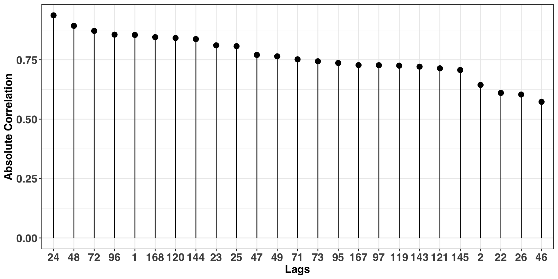 The plot above shows a strong autocorrelation at multiples of 24, confirming our initial hunch of an hourly periodicity. We’ll use this frequency when modeling our time series.
Feature Engineering, Parameter Tuning, & Forecasting
We’ll implement the forecast with the nnetar function in the forecast package. Neural networks, while incredibly powerful, have a tendency to overfit, so it is imperative to understand how different parameter configurations affect performance on unseen data. Accordingly, a total of seven, 24-hour forecasts are created from our validation set. Each model will have different parameter settings and vary along a complexity spectrum. For example, the size parameter specifies how many nodes are in a single hidden layer within the network. More nodes are capable of handling increasingly complex interactions amongst the inputs and target variable but are also more prone to overfitting.
The tuning process is parallelized with the doParallel and foreach packages. The output of each model is independent of the others, so we can run all candidate models in parallel. Finally, performance is based on two metrics: Mean Absolute Percentage Error (MAPE), and Coverage of the prediction intervals.
Note that we would typically scale our inputs. However, the nnetar automatically takes care of this prior to modeling, which eliminates this step from preprocessing.
# parameter grid
tune_grid = expand.grid(n_seasonal_lags = c(2, 3),
                        size = c(2, 8, 16)
                        )

# init computing cluster
registerDoParallel(cores = detectCores())

# bind training and validation datasets together
train_val_df = bind_rows(train_df,
                         validation_df)
# create moving window across time when validating model
end_index_train = nrow(train_df)
start_index_validation = nrow(train_df) + 1
end_index_validation = start_index_validation + 23
prediction_results = NULL
n_days = 1:7
for(n in n_days){
temp_train = train_val_df[1:end_index_train,]
temp_validation = train_val_df[start_index_validation:end_index_validation,]
temp_train_ts = ts(temp_train$value, frequency = 24)
# test different parameter settings in parallel
temp_result = foreach(i = 1:nrow(tune_grid), .combine = rbind) %dopar% {
nn_fit = forecast::nnetar(temp_train_ts,
P = tune_grid[i,]$n_seasonal_lags,
size = tune_grid[i,]$size,
repeats = 25
)
nn_fcast = forecast(nn_fit,
PI = TRUE,
npaths = 50,
h = daily_p) %>%
data.frame() %>%
clean_names()
data.frame(predicted = nn_fcast$point_forecast,
lwr = nn_fcast$lo_95,
upr = nn_fcast$hi_95,
actual = temp_validation$value,
n_seasonal_lags = tune_grid[i,]$n_seasonal_lags,
size = tune_grid[i,]$size
)
}
end_index_train = end_index_train + 23
start_index_validation = end_index_validation
end_index_validation = end_index_validation + 23
prediction_results = bind_rows(prediction_results,
temp_result %>%
mutate(day = n,
hour = rep(0:23, nrow(tune_grid))
))
}We have the forecasts for each parameter combination across the seven validation days. We’ll select the model with the best balance between a high Coverage Rate and a low MAPE.
validation_perf = prediction_results %>%
            mutate(residual = actual - predicted,
                   coverage = ifelse(actual >= lwr & actual <= upr, 1, 0)) %>%
            group_by(n_seasonal_lags, size) %>%
            summarise(MAPE = round(mean(abs(residual)/actual * 100), 2),
                      coverage_95 = round(sum(coverage)/n() * 100, 2)
                      ) %>%
            data.frame() %>%
arrange(desc(coverage_95), MAPE)| n_seasonal_lags | size | MAPE | coverage_95 |
|---|---|---|---|
| 3 | 2 | 3.87 | 85.71 |
| 2 | 2 | 3.88 | 85.71 |
| 3 | 8 | 3.84 | 83.33 |
| 2 | 8 | 3.81 | 82.14 |
| 3 | 16 | 3.74 | 77.98 |
| 2 | 16 | 3.82 | 75.60 |
According to performance on our validation set, the best model has 3 seasonal lags and 2 nodes in the hidden layer. The coverage rate of 85.71 is reasonably close to 95%, although the intervals are bit too narrow. The MAPEs are similiar amongst all of the models, so the coverage rate is the differentiating factor. However, before moving on, it’s important to dig a bit deeper into the output by examining the residuals. First, we want to consider the autocorrelation between errors. If there is autocorrelation, then there remains signal that we could leverage to improve the model. Second, we want to consider if the forecast is biased upwards or downwards. If there is a bias, we can add a constant (i.e., the magnitude of the bias) to subsequent forecasts. Let’s investigate both issues by visualizing the validation residuals.
week_results = prediction_results %>%
               filter(n_seasonal_lags == validation_perf$n_seasonal_lags[1] &
                      size == validation_perf$size[1]
                        ) %>%
               mutate(residuals = actual - predicted)

week_results %>%
    dplyr::select(day, hour, predicted, actual) %>%
    melt(c("day", "hour")) %>%
    ggplot(aes(x = hour, y = value, color = variable)) +
    geom_point() + geom_line() +
    facet_grid(day ~ .) +
    theme_bw() +
    my_plot_theme() +
    theme(plot.title = element_blank())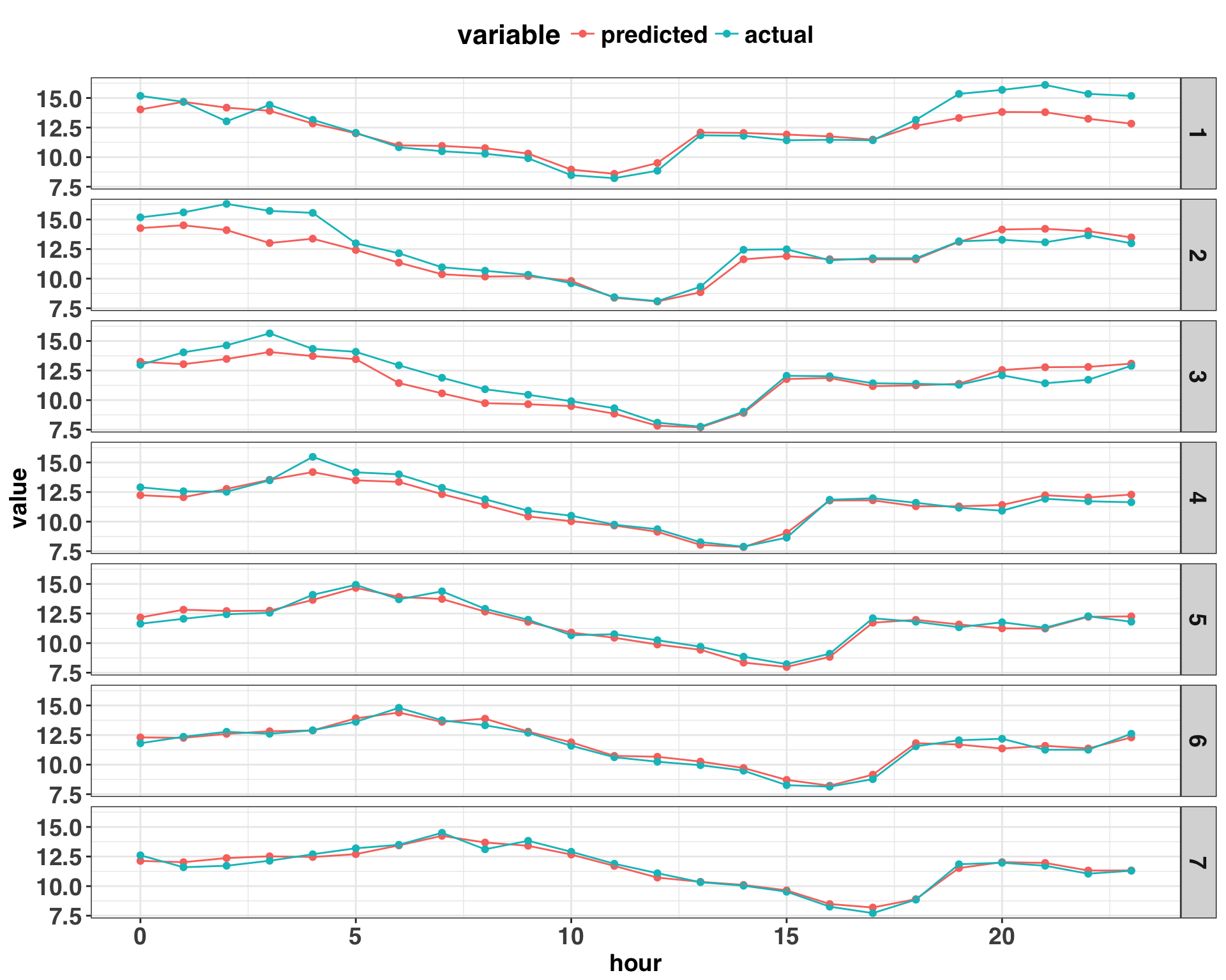
Based on the plot above, there are continuous “runs” of prediction errors that are either positive or negative, suggesting the presence of autocorrelation. We can provide some statistical rigor to this insight by calculating the correlation coefficients for different lags amongst the residuals.
# all correlation coefficients above abs(0.4) are significant
acf_threshold = 0.4
acf_df = week_results %>%
         group_by(day) %>%
         do(day_acf = Acf(.$residuals, plot = FALSE)) %>%
         data.frame()
acf_df = sapply(acf_df$day_acf, function(x) x[[1]]) %>%
         data.frame()
names(acf_df) = gsub("X", "", names(acf_df))
acf_df$lag = 0:(nrow(acf_df) - 1)

acf_df %>%
    filter(lag != 0) %>%
    melt('lag') %>%
    dplyr::rename(day = variable,
           ACF = value
           ) %>%
    mutate(sig_acf = as.factor(ifelse(ACF > acf_threshold | ACF < -acf_threshold, 1, 0))) %>%
    ggplot(aes(x = lag, y = ACF, color = sig_acf)) +
    geom_point() +
    geom_segment(aes(x=lag, xend=lag, y=0, yend=ACF)) +
    facet_grid(day ~ .) +
    theme_bw() +
    my_plot_theme() +
    geom_hline(yintercept = c(acf_threshold, 0, -acf_threshold), linetype = 2) +
    theme(legend.position = "none")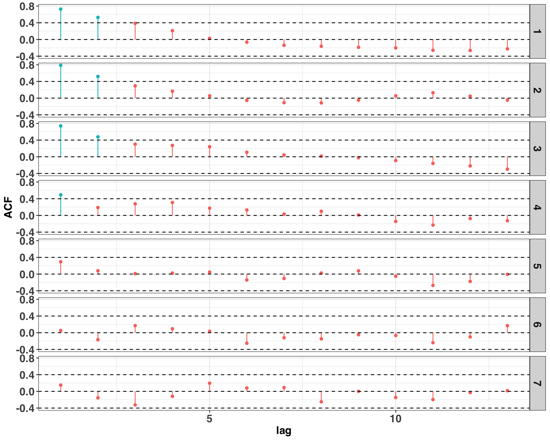
Autocorrelation is present on several days at lags one and two. There are some steps to remedy the issue, and I’ve found that identifying an omitted variable is a great place to start. For example, this data set is based on power consumption of a commercial building. Perhaps there are events that occur on certain days that lead to prolonged increases or decreases in power consumption outside of what is normal. Such events could be included as an external regressor in the model with the goal of reducing or eliminating the presence of autocorrelation. However, in order to keep things simple, we’ll stick with the model specification suggested by the validation set.
Next, we’ll consider if the forecasts are biased upward or downward. Overall, the mean of our residuals is near zero at 0.18, indicating that our model is not biased.
Finally, let’s examine the distribution of our residuals. One key assumption of the approach used to calculate the prediction intervals is that our residuals follow a normal distribution. If we find that they deviate significantly from a theoretical normal distribution, then our prediction intervals will might not be accurate.
set.seed(123)
validation_residuals = week_results %>%
                       mutate(normal_residuals = rnorm(n = n(),
                                                      mean = mean(residuals),
                                                      sd = sd(residuals)
                                                      )) %>%
                       dplyr::select(residuals, normal_residuals)
validation_residuals %>%
  melt() %>%
  dplyr::rename(Residuals = value) %>%
  ggplot(aes(x = Residuals, fill = variable, color = variable)) +
  geom_density(alpha = 0.1) +
  theme_bw() +
  my_plot_theme() +
  ylab("Density") +
  theme(legend.title = element_blank())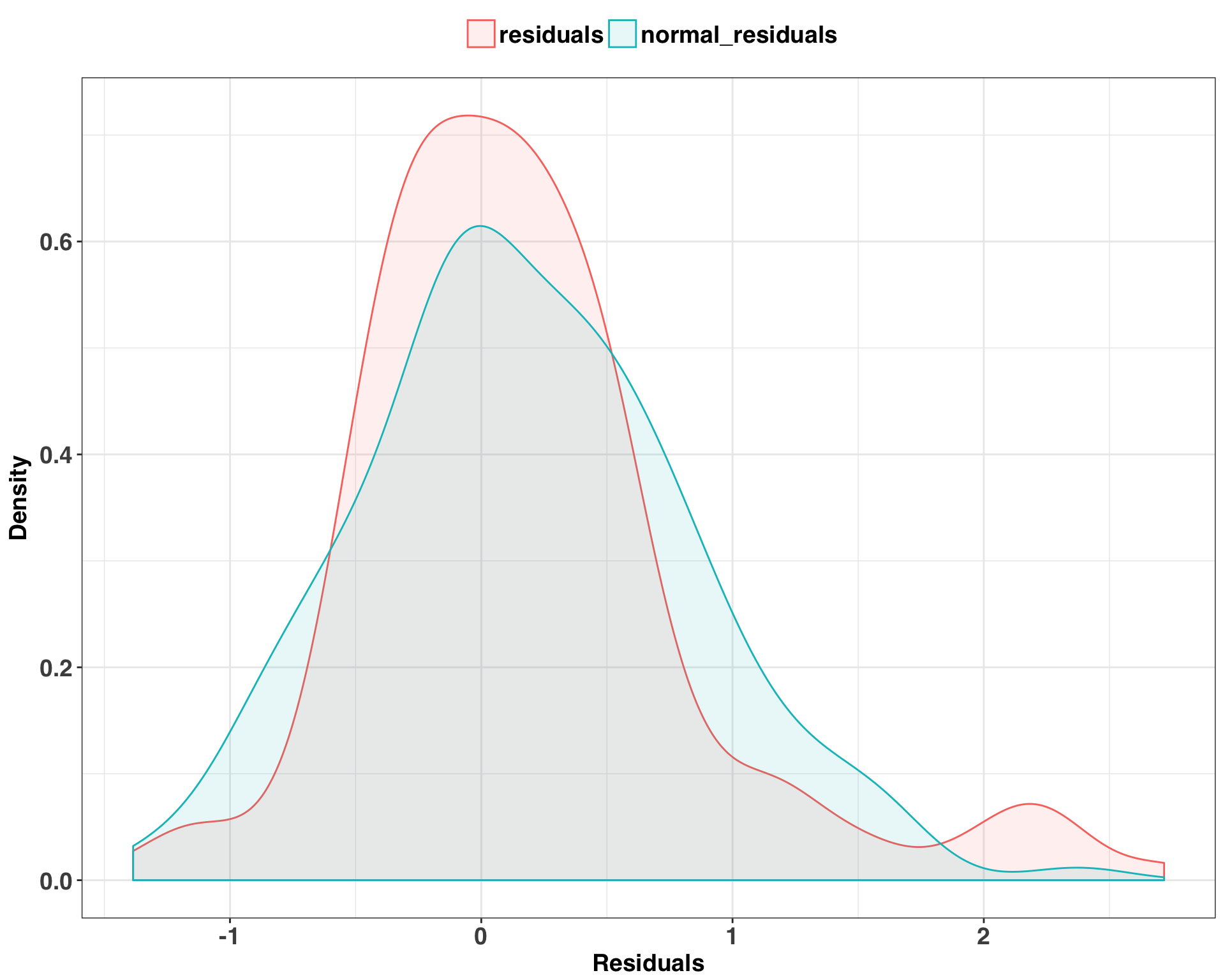
There is a fair amount of overlap between the distributions, which implies that our errors do in fact follow a normal distribution. We’ll run a KS-test just to be sure, which compares our actual residuals with those generated from our theoretical normal distribution.
ks.test(validation_residuals$residuals,
        validation_residuals$normal_residuals)
##
## Two-sample Kolmogorov-Smirnov test
##
## data: validation_residuals$residuals and validation_residuals$normal_residuals
## D = 0.095238, p-value = 0.4313
## alternative hypothesis: two-sidedA non-significant p-value indicates that both samples are drawn from the same distribution, so the assumption of normality is valid. This means we can have greater confidence in the accuracy of our prediction intervals and their ability to quantify forecasting uncertainty.
Now that we have our parameter settings and have investigated potential limitations of the model, let’s get a true test of our performance by making seven 24-hour ahead forecasts on our test set. We’ll also run several benchmark models to compare our performance against. Indeed, while neural networks are very powerful, they take a lot of computing resources and time to run. They also lack the interpretability of other forecasting approaches, such as seasonal decomposition. Can we achieve similar performance with a simpler model? To answer this question, we’ll use the HoltWinters and stl functions – two forecasting approaches that have quick run times and can produce solid forecasting results.
train_test_df = bind_rows(train_val_df,
                          test_df
                          )
end_index_train = nrow(train_val_df)
start_index_test = nrow(train_val_df) + 1
end_index_test = start_index_test + 23
prediction_results = NULL

for(n in n_days){
  temp_train = train_test_df[1:end_index_train,]
  temp_test = train_test_df[start_index_test:end_index_test,]
  temp_train_ts = ts(temp_train$value, frequency = 24)

  nn_fit = forecast::nnetar(temp_train_ts,
                              P = validation_perf[1,]$n_seasonal_lags,
                              size = validation_perf[1,]$size,
                              repeats = 50)

  nn_fcast = forecast(nn_fit,
                      PI = TRUE,
                      npaths = 50,
                      h = daily_p) %>%
             data.frame() %>%
             clean_names() %>%
             setNames(paste0('nn_', names(.)))

  stl_fcast = forecast(stl(temp_train_ts,
                           s.window = "periodic",
                           robust = TRUE),
                       h = daily_p) %>%
              data.frame() %>%
              clean_names() %>%
              setNames(paste0('stl_', names(.)))

  hw_fcast = forecast(HoltWinters(temp_train_ts),
                        h = daily_p) %>%
             data.frame() %>%
             clean_names() %>%
             setNames(paste0('hw_', names(.)))
  end_index_train = end_index_train + 23
  start_index_test = end_index_test
  end_index_test = end_index_test + 23

  prediction_results = bind_rows(prediction_results,
                                 bind_cols(nn_fcast,
                                           stl_fcast,
                                           hw_fcast) %>%
                                   dplyr::select(matches('point_forecast|hi_95|lo_95')) %>%
                                   mutate(day = n,
                                          hour = 0:23,
                                          actual = temp_test$value
                                          )
                                 )

}
We’ll compare the forecasting accuracy and coverage between the three methods below.
# combine all forecasts here
mape_calc = function(actual, predicted){
  return(abs(actual - predicted)/actual * 100)
}

coverage_calc = function(actual, upr, lwr){
  return(ifelse(actual < upr & actual > lwr, 1, 0))
}

test_results = prediction_results %>%
  mutate(nn = mape_calc(actual, nn_point_forecast),
         stl = mape_calc(actual, stl_point_forecast),
         hw= mape_calc(actual, hw_point_forecast),
         nn_coverage = coverage_calc(actual, nn_hi_95, nn_lo_95),
         stl_coverage = coverage_calc(actual, stl_hi_95, stl_lo_95),
         hw_coverage = coverage_calc(actual, hw_hi_95, hw_lo_95)
        ) %>%
  dplyr::select(nn:hw_coverage)

test_mape = test_results %>%
            dplyr::select(nn:hw) %>%
            melt() %>%
  dplyr::rename(method = variable,
         MAPE = value) %>%
  group_by(method) %>%
  summarise(MAPE = round(mean(MAPE), 2)) %>%
  data.frame()

test_coverage = test_results %>%
                dplyr::select(nn_coverage:hw_coverage) %>%
                melt() %>%
                dplyr::rename(method = variable) %>%
                group_by(method) %>%
                summarise(coverage = round(sum(value)/n() * 100, 1)) %>%
                data.frame() %>%
                mutate(method = gsub("_coverage", "", method))

test_comparison_df = inner_join(test_mape,
                                test_coverage
                                ) %>%
                     dplyr::rename(coverage_95 = coverage) %>%
arrange(MAPE, coverage_95)| method | MAPE | coverage_95 |
|---|---|---|
| nn | 3.89 | 89.3 |
| hw | 6.35 | 86.9 |
| stl | 7.69 | 86.3 |
While the coverage of our prediction intervals is comparable between the three methods, the prediction accuracy is notably better with the NN. This suggests that the additional training time and lack of interpretability are justified given the low forecasting error. While NNs don’t always outperform the “classic” time series forecasting methods, the results observed here fit with my experiences when working with highly granular time series.
Final Remarks
Hopefully this post clarified one the biggest hurdles faced by data scientists and analysts: Getting your data into the right format and checking your assumptions to make the best forecast possible. There are a few more pre-processing steps to go through, but in many cases, the extra effort can result in more accurate predictions. Happy Forecasting!