
Overview
Businesses have several “levers” they can pull to boost sales. For example, a series of advertisements might be shown in a city or region with the hopes of increasing sales for the advertised product. Ideally, the cost associated with the advertisement would be outstripped by the expected increase in sales, visits, conversion, or whatever KPI (key performance indicator) the business hopes to drive. But how do you capture the ROI of the advertisement? In a parallel universe, where all experiments are possible (and unicorns roam the land), we would create two copies of the same city, run the advertisement in one of them, track our metric of interest over the same time period, and then compare the difference between the two cities. All potential confounding variables, such as differences in seasonal variation, viewership rates, or buying preference, would be controlled. Thus, any difference (lift) in our KPI could be attributed to the intervention.
Used Cars and Wacky Inflatable Tube Men
We can’t clone cities, but there is a way to statistically emulate the above situation. This post provides a general overview of how to generate a counterfactual prediction, which is a way to quantify what would’ve happened had we never run the advertisement, event, or intervention.
Incremental Sales, ROI, KPIs, Lift – these terms are somewhat abstract. Cars and Wacky-Inflatable-Tube-Men (WITM for short) – that all seems pretty straight-forward. So imagine you run a car dealership and you’re looking for ways to attract additional customers and (hopefully) increase sales. You decide to purchase this guy below, hoping it will draw attention to your dealership, increase foot traffic, and ultimately produce more car sales.

Being a savvy business owner, you’re interested in the effect of your new WITM on sales. Does having this form of advertisement drive sales beyond what would’ve happened in the absence of any WITM? You look to the other car dealerships in separate parts of town to answer this question. The other shops will serve as a control group because they don’t have a WITM. Additionally, the other shops are located far enough away from your shop so there is no way for their sales to be affected by your WITM (this is a critical assumption that in real-world contexts should be verified). After accounting for baseline differences in sales between your shop and the control shops, you build a forecast – or counterfactual prediction – premised on what would’ve happened in your shop had the WITM intervention never taken place. This prediction will then serve as the baseline from which to compare what happened to sales.
In short, you (the owner) are faced with two tasks:
- Identifying which control shop(s) are most like your shop
- Generating the counterfactual prediction
I’ll go through each of these steps at a high level, just to give you a general idea of the logic underlying the process. For an excellent, more in-depth explanation of the technical details check out this post by the author of the MarketMatching package, which we will leverage to address both tasks.
Creating the Synthetic Data Set
Let’s read the dataset, which can be downloaded here, and load the required libraries. The original dataset is the total number of cars sold each month in Quebec between 1960 and 1968. In this case, let’s assume that the numbers represent the total number of cars sold each month at our dealership.
libs = c("devtools", "CausalImpact", "forecast",
         "data.table", "kableExtra","dplyr",
         "forcats", "MarketMatching", "knitr",
         "ggplot2", "ggforce", "readr",
         "janitor", "lubridate"
         )

lapply(libs, require, character.only = TRUE)
# Uncomment if you dont have the package installed
#devtools::install_github("klarsen1/MarketMatching", build_vignettes=TRUE)
working_dir = "path_to_data"
file_name = "monthly-car-sales-in-quebec-1960.csv"
car_sales = read_csv(file.path(working_dir, file_name)) %>%
            clean_names() %>%
            data.frame() %>%
            mutate(month = as.Date(paste0(month, "-01"),
                                   format = "%Y-%m-%d"
                                   )) %>%
            rename(sales = monthly_car_sales_in_quebec_1960_1968,
                   date = month) %>%
            mutate(sales = floor(sales/100)) # to make numbers more realistic
Let’s take a high-level glance at our time series to see if we need to clean it up.
my_plot_theme = function(){
    font_family = "Helvetica"
    font_face = "bold"
    return(theme(
    axis.text.x = element_text(size = 18, face = font_face, family = font_family),
    axis.text.y = element_text(size = 18, face = font_face, family = font_family),
    axis.title.x = element_text(size = 20, face = font_face, family = font_family),
    axis.title.y = element_text(size = 20, face = font_face, family = font_family),
    strip.text.y = element_text(size = 18, face = font_face, family = font_family),
    plot.title = element_text(size = 18, face = font_face, family = font_family),
    legend.position = "top",
    legend.title = element_text(size = 16,
    face = font_face,
    family = font_family),
    legend.text = element_text(size = 14,
    face = font_face,
    family = font_family)
))
}

ggplot(car_sales, aes(x = date, y = sales)) + geom_point(size = 2) +
                                             geom_line(size = 2) +
  theme_bw() +
  my_plot_theme()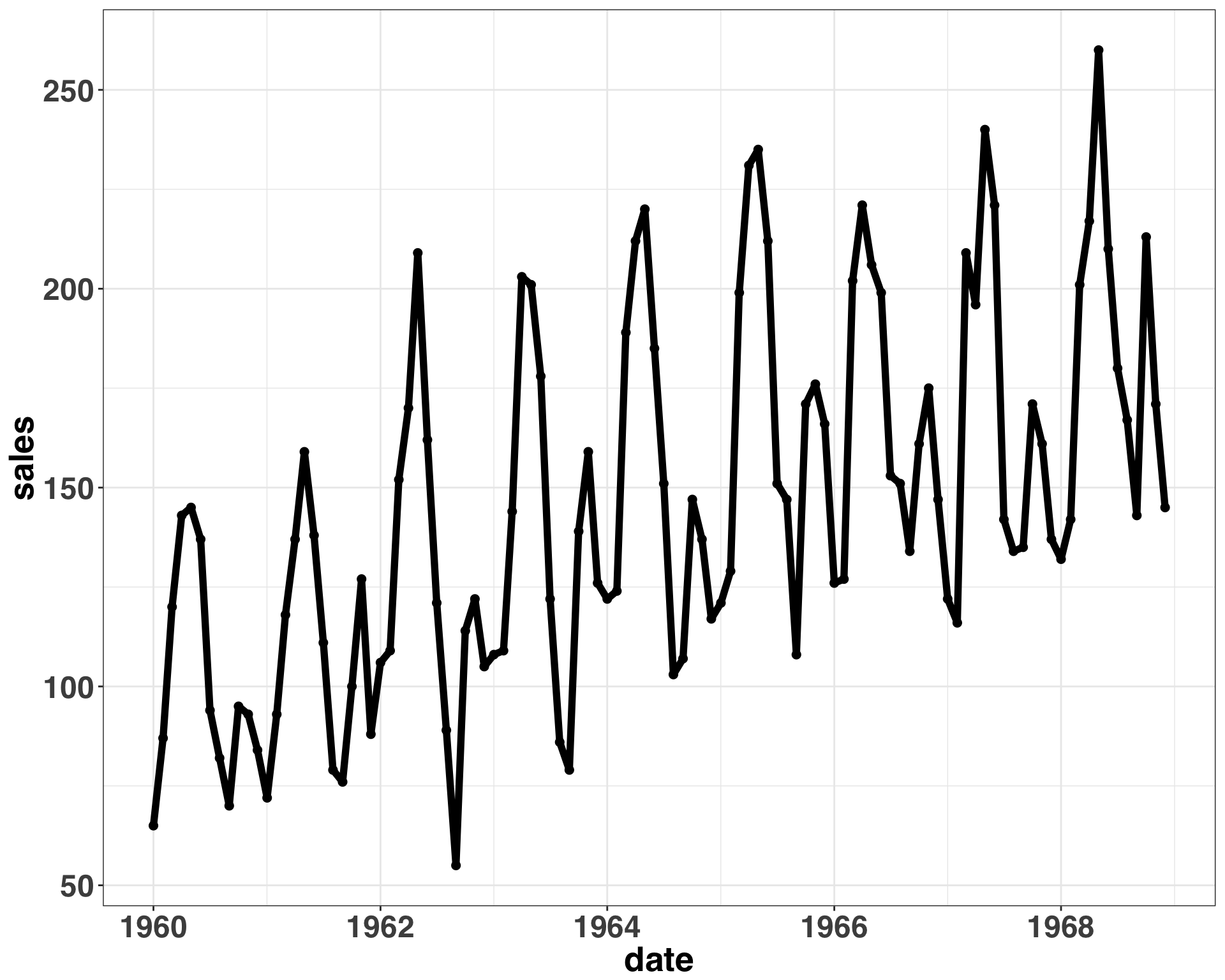
Overall, everything looks good. No major outliers or missing data. The magnitude of seasonal changes and random variation remains relatively constant over time, so the data generating process can be described with an additive model. Let’s transform our outcome variable (total monthly car sales) into a time series format.
cars_ts = ts(car_sales$sales,
             frequency = 12,
             start = c(lubridate::year(min(car_sales$date)),
                       lubridate::month(min(car_sales$date))))
Next, we’ll generate a 6-month ahead forecast. To simulate the positive effect that the WITM intervention had on sales during the 6-month intervention period, we’ll sample from a normal distribution where the mean is 105% of the forecasted value and the standard deviation is defined by the residuals of the fitted model. This would simulate a 5% lift above the number of cars we would expect to sell for that month. Using the residuals from the fitted model will result in a smaller standard deviation than using a holdout set, but to keep things simple we’ll estimate uncertainty based on model residuals.
set.seed(111)
# define length of intervention
trial_period_months = 6
# define simulated effect size as a percentage (e.g., a 5% lift above what is expected each month)
effect_size = 0.05
arima_fit = auto.arima(cars_ts)
simulated_intervention = forecast(arima_fit, trial_period_months)$mean
# create simulated effect
simulated_intervention = sapply(simulated_intervention, function(x) x + rnorm(1,
                                                     mean = (x * effect_size),
                                                     sd = sd(arima_fit$residuals)))

monthly_sales = c(cars_ts, simulated_intervention)

study_dates = seq(max(car_sales$date),
                  by = "month",
                  length.out = (trial_period_months + 1))

study_dates = study_dates[2:length(study_dates)]
intervention_start = study_dates[1]

cars_sim = data.frame(measurement_date = c(car_sales$date, study_dates),
                          sales = c(cars_ts, simulated_intervention),
                          shop = "1") %>%
                mutate(time_period = ifelse(measurement_date >= intervention_start,
                                            "post-intervention",
                                            "pre-intervention"))
Let’s plot the results to get a better idea of when each of the events is happening.
ggplot(cars_sim, aes(x = measurement_date,
                         y = sales,
                         color = time_period
                         )) +
  geom_point(size = 2) + geom_line(size = 2) +
  theme_bw() +
  my_plot_theme() + ylab("Sales") + xlab("Date") +
  facet_zoom(x = measurement_date %in% as.Date(cars_sim %>%
                                      filter(time_period == "post-intervention") %>%
                                      pull(measurement_date))) +
  theme(legend.title=element_blank())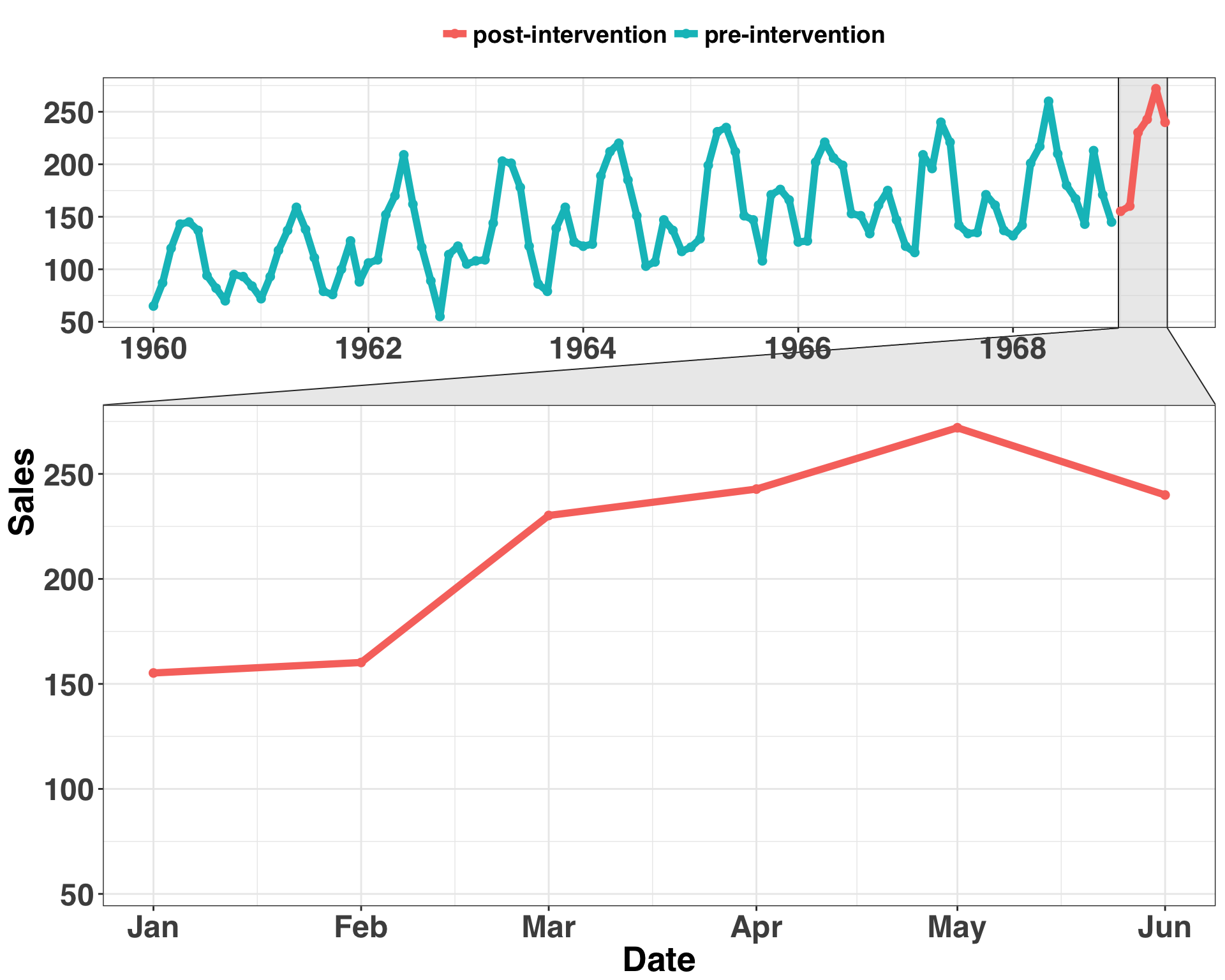
The blue region is the time before the intervention, while the red region is the time during the intervention. It’s hard to determine if the level (mean) has increased for the last six months of our time series. The uptick could be due to seasonal variation or where the trend of the series was naturally going (Obviously, we know this to be false). We want to rule these explanations out. To do so, we’ll make a counterfactual prediction based on the other control shops. We’ll use the original time series as a basis to create six other time series. Three will be the original time series with an added Gaussian error term while the other three will be random walks. All six will serve as initial candidates for our control shops. Let’s generate the time series for our comparison shops.
set.seed(111)
comparison_df = data.frame(NULL)
similiar_shops = c("2", "3", "4")
# generate time series for similar shops
for(i in 1:length(similiar_shops)){
  temp_ts = cars_ts

  # add a bit of random noise to comparison shop sales
  temp_ts = data.frame(sales = temp_ts + rnorm(length(temp_ts),
                                               0,
                                               (sd(temp_ts) * 0.25)))

  # fit a arima model to the simulated sales data
  temp_fit = auto.arima(ts(temp_ts$sales,
                           frequency = 12,
                           start = c(lubridate::year(min(car_sales$date)),
                                     lubridate::month(min(car_sales$date)))))

  # generate forecast
  forecasted_values = data.frame(forecast(temp_fit,
                                          h = trial_period_months))$Point.Forecast

  temp_ts = data.frame(sales = c(temp_ts$sales, forecasted_values),
                       shop = similiar_shops[i])

  comparison_df = bind_rows(comparison_df, temp_ts)
}

# generate time series for random shops
random_shops = c("5", "6", "7")

for(r in random_shops){
  temp_random = data.frame(sales = rnorm((length(cars_ts) + trial_period_months),
                                         mean = mean(cars_ts),
                                         sd = sd(cars_ts)),
                           shop = r
  )
  comparison_df = rbind(comparison_df, temp_random)
}

comparison_df = comparison_df %>%
                mutate(measurement_date = rep(seq(min(car_sales$date),
                                    by = "month",
                                    length.out = nrow(cars_sim)
                                    ),
                                length(unique(comparison_df$shop)))
                       ) %>%
                bind_rows(cars_sim %>%
                          dplyr::select(-time_period))
We now have all of time series in a neat dataframe. Let’s visualize what that looks like.
ggplot(comparison_df, aes(x = as.Date(measurement_date),
                          y = sales,
                          color = shop)) + geom_point() + geom_line() +
  facet_wrap(~shop, ncol = 1) +
  theme_bw() +
  my_plot_theme() + ylab("Sales") +
  xlab("Date") +
  theme(strip.text.x = element_text(size = 14, face = "bold"),
        axis.text.y = element_blank(),
        legend.position = "none")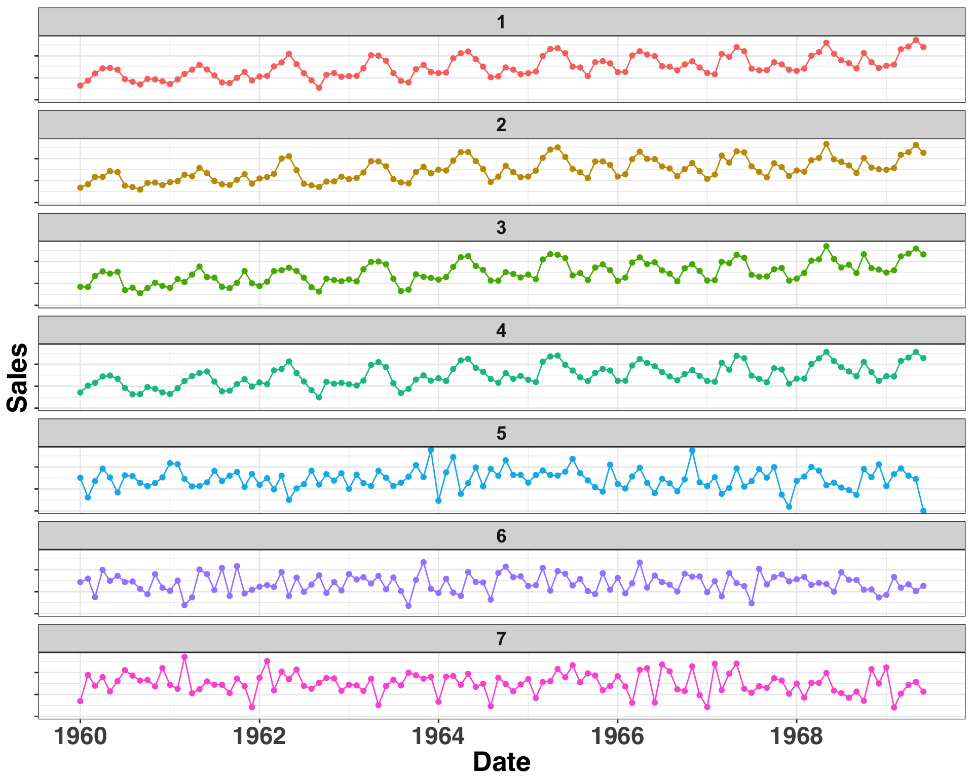
Shop 1 is our shop, while Shops 2-7 are the potential control shops. To make inferences about the effect of our intervention, we want to identify a seperate shop with similar sales history to serve as the control shop We’ll keep it simple here and only use a single shop, but you could use any number of shops as a control. I’ll discuss in the next section how we go about defining and identifying similarity.
Selecting a Control Time Series with Dynamic Time Warping
We’ll implement a technique known as Dynamic Time Warping. It sounds like something you’d hear in a Steven Hawking TED talk, but it’s just a way to measure the similarity between two sequences. A common approach for measuring the similarity between sequences is to take the squared or absolute difference between them at the same period and then sum up the results. The main drawback with this approach is that it fails to account for seasonal changes that might be shifted or delayed but still occur in the same order. It’s like if two people said the same sentence but one person said it much slower than the other. The order and content of the utterance is the same but the cadence is different. This is where Dynamic Time Warping shines. It stretches or compresses (within some constraints) one time series to make it as similar as possible to the other. An individual’s speech cadence wouldn’t affect our ability to determine the similarity between two separate utterances.
In the current context, we aren’t concerned with leading or lagging seasonality, as a random error was added to each value in the absence of any forward or backward shifts. However, this can be an issue when dealing with phenomena that are impacted by, say, weather. For example, imagine you sell a seasonal product like ice cream. Ice cream sales go up when the weather gets hot, and perhaps it warms up in some parts of the same region before others. This is a case when you might see the exact same sales patterns but some emerge a few months before or after others. Therefore, it is important to use a matching method that can account for these shifts when comparing the similarity of two time-series.
We’ll leverage the MarketMatching package to select our control time series. The selection process is done via DTW.
start = min(comparison_df$measurement_date)
end = unique(comparison_df$measurement_date)[(length(unique(comparison_df$measurement_date)) -
                                                                                       trial_period_months)]
most_similar_shop = MarketMatching::best_matches(data = comparison_df,
                             id_variable = "shop",
                             date_variable = "measurement_date",
                             matching_variable = "sales",
                             warping_limit = 3,
                             matches = 1,
                             start_match_period = start,
                             end_match_period = end
)| shop | BestControl | RelativeDistance | Correlation | Length | rank | MatchingStartDate | MatchingEndDate |
|---|---|---|---|---|---|---|---|
| 1 | 4 | 0.0892325 | 0.9749544 | 108 | 1 | 1960-01-01 | 1968-12-01 |
| 2 | 1 | 0.1046940 | 0.9675096 | 108 | 1 | 1960-01-01 | 1968-12-01 |
| 3 | 1 | 0.1007655 | 0.9667409 | 108 | 1 | 1960-01-01 | 1968-12-01 |
| 4 | 1 | 0.0887502 | 0.9749544 | 108 | 1 | 1960-01-01 | 1968-12-01 |
| 5 | 7 | 0.2950050 | 0.1958782 | 108 | 1 | 1960-01-01 | 1968-12-01 |
| 6 | 2 | 0.3073312 | 0.1539837 | 108 | 1 | 1960-01-01 | 1968-12-01 |
| 7 | 5 | 0.2831873 | 0.1958782 | 108 | 1 | 1960-01-01 | 1968-12-01 |
That was too easy! This table indicates that the pre-intervention sales for Shop Number 4 are the most similar to those in Shop Number 1. Thus, we’ll use Shop 4 as our reference when generating the counterfactual prediction.
Generating Counterfactual Predictions
This is the inference part – namely, can we infer that our intervention impacted sales?
results = MarketMatching::inference(matched_markets = most_similar_shop,
                                     test_market = "1",
                                     end_post_period = max(comparison_df$measurement_date)
                                    )
## ------------- Inputs -------------
## Test Market: 1
## Control Market 1: 4
## Market ID: shop
## Date Variable: measurement_date
## Matching (pre) Period Start Date: 1960-01-01
## Matching (pre) Period End Date: 1968-12-01
## Post Period Start Date: 1969-01-01
## Post Period End Date: 1969-06-01
## Matching Metric: sales
## Local Level Prior SD: 0.01
## Posterior Intervals Tail Area: 95%
##
##
## ------------- Model Stats -------------
## Matching (pre) Period MAPE: 5.75%
## Beta 1 [4]: 0.9362
## DW: 1.92
##
##
## ------------- Effect Analysis -------------
## Absolute Effect: 93.19 [15.59, 161.41]
## Relative Effect: 7.72% [1.29%, 13.37%]
## Probability of a causal impact: 98.996%Let’s break down the Effect Analysis portion of the output. The Absolute Effect indicates that we sold ~93 more cars over the 6-month intervention period relative to what we expected to sell. The Relative Effect provides a standardized view, indicating a 7.7% lift in sales. Finally, the probability of a causal impact indicates that the likelihood of observing this effect by chance is extremely low (e.g., 100 - 98.9). We can see what was just described above in visual format below.
plot(results$PlotActualVersusExpected)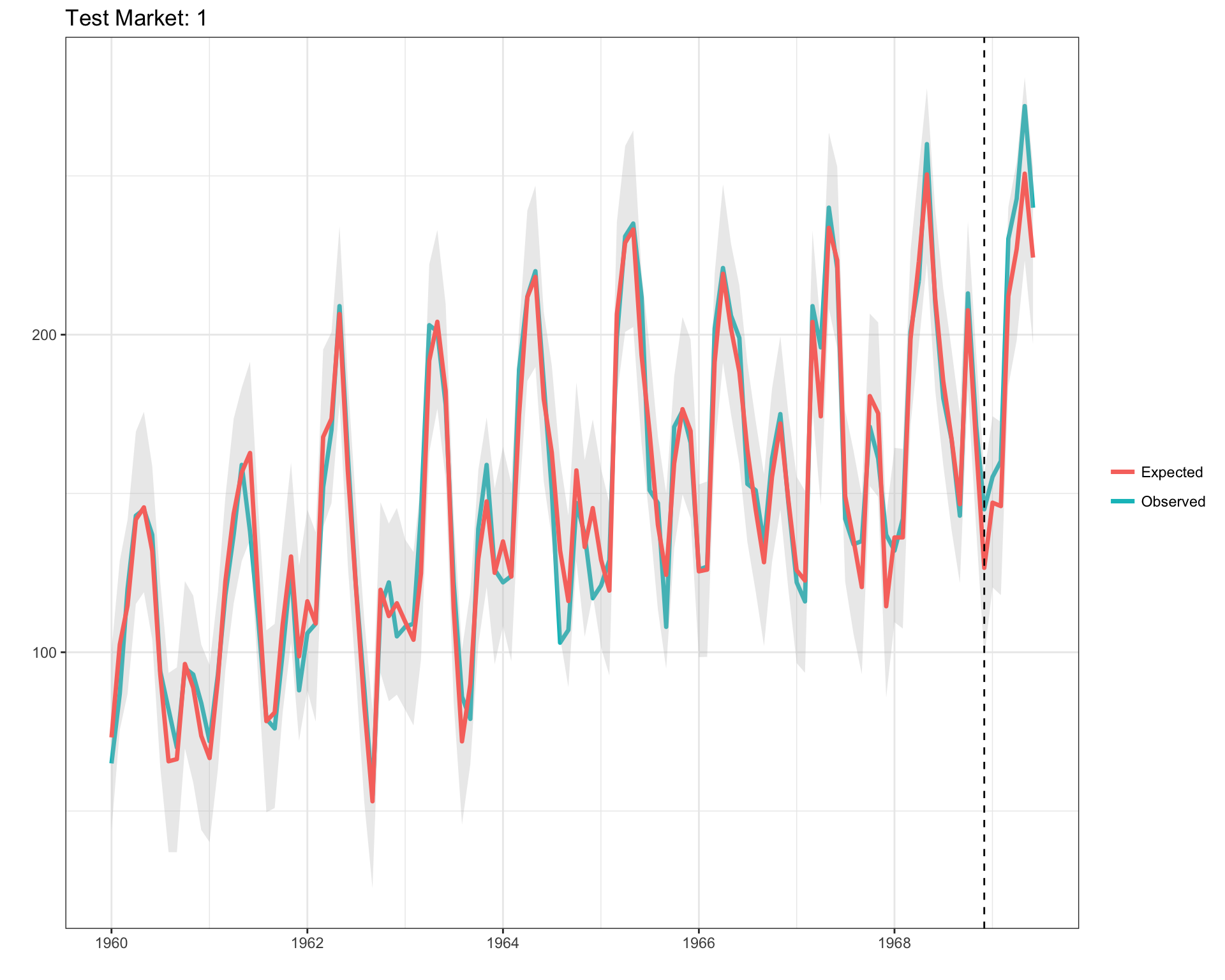
This drives home that our intervention had a clear effect – and we should promote the WITM to shop manager for the excellent work in driving up sales. Hopefully, this post gave you a better idea of how to quantify the impact of an intervention. The ability to run a randomized experiment in the real-world is often too expensive or simply not possible. In many cases creating a statistical control group is the best (and cheapest) option available. For more information about the forecasting methodology used produce counterfactual predictions, check out the bsts and CausalImpact packages. Happy experimenting!