Overview
While there are several definitions for an outlier, I generally think of an outlier as the following: An unexpected event that is unlikely to happen again. For example, website traffic drops precipitously because of a server fire, or insurance claims spike because of an unprecedented, 500-year weather event. These events are occurrences that (we hope) do not occur a regular cadence. Yet if you were attempting to predict future website traffic or understand the seasonal patterns of insurance claims, the aforementioned events may greatly impact our forecasting accuracy. Thus there are two main reasons for conducting an outlier analysis prior to generating a forecast:
- Outliers can bias forecasts
- Outliers can inflate estimated variance and produce prediction intervals that are too wide
This post discusses the use of seasonal-decomposition to isolate errors that cannot be explained as a function of trend or seasonality. We’ll also discuss two simple, commonly used approaches for identifying outliers, followed by a brief overview of how to replace outliers with more sensible values. Finally, we’ll test how including or excluding outliers affects the accuracy of our forecasts as well as the width of our prediction intervals. These questions will be explored within the context of monthly milk production from 1962-1975, where the value for each month represents the pounds of milk produced per cow (Riveting stuff, right?).
The data for this post is located here. Let’s load up the required libraries, bring the data into R, do a bit of cleaning, and then have a quick look at the data.
libs = c('dplyr', 'artyfarty', 'ggplot2',
         'forecast', 'reshape','readr',
         'reshape')
lapply(libs, require, character.only = TRUE)
working_directory = "path_to_file"
file_name = "monthly-milk-production-pounds-p.csv"
milk_df = read_csv(file.path(working_directory, file_name))
names(milk_df) = c('month', 'milk_production')
milk_df = milk_df %>%
          mutate(month = as.Date(paste(month, "01", sep = "-"),
format = "%Y-%m-%d"))| month | milk_production |
|---|---|
| 1962-01-01 | 589 |
| 1962-02-01 | 561 |
| 1962-03-01 | 640 |
| 1962-04-01 | 656 |
| 1962-05-01 | 727 |
| 1962-06-01 | 697 |
Now that we have our time series dataframe, let’s introduce six outliers into our time series. I picked these data points and their values at random.
milk_df$milk_production[30] = milk_df$milk_production[30] + 70
milk_df$milk_production[55] = milk_df$milk_production[55] - 60
milk_df$milk_production[99] = milk_df$milk_production[99] - 220
milk_df$milk_production[100] = milk_df$milk_production[100] + 100
milk_df$milk_production[152] = milk_df$milk_production[152] + 40
milk_df$milk_production[153] = milk_df$milk_production[153] - 70

outlier_milk_df = milk_df[c(30, 55, 99, 100, 152, 153),]
Let’s examine what our time series. The pink points are the outliers we just introduced.
ggplot(milk_df, aes(x = month, y = milk_production)) +
    geom_point(size = 2, color = color_values[1]) +
    geom_line(size = 2, color = color_values[1]) +
    theme_bw() +
    my_plot_theme() +
    theme(legend.title = element_blank()) +
    xlab("Date") + ylab("Milk Production") +
    geom_point(data = outlier_milk_df, colour = color_values[2], size = 8)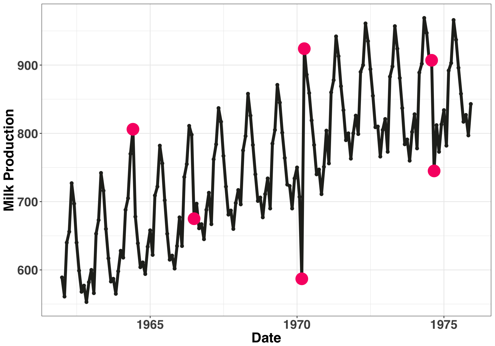
Let’s break our time series into three separate components: Seasonal, Trend, and Remainder. The seasonal and trend are structural parts of the time series that we can explain, while the remainder is everything that’s left over that we cannot explain. We’ll focus on this portion of the time series when looking for anomalous data points.
decomp_ts = stl(ts(milk_df$milk_production, frequency = 12),
                s.window = "periodic",
                robust = TRUE
                )
ts_decomposition = data.frame(decomp_ts$time.series) %>%
                   melt() %>%
                   mutate(month = rep(milk_df$month, 3)) %>%
                   dplyr::rename(component = variable)
ggplot(ts_decomposition, aes(x = month, y = value, fill = component)) +
geom_bar(stat = "identity") +
facet_grid(component~ ., scales = "free") +
theme_bw() +
my_plot_theme() +
scale_fill_manual(values = c(color_values[1:3])) +
theme(legend.title = element_blank()) +
ylab("") + xlab("Date")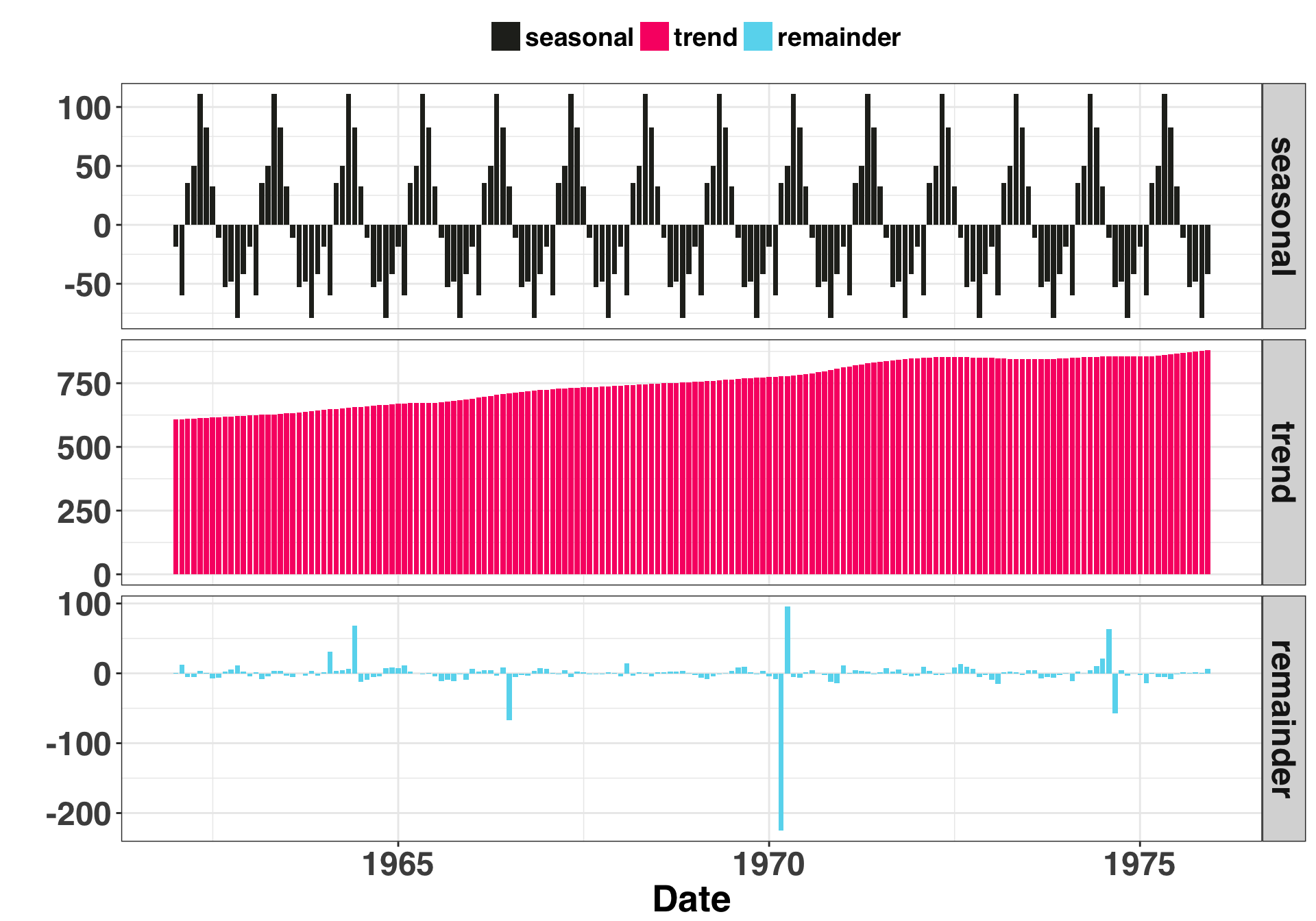
Based on this breakout, there is one clear anomaly (the -200 point). The other five aren’t as salient but we know they are there. Let’s try out our two approaches: The first is the +- 3 standard deviation rule. Any residual that is +- 3 SDs is considered an anomaly. If our residuals are normally distributed, then by chance alone 27 of every 10000 points should fall outside of these boundaries. Thus it is possible (but unlikely) when you detect a residual of this magnitude or greater. The second method leverages the Interquartile Range (or IQR). The IQR is the difference between the value at the 75th and 25th percentiles of your residuals. You then multiply the range by some constant (often 1.5). Any values outside of this range are considered an anomaly.
I don’t want to bury the lede here, so I’ll just come right out and say it: The +-3 SD rule is not the approach you want to use. In the real world, which can admittedly be a scary place, forecasting is done at scale. You’ll be generating lots and lots of forecasts, so many that you won’t be able to verify the assumptions or examine the residuals for each one (very scary). Thus it is imperative to use methods for outlier detection that are robust. What does this mean? In short, a measure that quantifies “outlierness” must be immune to the effects of outliers. Hang on…I’m confused. I’ll visualize what this means below.
+- 3 SD Approach
remainder = ts_decomposition %>%
            filter(component == 'remainder')
sd_remainder = sd(remainder$value)
anomaly_boundary = c(-sd_remainder * 3,
                      sd_remainder * 3)
remainder_sd = remainder %>%
               mutate(is_anomaly = ifelse(value > anomaly_boundary[2] |
                             value < anomaly_boundary[1], "yes", "no"))
ggplot(remainder_sd, aes(x = value, fill = is_anomaly)) + geom_histogram(aes(y=..density..),
bins = 30,
colour="black") +
theme_bw() +
my_plot_theme() +
geom_vline(xintercept = anomaly_boundary[1], size = 2, linetype = "dotted",
color = color_values[1]) +
geom_vline(xintercept = anomaly_boundary[2], size = 2, linetype = "dotted",
color = color_values[1]) +
xlab("Remainder") +
scale_fill_manual(values = c(color_values[1],color_values[2]))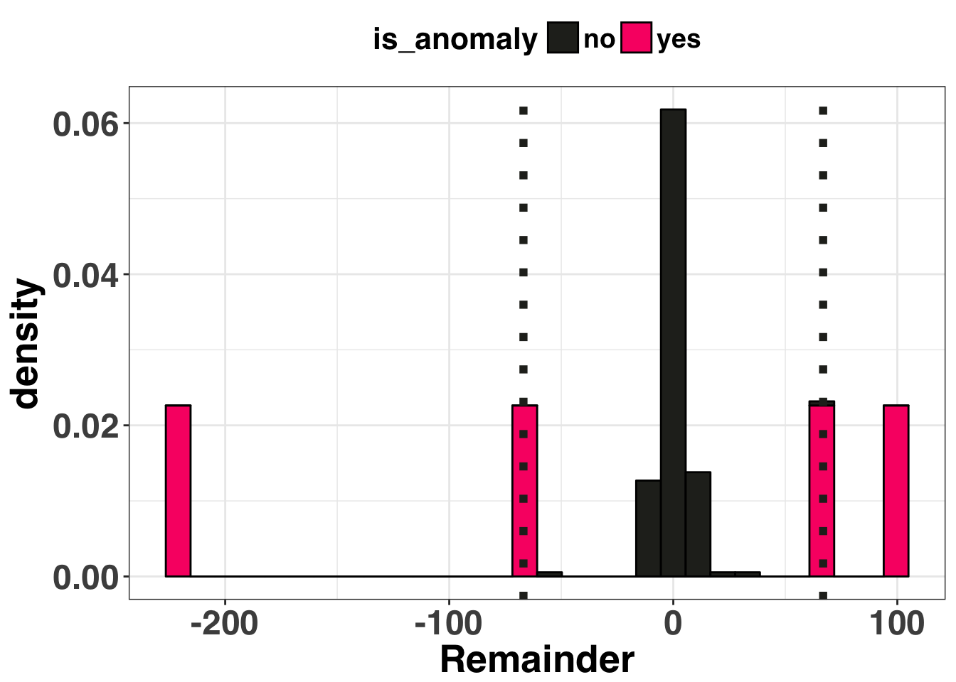
This method identified four of the six outliers It missed the other two because the one really big outlier (-220) inflated our standard deviation, making the other two, smaller outliers undetectable. Let’s see how the IQR approach performed.
IQR Approach
spread = 1.5
pct_50 = unname(quantile(remainder$value, 0.5))
iqr = diff(unname(quantile(remainder$value, c(0.25, 0.75))))
lb = unname(quantile(remainder$value, 0.25)) - (spread * iqr)
ub = unname(quantile(remainder$value, 0.75)) + (spread * iqr)
remainder_iqr = remainder %>%
                mutate(is_anomaly = ifelse(value > ub | value < lb, "yes", "no"))
ggplot(remainder_iqr, aes(x = component, y = value)) +
geom_boxplot() +
geom_point(size = 4, aes(color = is_anomaly,
fill = is_anomaly)) +
theme_bw() +
my_plot_theme() +
xlab("") + ylab("Remainder") +
theme(axis.text.x = element_blank()) +
scale_color_manual(values = c(color_values[1],color_values[2]))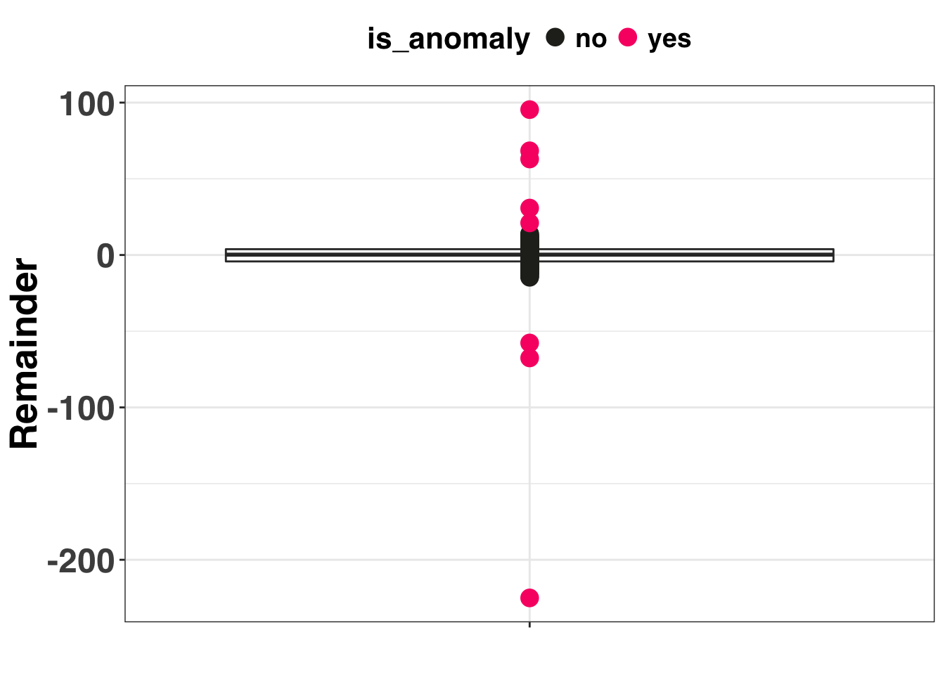
The IQR method detected all 6 of the synthetic outliers in addition to two non-outliers. However, does any of this matter? Data cleaning steps are a means to an end. We address outliers in our data so we (presumably) get better forecasts and more accurate prediction intervals. Let’s compare the forecasting accuracy between three methods:
- Do Nothing (just leave outliers in there and make a forecast)
- +- 3 SDs
- +- 1.5 Interquartile Range
Methods 2 and 3 use linear interpolation to replace the outliers. Let’s create our validation dataset below.
anom_index_sd = which(match(remainder_sd$is_anomaly, "yes") %in% c(1))
anom_index_iqr = which(match(remainder_iqr$is_anomaly, "yes") %in% c(1))
sd_df = milk_df
iqr_df = milk_df
sd_df$milk_production[anom_index_sd] = NA
iqr_df$milk_production[anom_index_iqr] = NA
n_holdout = 12 # number of months in the validation set
validation_set = milk_df$milk_production[(nrow(sd_df) - n_holdout + 1):nrow(sd_df)]
And then create three seperate forecasts via the auto.arima function. The na.interp function is used to replace the NA values with an interpolated (i.e., non-anomalous) value.
sd_ts = na.interp(ts(sd_df$milk_production[1:(nrow(sd_df) - n_holdout)],
                     frequency = 12))
sd_forecast = forecast(auto.arima(sd_ts), h = n_holdout)
iqr_ts = na.interp(ts(iqr_df$milk_production[1:(nrow(iqr_df) - n_holdout)],
                      frequency = 12))
iqr_forecast = forecast(auto.arima(iqr_ts), h = n_holdout)
none_ts = ts(sd_df$milk_production[1:(nrow(sd_df) - n_holdout)],
                      frequency = 12)
none_forecast = forecast(auto.arima(none_ts), h = n_holdout)
forecast_df = data.frame(anom_method = c(rep("IQR", n_holdout),
rep("SD", n_holdout),
rep("None", n_holdout)),
forecasted_amt = c(iqr_forecast$mean,
sd_forecast$mean,
none_forecast$mean),
actual_amt = rep(validation_set, 3)) %>%
mutate(residual_squared = (actual_amt - forecasted_amt)^2) %>%
group_by(anom_method) %>%
summarise(mse = mean(residual_squared)) %>%
mutate(anom_method = factor(anom_method)) %>%
mutate(anom_method = fct_reorder(anom_method,
mse,
.desc = FALSE))ggplot(forecast_df, aes(x = anom_method, y = round(mse, 0),
fill = anom_method, label = as.character(round(mse, 0)))) +
geom_bar(stat = "identity") +
theme_bw() +
my_plot_theme() +
scale_fill_manual(values = color_values[1:length(unique(forecast_df$anom_method))]) +
xlab("Outlier Replacement Method") + ylab("Mean Square Error") +
theme(legend.position = "none") +
geom_label(label.size = 1, size = 10, color = "white")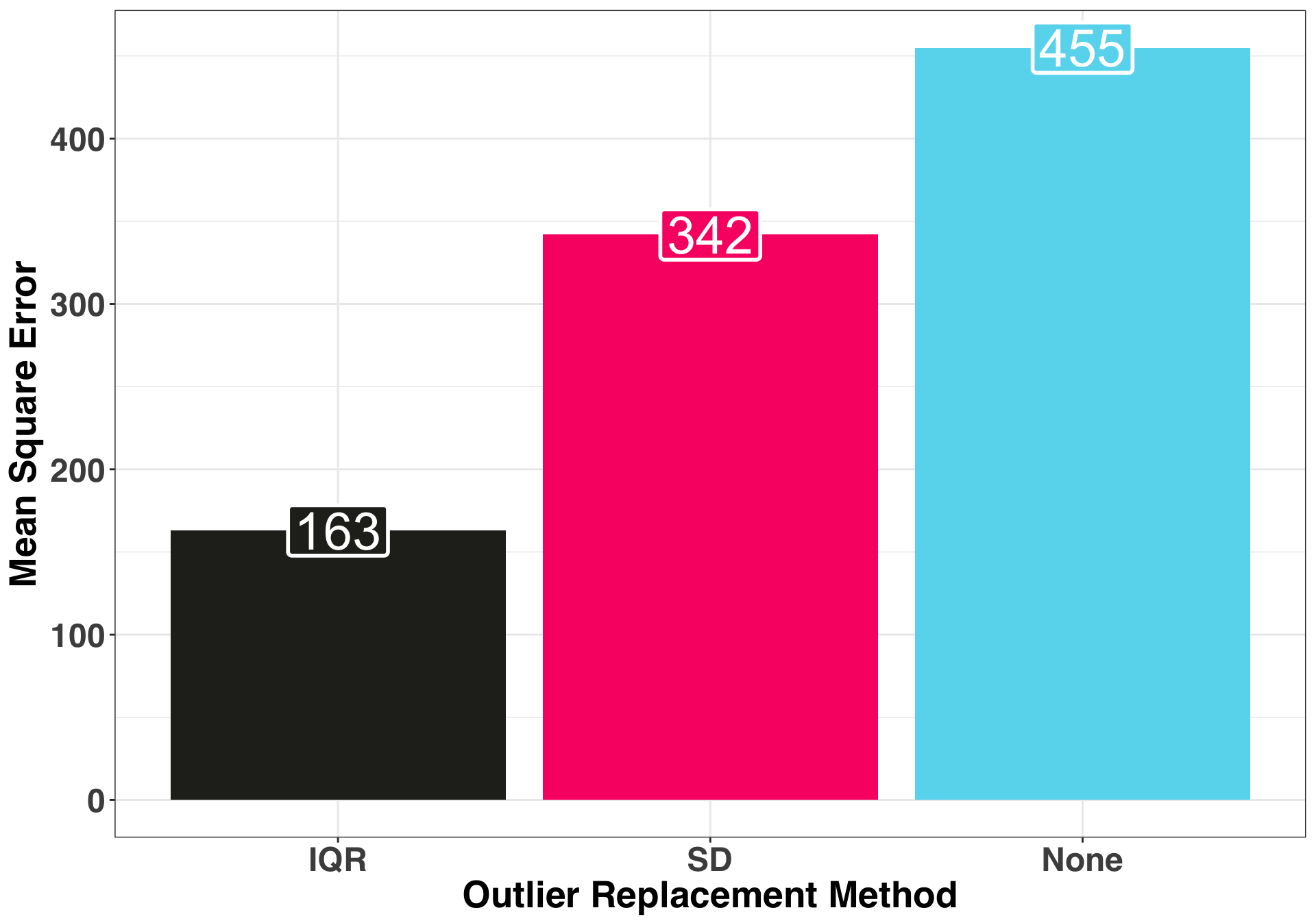
Replacing the outliers via the IQR method produced the most accurate 12-month ahead forecast. Now let’s examine the prediction intervals of each method, specifically the range as well as the coverage rate.
pi_df = data.frame(anom_method = c(rep("IQR", n_holdout),
                                   rep("SD", n_holdout),
                                   rep("None", n_holdout)),
                   upper_bound = c(iqr_forecast$upper[,2],
                                   sd_forecast$upper[,2],
                                   none_forecast$upper[,2]),
                   lower_bound = c(iqr_forecast$lower[,2],
                                   sd_forecast$lower[,2],
                                   none_forecast$lower[,2]),
                   actual_amt = rep(validation_set, 3)) %>%
        mutate(pi_range = upper_bound - lower_bound) %>%
        mutate(actual_in_pi_range = as.integer(actual_amt < upper_bound & actual_amt > lower_bound))
ggplot(pi_df, aes(x = anom_method, y = pi_range, color = anom_method)) +
geom_boxplot() +
theme_bw() +
my_plot_theme() +
scale_color_manual(values = c(color_values[1:3])) +
xlab("Outlier Replacement Method") + ylab("Prediction Interval Range") +
theme(legend.position = "none")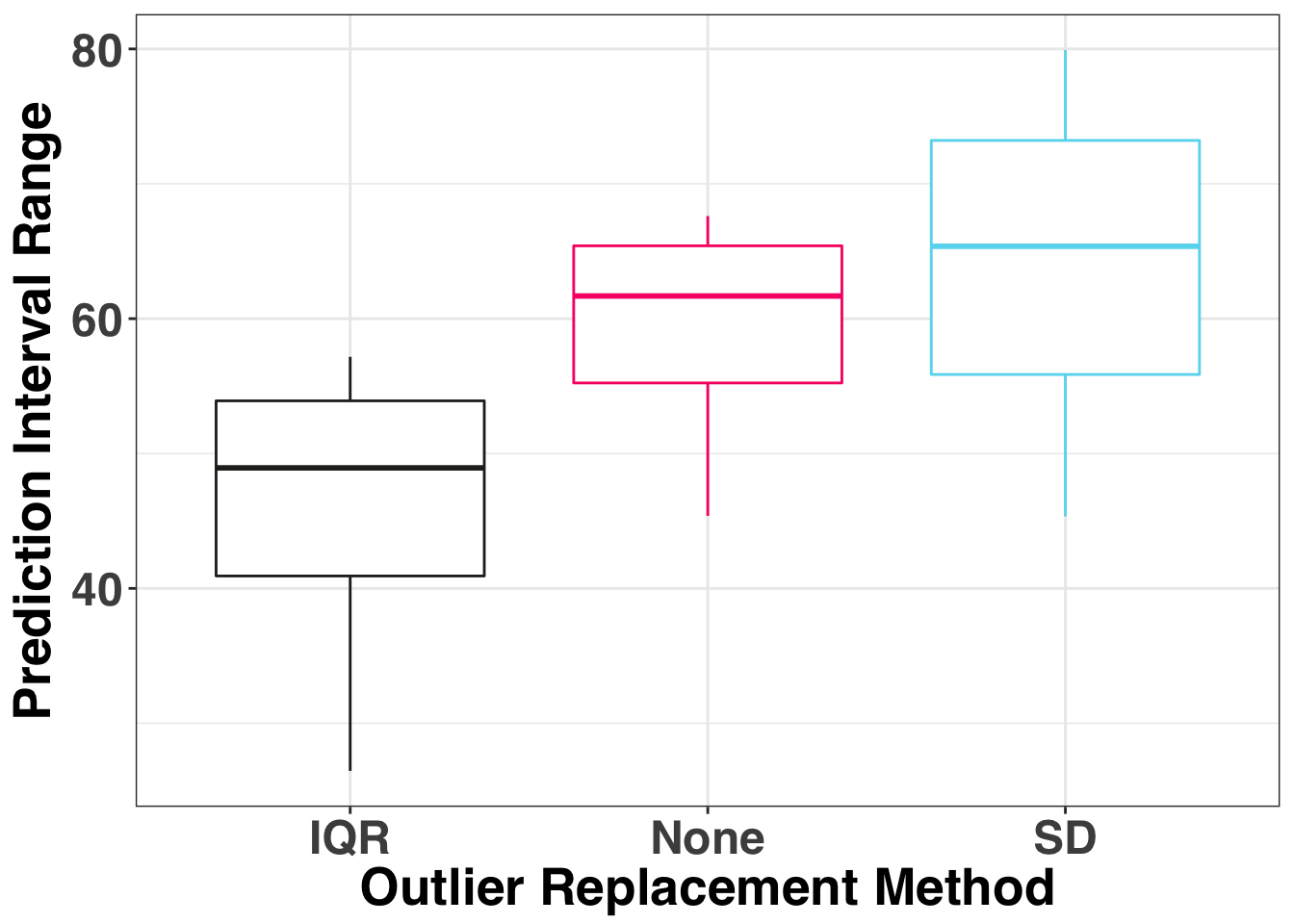
The median PI range is the narrowest for the IQR and the widest when we don’t replace any of the outliers. Finally let’s consider the coverage rate, which is how often the actual value fell within the monthly prediction interval.
coverage_df = pi_df %>%
              group_by(anom_method) %>%
summarise(coverage_rate = round(sum(actual_in_pi_range)/12 * 100, 1))| anom_method | coverage_rate |
|---|---|
| IQR | 100.0 |
| None | 83.3 |
| SD | 91.7 |
The IQR and None approaches provided 100% coverage, while the SD method missed one month, yielding a coverage rate of ~92%.
Taken together, the IQR method provided the most accurate forecasts and prediction intervals. While this is only one example, it is interesting to note that using the SD method actually reduced our forecasting accuracy and coverage rate below what would’ve happened had we not taken any steps to remedy our outliers prior to fitting a model. This really illustrates the value of using a robust method for anomaly detection.