Overview
Phil Karlton, a famous Netscape Developer (i.e., OG Google Chrome) once said, ‘There are two hard things in computer science: cache invalidation and naming things’. I haven’t done much cache invalidation, but I have named a few things – and naming a person is by far the hardest of them all! Indeed, having waited two days after my own son’s birth to finally settle on a name, I wondered to what extent other new parents encountered the same struggles. Are there shortcuts or heuristics that others use to simplify the decision-making process, specifically cues from their immediate surroundings to help guide their choices when choosing a baby name? This question motivated me to look into the nuances of naming conventions over the past century in America.
Accordingly, in this post, we’ll investigate the influence of one’s state of residence on the frequency with which certain names occur. We’ll also explore possible reasons for why some states have more variety in their names than others. Finally, we’ll finish up in my home state of Oregon to identify the trendiest names over the past 20 years and predict whether those names will remain trendy in the future. From a technical standpoint, we’ll cover some central, bread-and-butter topics in data science, including trend detection, false discovery rates, web scraping, time-series forecasting, and geovisualization. Let’s get started!
People Born in Oregon are Named after Trees
We’ll begin by downloading more than 110 years of US name data from 🌲 the codeforest github repo 🌳. Our dataset is published yearly by the Social Security Administration, and it contains a count of all names that occur more than five times by year within each US state. Let’s get started by loading relevant libraries and pulling our data into R.
# Core Packages
library(tidyverse)
library(purrr)
library(skimr)
library(janitor)
library(drlib)
library(broom)
library(openintro)
library(sweep)

# Webscraping Packages
library(rvest)

# Forecasting Packages
library(forecast)
library(timetk)

# Visualization Packages
library(ggplot2)
library(ggmap)
library(ggthemes)
library(ggrepel)
library(artyfarty)
library(kableExtra)

# Trend Detection Packages
library(trend)
# Path to codeforest repo
repo <- "https://raw.githubusercontent.com/thecodeforest/names_data/master"
# Set visualization themes
theme_set(theme_bw())
source(file.path(repo,'viz_theme','names_post_theme.R'))
# Collect file paths from Github
file_names <- read_html("https://github.com/thecodeforest/names_data") %>%
html_nodes("table") %>%
html_table(fill = TRUE) %>%
data.frame() %>%
clean_names() %>%
filter(str_ends(name, '.TXT'))
# Append data from each state into single table
names_raw <- file.path(repo, file_names$name) %>%
purrr:::map(read_csv, col_names = FALSE) %>%
reduce(rbind)Let’s have a quick peek at our data.
| X1 | X2 | X3 | X4 | X5 |
|---|---|---|---|---|
| AK | FALSE | 1910 | Mary | 14 |
| AK | FALSE | 1910 | Annie | 12 |
| AK | FALSE | 1910 | Anna | 10 |
| AK | FALSE | 1910 | Margaret | 8 |
| AK | FALSE | 1910 | Helen | 7 |
| AK | FALSE | 1910 | Elsie | 6 |
| AK | FALSE | 1910 | Lucy | 6 |
| AK | FALSE | 1910 | Dorothy | 5 |
| AK | FALSE | 1911 | Mary | 12 |
| AK | FALSE | 1911 | Margaret | 7 |
A little cleaning is in order. We’ll name our fields, create a gender feature, and remove spurious names.
names(names_raw) <- c("state", "gender", "year", "name", "frequency")

names_processed <- names_raw %>%
  mutate(gender = ifelse(is.na(gender), "Male", "Female")) %>%
  filter(!str_to_lower(name) %in% c("unknown", "noname", "female", "male"))
Let’s do some quick exploratory data analysis before addressing our original questions. Any time we are working with categorical variables (e.g., name, state, gender, etc.), I like to start by counting and visualizing their distributions. Below we’ll create two separate data views for quality assurance purposes: (1) The most popular names since 1910, and (2) the total number of births (based on name counts) across time. The goal is to ensure the data aligns with our expectations (e.g., the most popular boy names over the past 100 years are not ‘Florp’ or ‘Spaghetti Joe’).
# calculate the top 20 most popular names
name_popularity <- names_processed %>%
  group_by(name, gender) %>%
  summarise(total = sum(frequency)) %>%
  group_by(gender) %>%
  top_n(20, total) %>%
  ungroup() %>%
  mutate(name = reorder_within(name, total, gender))

name_popularity %>%
  ggplot(aes(name, total, fill = gender)) +
  geom_col(alpha = 0.8, color = 'black') +
  coord_flip() +
  scale_x_reordered() +
  facet_wrap(~ gender, scales = 'free', ncol = 1) +
  scale_y_continuous(labels = scales::comma_format()) +
  scale_fill_manual(values = pal("monokai")) +
  my_plot_theme() +
  labs(x = NULL,
       y = 'Total Names',
       title = 'US Top 20 names by gender since 1910'
       ) +
  theme(legend.position = "none")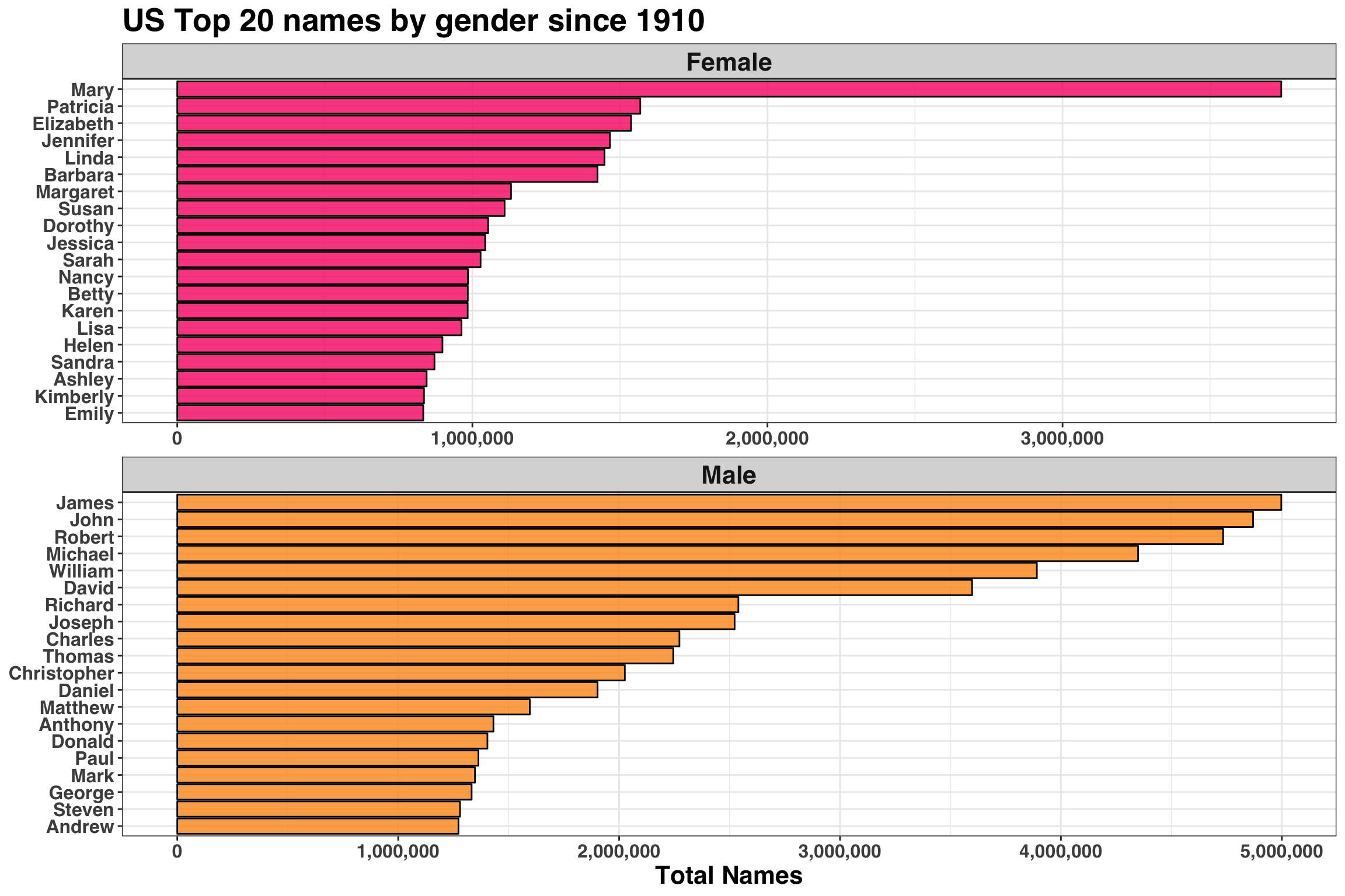
These frequencies seem reasonable! Next, let’s examine how the total count of names has changed across time between 1910 and 2018 to determine if there are any missing or incomplete years.
names_processed %>%
  mutate(year = as.Date(paste(as.character(year), '01', '01', sep = '-'))) %>%
  group_by(year) %>%
  summarise(total = sum(frequency)) %>%
  ggplot(aes(year, total)) +
  geom_line(size = 2) +
  scale_y_continuous(labels = scales::comma_format()) +
  scale_x_date(date_breaks = "10 year", date_labels = '%Y') +
  my_plot_theme() +
  labs(x = 'Year',
       y = 'Total Births',
       title = 'Total US Births by Year',
       subtitle = 'Total based only on names appearing > 5 times per state per year'
) 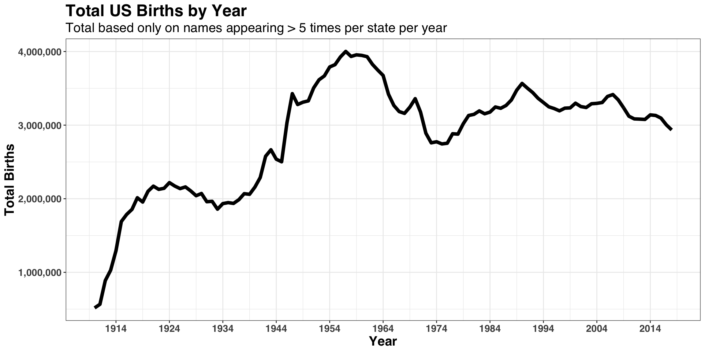
The overall trend here also checks out as well, with the baby-boom occurring between 1946 to 1964 and a steady decline in births rates since the early 1990s.
Now that we’ve done some quick validation, let’s tackle our first question: Which names over-index within each state? To address this question, we’ll compare the proportion of names occupied by a single name within a state relative to how frequently the name occurs across all 50 states. We’ll also focus only on the past 10 years to capture recent name trends. Note that the technique implemented below was adapted from the excellent Tidy Tuesday Screen cast series found here.
# count of names by state since 2008
name_state_counts <- names_processed %>%
  filter(year >= 2008) %>%
  group_by(name, state) %>%
  summarise(n = sum(frequency)) %>%
  ungroup() %>%
  complete(state, name, fill = list(n = 0))

# total births in US
total_names <- sum(name_state_counts$n)

# name count across all states
name_counts <- name_state_counts %>%
  group_by(name) %>%
  summarise(name_total = sum(n))

# birth count by state
state_counts <- name_state_counts %>%
  group_by(state) %>%
  summarise(state_total = sum(n))
Next, we’ll create a ratio that summarizes how much more likely a name is to appear within a state relative to the US as a whole. We’ll put some filters on as well to prevent rare names from overwhelming our analysis.
# Minimum occurrences within a state
cnt_in_state <- 100

# Minimum occurrences across all US
cnt_in_US <- 200

# Calculate name ratio within state relative to within US
all_name_counts <- name_state_counts %>%
  inner_join(name_counts) %>%
  inner_join(state_counts) %>%
  mutate(state_name_full = openintro::abbr2state(state)) %>%
  filter(
    n >= cnt_in_state,
    name_total >= cnt_in_US
  ) %>%
  mutate(
    percent_of_state = n / state_total,
    percent_of_names = name_total / total_names
  ) %>%
  mutate(overrepresented_ratio = percent_of_state / percent_of_names) %>%
  arrange(desc(overrepresented_ratio))
Below we’ll plot the top 10 names by state from a geographically representative sample.
top_n_names <- 10

all_name_counts %>%
  group_by(state_name_full) %>%
  top_n(top_n_names, overrepresented_ratio) %>%
  ungroup() %>%
  filter(state_name_full %in%
    c(
      "Alabama", "New Jersey", "Arkansas",
      "Oregon", "Colorado", "New Mexico",
      "West Virginia", "Hawaii"
    )) %>%
  mutate(name = reorder_within(name, overrepresented_ratio, state_name_full)) %>%
  ggplot(aes(name, overrepresented_ratio, fill = state_name_full)) +
  geom_col(color = "black", alpha = 0.8) +
  coord_flip() +
  scale_x_reordered() +
  facet_wrap(~state_name_full, scales = "free", ncol = 2) +
  scale_fill_manual(values = pal("monokai")) +
  my_plot_theme() +
  labs(
    x = NULL,
    y = "Overrepresentation Ratio"
  ) +
  theme(legend.position = "none")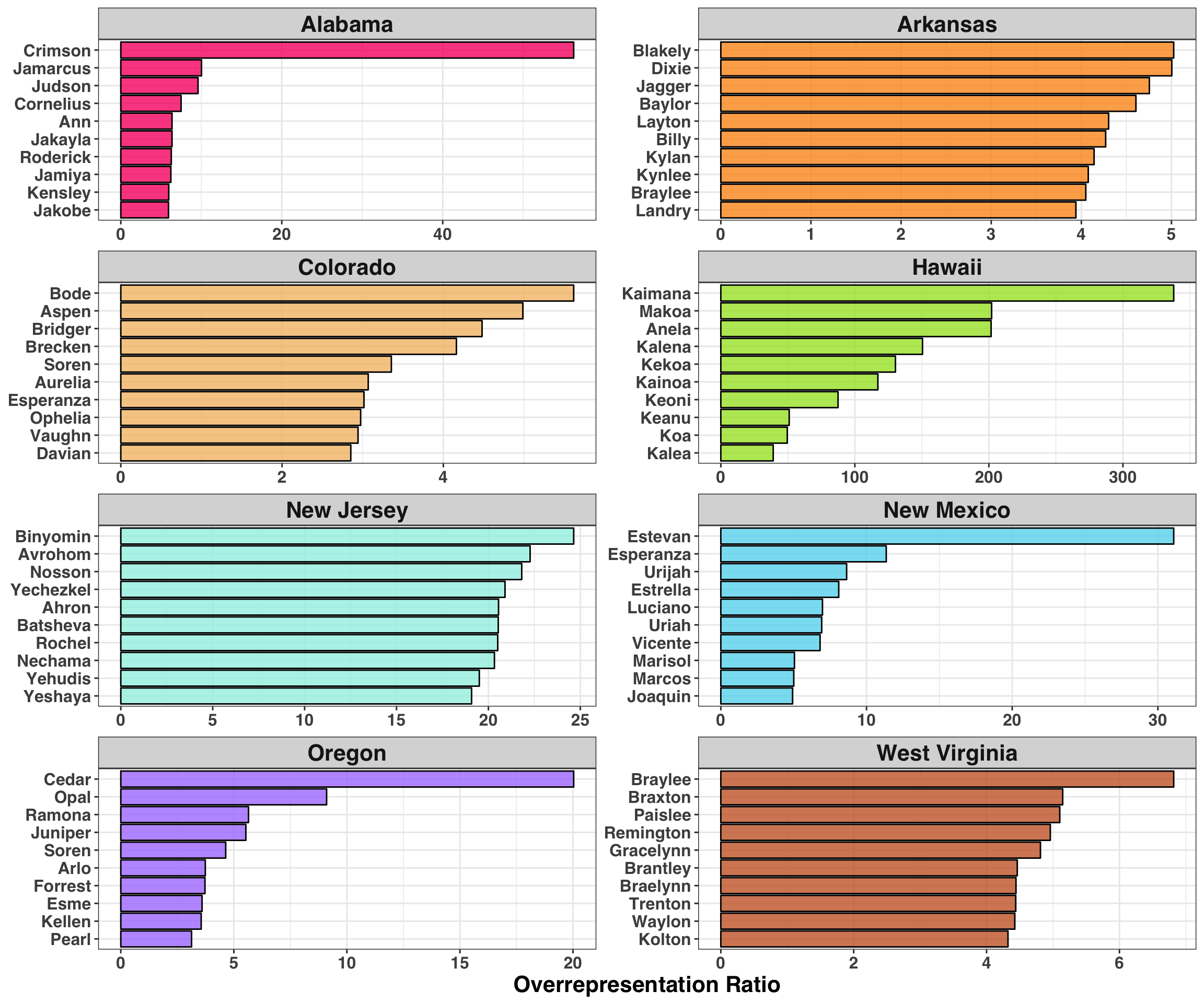
There’s a lot to unpack here, but that fact that ‘Crimson’ over-indexes in Alabama tells me we’re on to something. Let’s briefly summarise our findings for each state separately:
Alabama - Roll Tide.
Arkansas - Future country music stars.
Colorado - Mountain towns (Aspen, Breckenridge) and famous skiers (Bode Miller)
Hawaii - Native Hawaiian names. Note the large magnitude of this ratio, indicating that these names are found exclusively in Hawaii.
New Jersey - Large Jewish population.
New Mexico - Large Hispanic population.
Oregon - Nature.
West Virginia - Preferred gun brands (Remington, Kolton).
It’s interesting to see how cultures unique to each state come through in people’s names. Are you a big fan of the University of Alabama’s Football team? Name your kid Crimson. Are you a firearm’s enthusiast? Remington has a nice ring to it. Do you enjoy long hikes in the woods? Forrest is a great name. This finding indicates that (unsurprisingly) geography plays a significant role in determining naming conventions within a state, and that people leverage the cultural norms from within their state when deciding on a name.
Diversity of Names
In the previous section, we established that one’s state of birth influences naming conventions (still trying to figure out if this is a good or bad thing…). Let’s continue with this theme and initially consider how ‘Name Diversity’ varies between states, which we’ll define by comparing the proportion of all names represented by the top 100 most popular names in each state. For example, the figure below shows the cumulative percentage of all names captured by the top 10 names in Oregon relative to Vermont.
names_diversity_sample <- name_state_counts %>%
  filter(state %in% c('OR', 'VT')) %>%
  group_by(state) %>%
  arrange(desc(n)) %>%
  mutate(total = sum(n),
         cumulative_sum = cumsum(n),
         pct_of_names = cumulative_sum / total,
         total_names = 1:n()
         ) %>%
  slice(1:10) %>%
ungroup()| state | name | n | total | cumulative_sum | pct_of_names | total_names |
|---|---|---|---|---|---|---|
| OR | Emma | 2549 | 366114 | 2549 | 0.0069623 | 1 |
| OR | Olivia | 2452 | 366114 | 5001 | 0.0136597 | 2 |
| OR | Sophia | 2210 | 366114 | 7211 | 0.0196961 | 3 |
| OR | Liam | 2155 | 366114 | 9366 | 0.0255822 | 4 |
| OR | Benjamin | 1999 | 366114 | 11365 | 0.0310422 | 5 |
| OR | William | 1986 | 366114 | 13351 | 0.0364668 | 6 |
| OR | Logan | 1978 | 366114 | 15329 | 0.0418695 | 7 |
| OR | Noah | 1947 | 366114 | 17276 | 0.0471875 | 8 |
| OR | Alexander | 1944 | 366114 | 19220 | 0.0524973 | 9 |
| OR | Henry | 1895 | 366114 | 21115 | 0.0576733 | 10 |
| VT | Emma | 378 | 32623 | 378 | 0.0115869 | 1 |
| VT | Liam | 374 | 32623 | 752 | 0.0230512 | 2 |
| VT | Owen | 372 | 32623 | 1124 | 0.0344542 | 3 |
| VT | Mason | 357 | 32623 | 1481 | 0.0453974 | 4 |
| VT | Olivia | 354 | 32623 | 1835 | 0.0562487 | 5 |
| VT | Noah | 332 | 32623 | 2167 | 0.0664255 | 6 |
| VT | Sophia | 331 | 32623 | 2498 | 0.0765717 | 7 |
| VT | William | 323 | 32623 | 2821 | 0.0864727 | 8 |
| VT | Wyatt | 320 | 32623 | 3141 | 0.0962818 | 9 |
| VT | Ava | 317 | 32623 | 3458 | 0.1059988 | 10 |
When comparing the pct_of_namesbetween states, we see that approximately 5% of all names are represented by the top 10 in Oregon while 10% of all names are represented in Vermont. This means that fewer names occupy a greater proportion of names in Vermont relative to Oregon. Therefore, Vermont has less Name Diversity than Oregon. What does this relationship look like when expanding our search to the top 100 names across all lower 48 states?
top_n_names <- 100

# Create Name Diversity metric
names_diversity_lower_48 <- name_state_counts %>%
  group_by(state) %>%
  arrange(state, desc(n)) %>%
  mutate(
    name_index = row_number(),
    cumulative_sum = cumsum(n),
    pct_of_names = cumulative_sum / sum(n)
  ) %>%
  ungroup() %>%
  filter(name_index == top_n_names) %>%
  select(state, pct_of_names) %>%
  mutate(state_name_full = openintro::abbr2state(state))

# Join % of names accounted for by top 100 to map data
us_map <- map_data("state") %>%
  as_tibble() %>%
  mutate(state_name_full = str_to_title(region)) %>%
  inner_join(names_diversity_lower_48, by = "state_name_full")

# Plot relationship by state
us_map %>%
  ggplot(aes(long, lat)) +
  geom_polygon(aes(group = group, fill = pct_of_names), color = "white") +
  theme_map() +
  coord_map() +
  my_plot_theme() +
  scale_fill_viridis_c(labels = scales::percent) +
  labs(fill = "Percent of names in Top 100",
       title = 'Name Diversity by State',
       subtitle = 'Higher percentages indicate less diversity in names'
       ) +
  theme(legend.text=element_text(size=14),
        legend.title = element_blank(),
        legend.position = 'top'
        )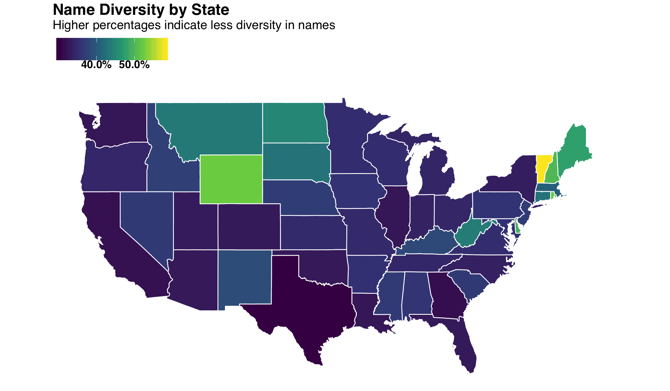
West Coast and Southeastern states tend to have greater name diversity (i.e., a lower % of names are represented in the top 100) while the North East has less diversity. This begs the question: What type of diversity correlates with our Name Diversity index? A recent study ranked states along six dimensions of diversity, such as Cultural, Economic, Household, Religious and Political. Let’s bring these rankings in and join them with our newly created diversity index.
url <- "https://wallethub.com/edu/most-least-diverse-states-in-america/38262/"

diversity_rank <- read_html(url) %>%
  html_nodes("table") %>%
  .[1] %>%
  html_table(fill = TRUE) %>%
  data.frame() %>%
  clean_names()

names(diversity_rank) <- purrr::map_chr(names(diversity_rank),
                                        function(x) str_replace(x, "x_", "")
                                        )

diversity_tidy <- diversity_rank %>%
  select(state, ends_with("_rank")) %>%
  gather(diversity_metric, rank, -state) %>%
  mutate(diversity_metric = str_to_title(str_replace(
                                         str_replace(diversity_metric,"_rank","")
                                                                     ,"_", " "
                                                    )
                                         )
         ) %>%
  inner_join(names_diversity_lower_48, by = c("state" = "state_name_full"))
We’ll plot the relationship between Name Diversity and the six aforementioned dimensions.
diversity_tidy %>%
  ggplot(aes(rank, pct_of_names, label = state)) +
  geom_point() +
  stat_smooth() +
  facet_wrap(~diversity_metric, scales = "free", ncol = 2) +
  scale_y_percent() +
  my_plot_theme() +
  labs(
    x = "State Rank (1 = Most Diverse, 50 = Least Diverse)",
    y = "Percent of names in Top 100"
  )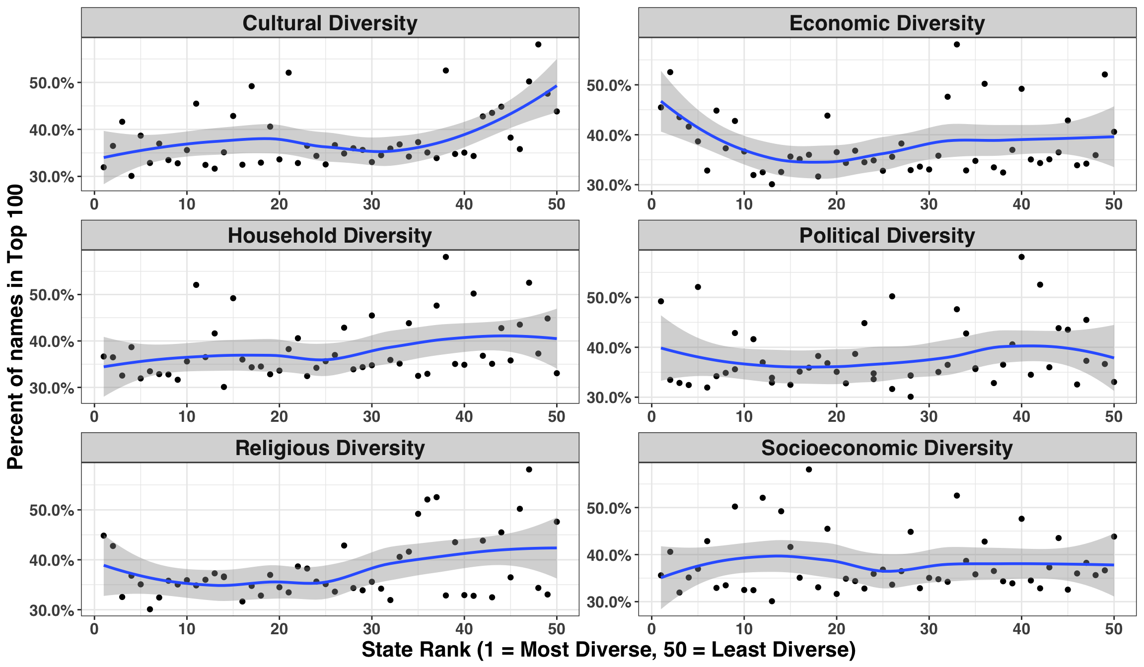
There might be a positive relationship between Cultural and Household diversity relative to Name Diversity, such that states with lower Cultural Diversity also have lower Name Diversity. Some formal hypothesis testing can be useful when we don’t have a strong prior hypothesis. However, we’ll need to be careful when considering the strength of evidence, given that we are testing six separate hypotheses. To do so, we’ll adjust each p-value based on the FDR or False Discovery Rate. Additionally, we’ll use Spearman’s correlation coefficient in lieu of the more popular Pearson’s because we have no reason to believe that our relationships are linear. We can relax this assumption and simply state that the relationship is monotonically increasing/decreasing.
cor_tidy <- diversity_tidy %>%
  select(-state.y, -state) %>%
  nest(-diversity_metric) %>%
  mutate(
    test = purrr::map(data, ~ cor.test(.x$rank, .x$pct_of_names, method = "spearman")),
    tidied = purrr::map(test, tidy)
  ) %>%
  unnest(tidied, .drop = TRUE) %>%
  clean_names() %>%
  mutate(corrected_p_value = p.adjust(p_value, method = "fdr")) %>%
  arrange(corrected_p_value) %>%
select(diversity_metric, estimate, p_value, corrected_p_value)| diversity_metric | estimate | p_value | corrected_p_value |
|---|---|---|---|
| Cultural Diversity | 0.4031212 | 0.0039494 | 0.0236961 |
| Household Diversity | 0.3328771 | 0.0181736 | 0.0545207 |
| Religious Diversity | 0.2055271 | 0.1521794 | 0.2282690 |
| Political Diversity | 0.2179155 | 0.1284464 | 0.2282690 |
| Socioeconomic Diversity | 0.1078031 | 0.4549937 | 0.5459924 |
| Economic Diversity | -0.0403842 | 0.7801327 | 0.7801327 |
After adjusting for multiple hypothesis tests, the only statistically significant relationship emerges from Cultural Diversity. This intuitively makes sense, as states with a greater blend of cultures will likely bring their own unique naming traditions. Let’s see how all of the states stack up against one another on this metric.
diversity_tidy %>%
  filter(diversity_metric == "Cultural Diversity") %>%
  ggplot(aes(rank, pct_of_names, label = state)) +
  geom_smooth(span = 3, alpha = 0.5) +
  geom_point() +
  geom_label_repel() +
  scale_y_percent() +
  my_plot_theme() +
  labs(
    x = "Cultural Diversity (1 = Most Diverse, 50 = Least Diverse)",
    y = "Name Diversity (Lower = More diverse)",
    title = 'States with Higher Cultural Diversity have a Greater Variety of Names'
  )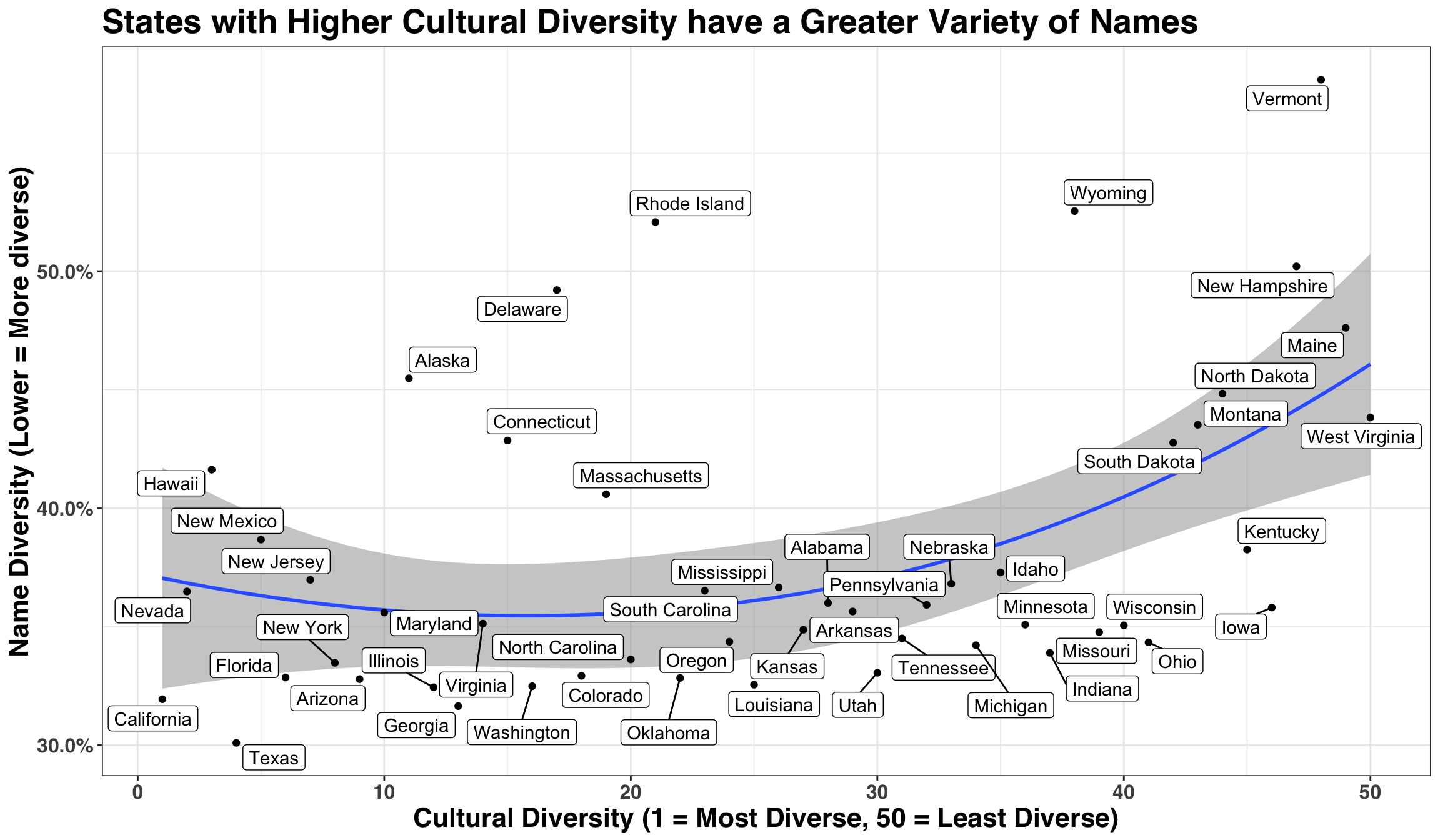
We see that cultural diversity relates to the breadth of names represented in each state, a relationship that is particularly pronounced amongst states with lower Cultural Diversity. Thus, if you live in a state with low Cultural Diversity and give your child a popular name, there’s a good chance they’ll be referred to as “Oliver #2”, “Emma C”, or “Other James” during grade school.
Trendy Names
In this section, we’ll focus on my current state of residence – Oregon – and explore which names have trended the most over the past two decades and where we expect the popularity of these names to go over the next decade. Let’s start with a little data cleaning.
# only consider names that appear at least 300 times
frequency_limit <- 300

start_year <- 2000

# arrange each name by year and count number of occurrences
oregon_names <- names_processed %>%
  as_tibble() %>%
  filter(
    state == "OR",
    year >= start_year
  ) %>%
  group_by(year, name) %>%
  summarise(frequency = sum(frequency)) %>%
  ungroup() %>%
  complete(year, name, fill = list(frequency = 0)) %>%
  group_by(name) %>%
  mutate(total_freq = sum(frequency)) %>%
  ungroup() %>%
  filter(total_freq >= frequency_limit) %>%
  select(-total_freq) %>%
  group_by(name) %>%
  arrange(name, year)
Below we’re going to use a simple (yet powerful) approach for trend detection via the mk.test (Mann-Kendall Test) function, which determines if a series follows a monotonic trend. Below we’ll apply this test to each name, order by the size of the resulting test statistic, and then select the top 25 largest test statistics. This will provide us with the ‘trendiest’ names since 2000.
# Identify trendiest names based on top 25 largest test statistics
trendy_names <- oregon_names %>%
  nest(-name) %>%
  mutate(
    model = purrr::map(data, ~ mk.test(.$frequency)),
    tidied = purrr::map(model, tidy)
  ) %>%
  unnest(tidied, .drop = TRUE) %>%
  arrange(desc(statistic)) %>%
  clean_names() %>%
  select(name:p_value) %>%
head(25)| name | statistic | p_value |
|---|---|---|
| Oliver | 5.776155 | 0e+00 |
| Hazel | 5.534499 | 0e+00 |
| Luna | 5.520964 | 0e+00 |
| Hudson | 5.473403 | 0e+00 |
| Leo | 5.464442 | 0e+00 |
| Nora | 5.457749 | 0e+00 |
| Mila | 5.450403 | 1e-07 |
| Harper | 5.416584 | 1e-07 |
| Penelope | 5.416584 | 1e-07 |
| Sawyer | 5.394385 | 1e-07 |
A quick cross-reference with some popular naming sites indicates that these names are popular both in Oregon as well as the remainder of the US. Let’s make some predictions (because you can’t have a blog post on data without trying to predict something!) for the next 10 years. As a technical aside, if your job consists of making many forecasts across different categories, the workflow below is a big time-saver and improves the readability of your source code.
# Set forecasting horizon
time_horizon <- 10

# Create a separate forecast for each name based on 18 years of history
name_forecast <- oregon_names %>%
  filter(name %in% trendy_names$name) %>%
  mutate(year = as.Date("0001-01-1") + years(year - 1)) %>%
  nest(-name) %>%
  mutate(
    ts = purrr::map(data, tk_ts, start = start_year, freq = 1),
    model = purrr::map(ts, ets),
    fcast = purrr::map(model, forecast, h = time_horizon)
  )
Let’s visualize both the historical time series as well as our 10-year ahead forecast.
name_forecast %>%
  unnest(purrr::map(fcast, sw_sweep)) %>%
  clean_names() %>%
  mutate(lo_80 = ifelse(lo_80 < 0, 0, lo_80)) %>%
  ggplot(aes(index, frequency, color = key)) +
  geom_line() +
  geom_ribbon(aes(ymin = lo_80, ymax = hi_80), alpha = .5) +
  facet_wrap(~name, scales = "free_y") +
  expand_limits(0) +
  scale_color_manual(values = pal("monokai")[c(1, 3)]) +
  my_plot_theme() +
  labs(
    x = "Year",
    y = "Total Names",
    title = "Trendiest Name in Oregon over the Past 20 Years",
    subtitle = "Forecast for 10 Year Period. Shaded region represents 80% prediction interval."
  ) +
  theme(legend.position = 'none')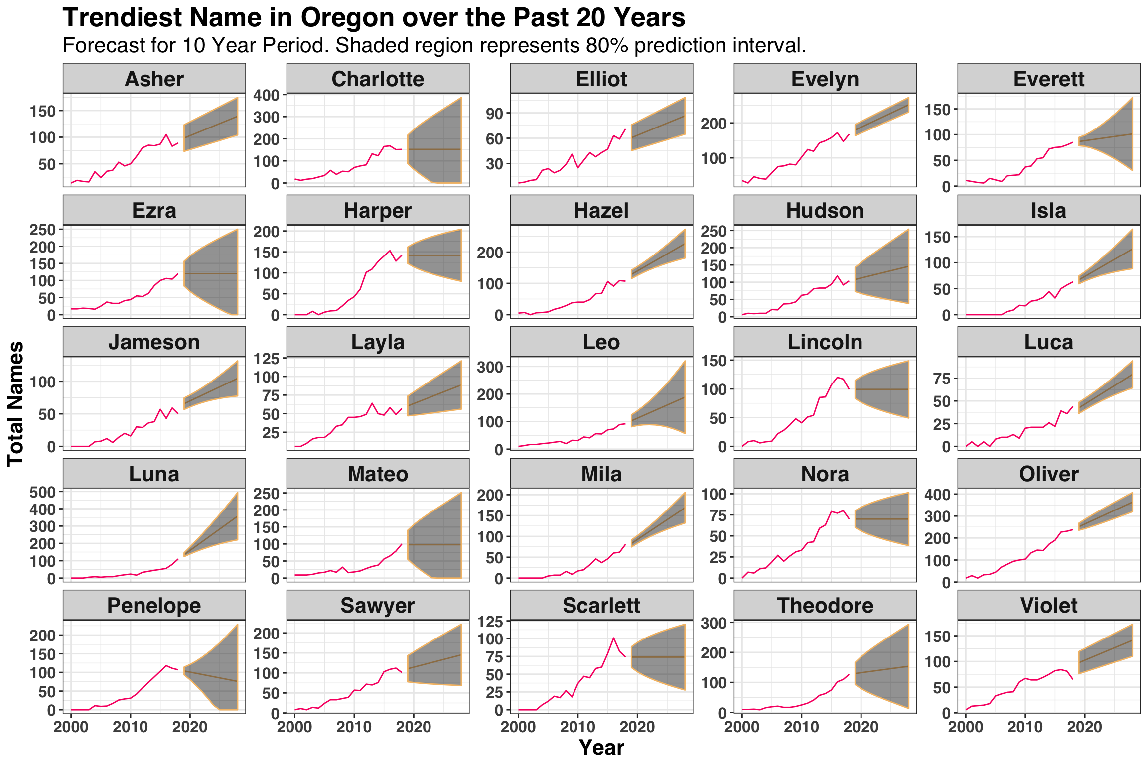
There’s about to be a lot more Luna’s, Mila’s, Oliver’s, Asher’s and Jameson’s in Oregon over the next decade, whereas the popularity of Harper and Penelope are either flat or heading downward. This could be helpful depending on if you wanted your child to be cool and trendy from day-1 😄. However, the intervals on the majority of these forecasts are fairly wide, indicating that naming trends are not an easy thing to predict!
Parting Thoughts
While this post only scratches the surface in terms of understanding how names come-to-be in America, it reveals the extent to which parents rely on cues from their surroundings and cognitive shortcuts when naming their children. Whether it’s a favorite football team, a family name that’s been passed down through generations, a ski town with great powder, or that cool tree in the backyard, our immediate environments play a central role in the naming process. It also highlights the pivotal role that cultural diversity plays in determining the breadth of names by geographical location, as well as how unpredictable naming trends can be into the near future.
Hopefully you enjoyed the post and, if faced with naming a child any time soon, can leverage some of the techniques outlined here to come up with an awesome name!