A Simple Forecasting Scenario
Imagine the following scenario: You’ve been asked to generate a 12-month ahead forecast to facilitate the planning of resources (e.g., labor, production capacity, marketing budget, etc.) based on the total number of units your company sells each month. The current forecasting process leverages a basic moving average to anticipate monthly sales. You believe there is more signal in the historical sales patterns that the current approach is not using and would like to prove out a new approach. You’re also interested in quantifying the lift or value-add of overhauling the existing forecasting process. Accordingly, before implementing an improved version of the existing process, you must first address the following:
Identify the method (or methods) that achieve the best forecasting performance.
Quantify the performance boost of the new method relative to the existing method, a process often referred to as “backtesting”.
We’ll cover each step by using a simple example. Let’s get started by loading the data from the 🎋 the codeforest repo 🎄 as well as few helper functions to make our analysis easier.
# Core package
library(tidyverse)
library(rlang)
library(janitor)

# Date manipulation
library(lubridate)

# Bootstrapping and time series cross validation
library(rsample)

# Forecasting
library(forecast)
library(prophet)
library(tidyquant)
library(timetk)
library(sweep)

# Holiday dates
library(timeDate)

# Parallel computation
library(furrr)

# Calculating standard error
library(plotrix)

# Table formatting for Markdown
library(kableExtra)

# Visualization of seperate time series components
library(ggforce)

# Global plot theme
theme_set(theme_bw())
# Code Forest repo
repo <- 'https://raw.githubusercontent.com/thecodeforest/time-series-cv-post/master/'
# Helper functions for manipulating forecasting results
source(file.path(repo, '/helper-functions/tsCVHelpers.R'))
# Helper function for visualization
source(file.path(repo, '/helper-functions/vizTheme.R'))
# Monthly sales data
sales_df <- read_csv(file.path(repo, 'data/beverage_sales.csv')) | date | sales |
|---|---|
| 1992-01-01 | 3459 |
| 1992-02-01 | 3458 |
| 1992-03-01 | 4002 |
| 1992-04-01 | 4564 |
| 1992-05-01 | 4221 |
| 1992-06-01 | 4529 |
| 1992-07-01 | 4466 |
| 1992-08-01 | 4137 |
| 1992-09-01 | 4126 |
| 1992-10-01 | 4259 |
Next, we’ll visualize the training and validation sections of our data. The first 22 years will serve as our training portion, and then we’ll hold out the remaining 4 years to test against.
# Number of years in dataset
n_yrs <- unique(year(sales_df$date))

sales_df %>%
  mutate(part = ifelse(year(date) <= n_yrs[22],"Train","Valid")) %>%
  ggplot(aes(date, sales, color = part)) +
  geom_point(alpha = 0.2) +
  geom_line() +
  my_plot_theme() +
  scale_y_continuous(labels = scales::comma_format()) +
  labs(
    x = "Date (Month)",
    y = "Units Sold",
    title = str_glue("Unit Sales Across {length(n_yrs)} Years")
  )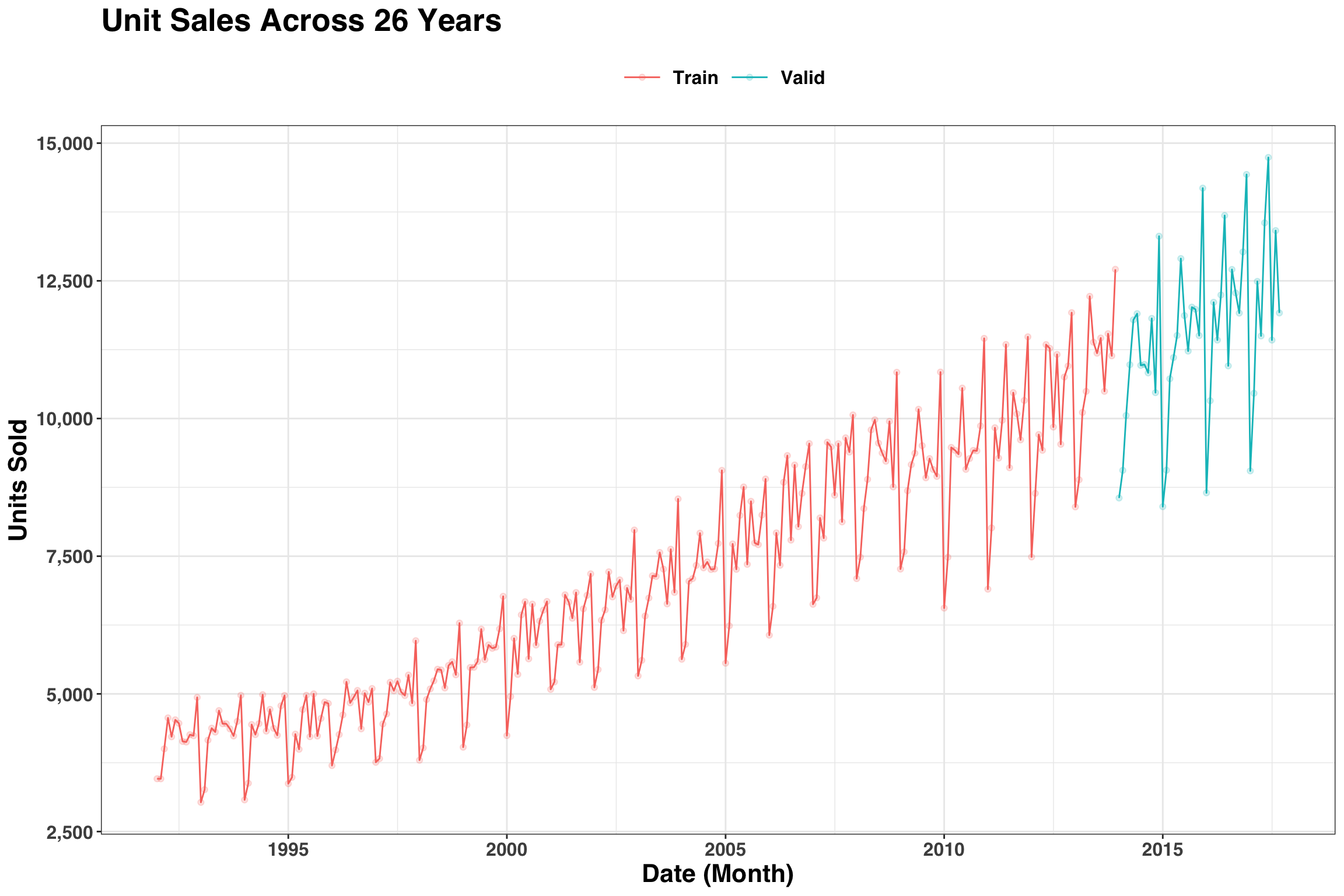
One thing we notice is that the variance of our time series is not stationary (i.e., the month-over-month variation is not constant across time). A log transformation of monthly sales is one way to address this issue.
sales_df$sales <- log(sales_df$sales)Below we’ll leverage the rolling_origin function from the rsample package to create the training/validation splits in our data. This will enable us to test out different forecasting approaches and quantify lift.
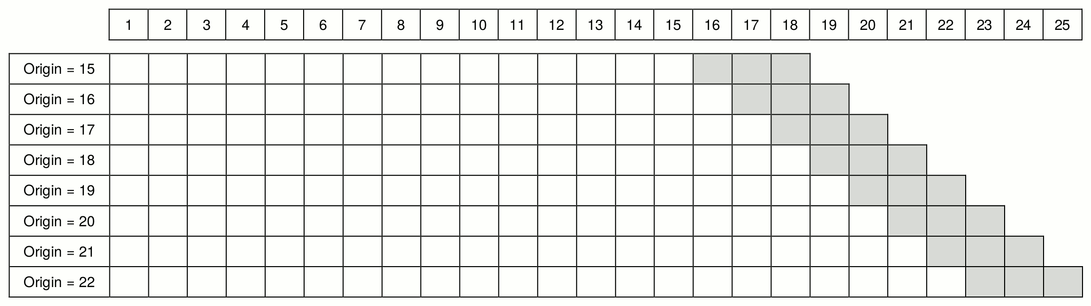
train_valid <- rolling_origin(
  sales_df,
  initial = 12 * 22, # 22 years of history
  assess = 12, # assess 12 month ahead forecast
  cumulative = TRUE #continue to build training set across time
) %>%
  mutate(
    train = map(splits, training), # split training
    valid = map(splits, testing) # split validation
  )
Let’s print out the train_valid object to see what’s going on.
## # Rolling origin forecast resampling
## # A tibble: 34 x 4
##    splits           id      train              valid
##  * <list>           <chr>   <list>             <list>
##  1 <split [264/12]> Slice01 <tibble [264 × 2]> <tibble [12 × 2]>
##  2 <split [265/12]> Slice02 <tibble [265 × 2]> <tibble [12 × 2]>
##  3 <split [266/12]> Slice03 <tibble [266 × 2]> <tibble [12 × 2]>
##  4 <split [267/12]> Slice04 <tibble [267 × 2]> <tibble [12 × 2]>
##  5 <split [268/12]> Slice05 <tibble [268 × 2]> <tibble [12 × 2]>
##  6 <split [269/12]> Slice06 <tibble [269 × 2]> <tibble [12 × 2]>
##  7 <split [270/12]> Slice07 <tibble [270 × 2]> <tibble [12 × 2]>
##  8 <split [271/12]> Slice08 <tibble [271 × 2]> <tibble [12 × 2]>
##  9 <split [272/12]> Slice09 <tibble [272 × 2]> <tibble [12 × 2]>
## 10 <split [273/12]> Slice10 <tibble [273 × 2]> <tibble [12 × 2]>
## # … with 24 more rows
The resulting tibble is 34 rows, indicating that we’ll fit 34 separate models to generate 34 separate forecasts, each with 1 additional month of history to train on. The visual below illustrates the ‘rolling origin’ concept.
Now that we understand how the backtesting will occur, let’s move on to the model-fitting and forecasting bit. Below we’ll test out four approaches: A “naive” method, which represents the current moving-average approach, as well as ETS and ARIMA, two methods that can use more signal in the data to create (hopefully) a better forecast. Lastly, we’ll create a simple ensemble where we average the predictions of ETS and ARIMA. We’ll lean heavily on the map function from the purrr package to keep this series of operations clean and compact.
# Use 7 of 8 cores for parallel processing when fitting arima models
plan(multiprocess, workers = availableCores() - 1)

fcast_results <- train_valid %>%
  mutate(
    ts_obj = map(train, function(x) tk_ts(x, freq = 12)), # convert to ts
    fit_naive = map(ts_obj, ma, order = 12), # fit moving average
    fit_ets = map(ts_obj, ets), # fit ets
    fit_arima = future_map(ts_obj, auto.arima), # fit arima in parallel
    pred_naive = map(fit_naive, forecast, h = 12), # 12 month naive forecast
    pred_ets = map(fit_ets, forecast, h = 12), # 12 month ets forecast
    pred_arima = map(fit_arima, forecast, h = 12) # 12 month arima forecast
  )
Below we’ll unnest our data and put it into a format where we can compare across our models. Additionally, we’ll generate our ensemble forecast by averaging the the ETS and ARIMA predictions. Combining predictions from different models is a simple way to improve predictive power in certain cases.
actuals <- format_actuals(fcast_results, sales)
naive_fcast <- format_fcast(fcast_results, pred_naive, "naive", value)
ets_fcast <- format_fcast(fcast_results, pred_ets, "ets", sales)
arima_fcast <- format_fcast(fcast_results, pred_arima, "arima", sales)
ens_fcast <- ensemble_fcast(ets_fcast, arima_fcast)
Let’s combine the results into a single tibble, convert the actual and forecasted values back to their original units, and calculate the error for each approach.
results_tidy <- bind_rows(
  inner_join(naive_fcast, actuals),
  inner_join(ets_fcast, actuals),
  inner_join(arima_fcast, actuals),
  inner_join(ens_fcast, actuals)
) %>%
  select(id, index, date, method, actual, everything()) %>%
  mutate(
    actual = exp(actual),
    pred = exp(pred),
    lo_80 = exp(lo_80),
    hi_80 = exp(hi_80),
    abs_error = abs(actual - pred)
  )
Results are in, so let’s answer our first question: Which method performed best during backtesting? We’ll quantify forecasting accuracy with the Mean Absolute Error (MAE).
results_tidy %>%
  group_by(method) %>%
  summarise(
    mae = mean(abs_error),
    se = std.error(abs_error)
  ) %>%
  ungroup() %>%
  ggplot(aes(method, mae, color = method)) +
  geom_point(size = 2) +
  geom_errorbar(aes(ymin = mae - se, ymax = mae + se)) +
  coord_flip() +
  theme(legend.position = "none") +
  labs(
    x = "Forecasting Method",
    y = "Mean Absolute Error (+- 1 Standard Error)",
    title = "Cross Validation Forecasting Performance"
  ) +
  my_plot_theme() +
  theme(legend.position = "none")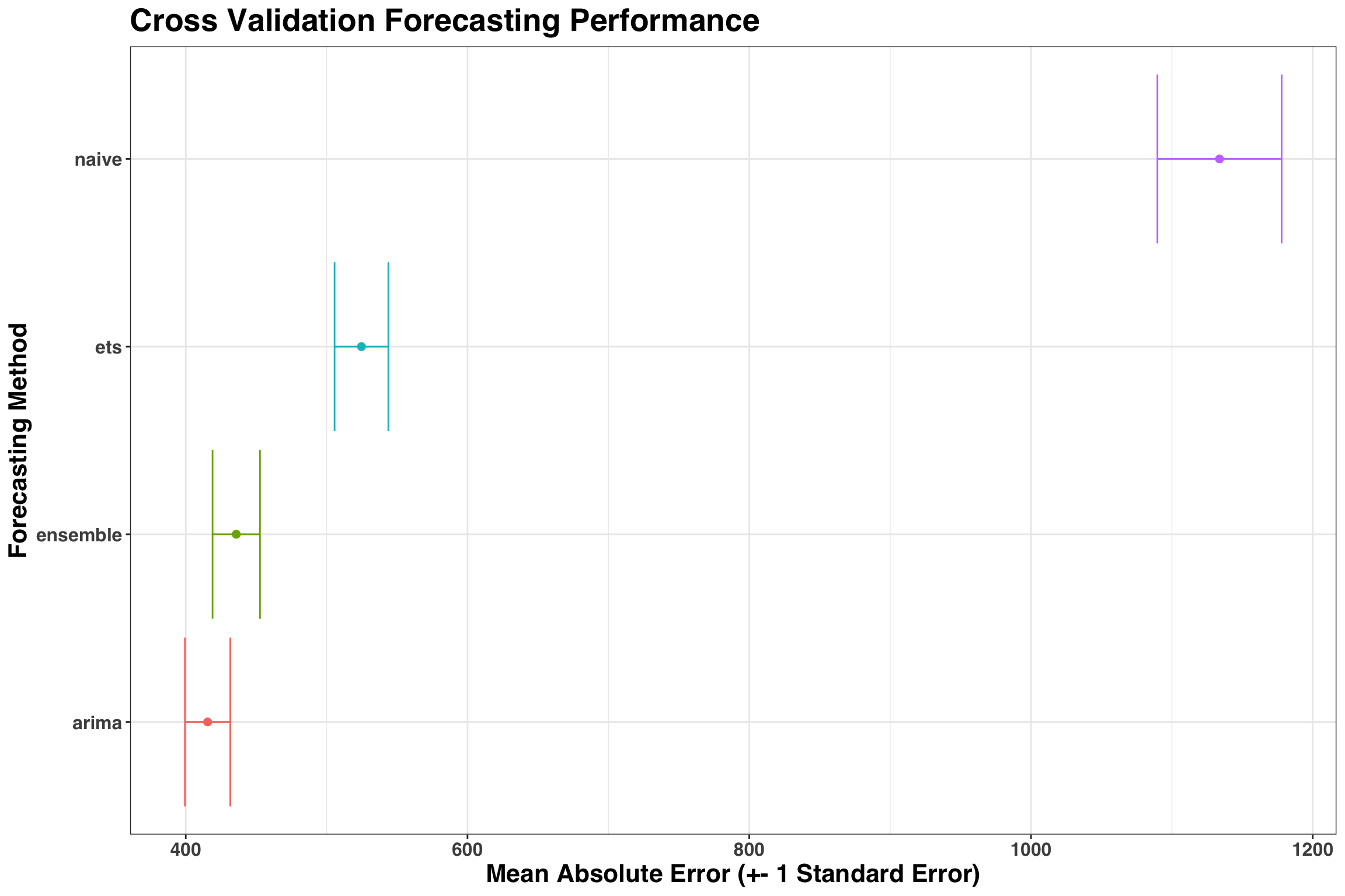
As a rule of thumb, I like to go with the simplest model that is +-1 Standard Error away from the best model. In this case, the ARIMA model both performed better than the Ensemble and is simpler to implement, so that’s the approach we’d choose going forward.
Let’s also extract a few cross-validation slices and compare the forecasted values to the actuals to quickly spot check our model.
results_tidy %>%
  filter(method == 'arima',
         id %in% unique(results_tidy$id)[1:4]
         ) %>%
  select(id, index, actual, pred) %>%
  gather(key, value, -index, -id) %>%
  mutate(key = str_to_title(key)) %>%
  ggplot(aes(index, value, color = key)) +
  geom_point(size = 2, alpha = 0.8) +
  facet_wrap(id ~ .) +
  scale_x_continuous(breaks = 1:12) +
  scale_y_continuous(labels = scales::comma_format()) +
  labs(x = "Forecasting Horizon (Months Ahead)",
       y = 'Value'
       ) +
  my_plot_theme()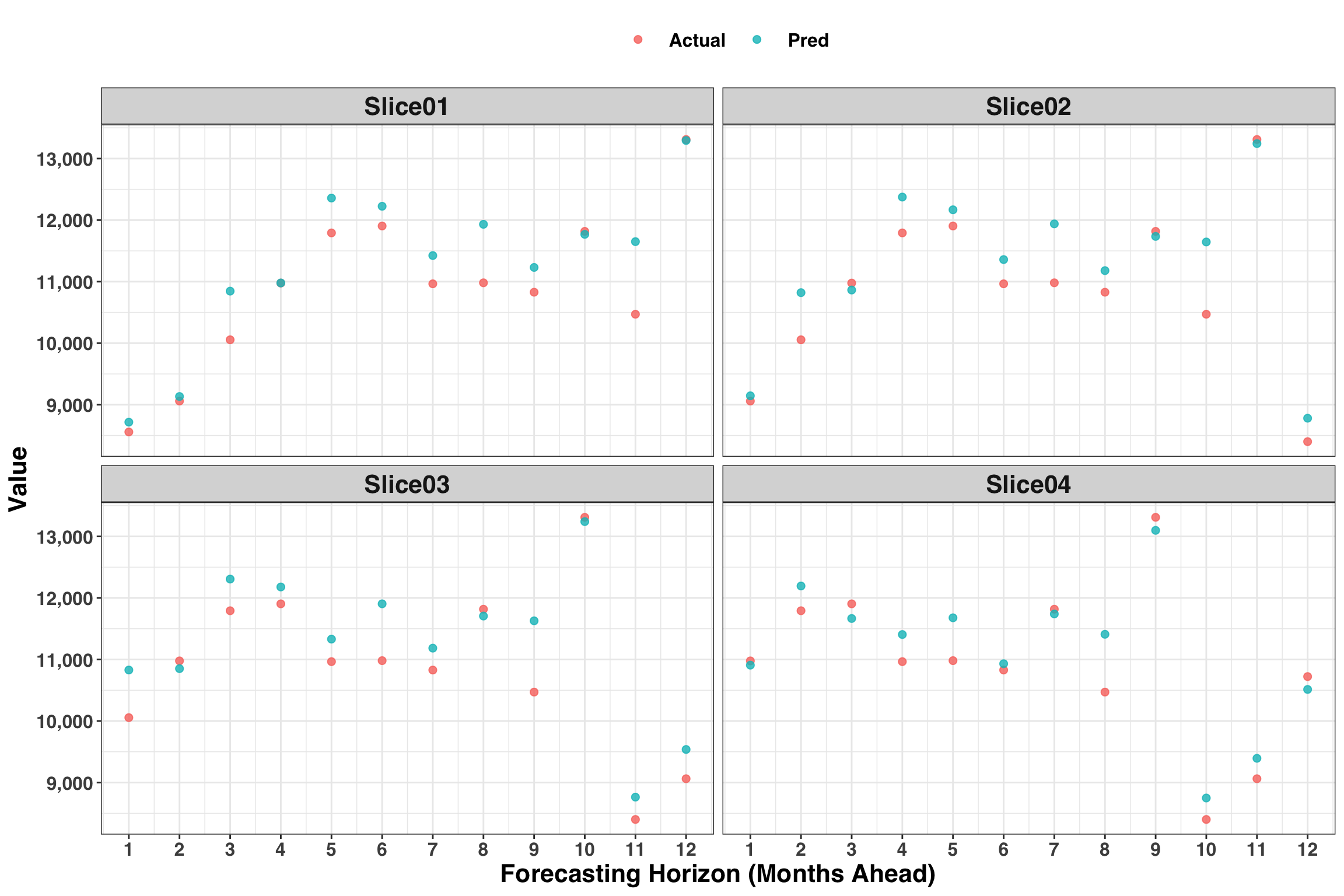
Looks good! While this is a helpful global view, we also want to know how our forecasting performance changes as the forecasting horizon (or the number of periods ahead) increases. Let’s also consider how the MAE varies across the 12 months.
results_tidy %>%
  filter(method == "arima") %>%
  mutate(index = as.factor(index)) %>%
  ggplot(aes(index, abs_error, group = index, color = index)) +
  geom_boxplot() +
  labs(
    x = "Forecasting Horizon (Months Ahead)",
    y = "Absolute Error"
  ) +
  my_plot_theme() +
  theme(legend.position = "none")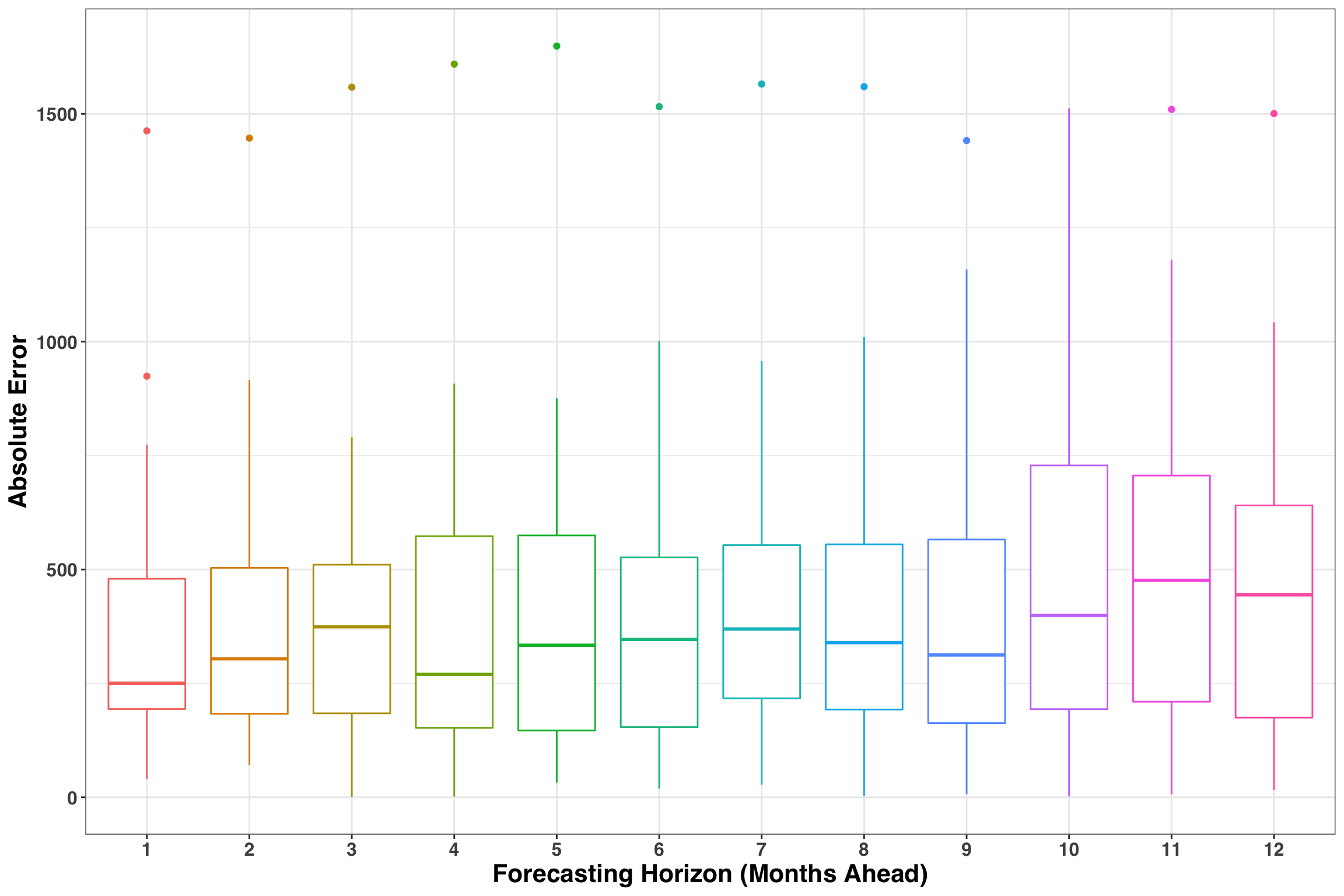
Lastly, we’ll address the issue of “coverage”, which measures how well our prediction intervals (PIs) capture the uncertainty in our forecasts. Given that we are using an 80% PI, then approximately 80% of the time the actual amount should fall within the interval. We can verify this below with a simple plot.
results_tidy %>%
  filter(method == "arima") %>%
  mutate(coverage = ifelse(actual >= lo_80 & actual <= hi_80, 1, 0)) %>%
  group_by(index) %>%
  summarise(prop_coverage = mean(coverage)) %>%
  ggplot(aes(index, prop_coverage)) +
  geom_bar(stat = "identity", color = "black") +
  geom_hline(yintercept = 0.8, lty = 2, size = 3, alpha = 0.5, color = "red") +
  scale_x_continuous(breaks = 1:12) +
  scale_y_continuous(labels = scales::percent) +
  labs(
    x = "Forecasting Horizon (Months Ahead)",
    y = "Coverage"
  ) +
  my_plot_theme()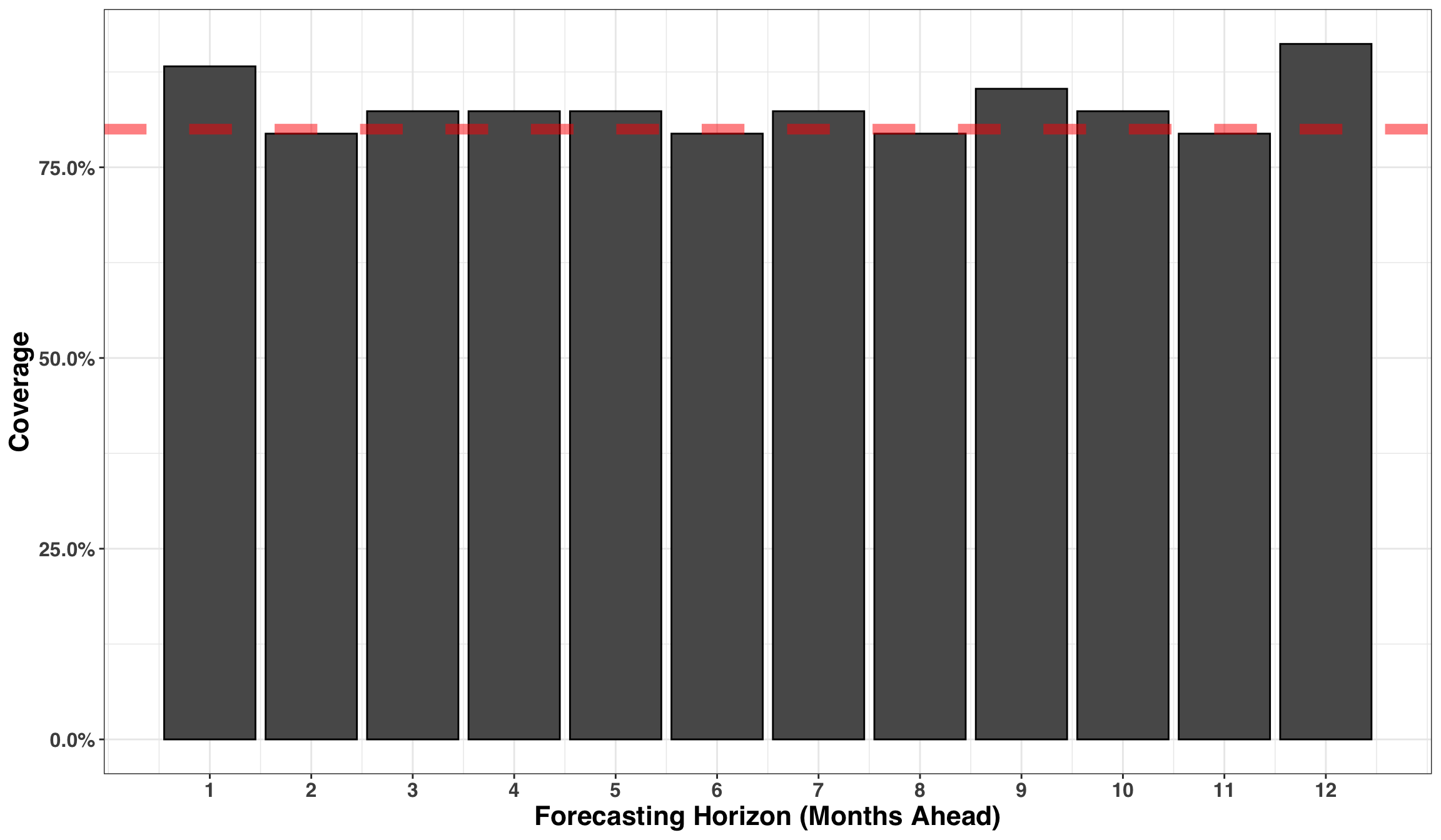
The coverage rate is right where it should be around 80% across all periods, indicating that our prediction intervals are capturing an appropriate amount of uncertainty surrounding our forecast.
So far we’ve identified our forecasting method, measured how accuracy changes over time and assessed our prediction intervals. Lastly, let’s quantify the value-add of using our new method relative to the existing, naive approach. The average error for ARIMA is around 400 units while the naive method is around 1100 units. If we were to shift our planning process to the new method, we could anticipate a 64% reduction in forecasting error across our 12-month time span. Depending on your business, this could translate into big cost-savings/incremental revenue opportunities stemming from an improved ability to plan product inventory, labor, or manufacturing/processing capacity!
A More Realistic Forecasting Scenario
While the previous example illustrated a basic forecasting task, it left out a few design patterns that often emerge in real-world forecasting scenarios. In particular, many decisions are made at a lower granularity than the month (e.g., day, week). Second, leveraging data other than the time series itself (e.g,. external regressors) can greatly improve forecasting accuracy. These inputs might include promotions or holidays that change year-over-year and impact our business, such as Easter, Cyber-Monday, or the Superbowl. Accordingly, we’ll leverage the previously outlined techniques in addition to the prophet package to create more granular forecasts with external regressors. We’ll use a new data set to make these concepts more concrete.
store_sales <- read_csv(file.path(repo, "data/store_sales.csv"))| date | sales |
|---|---|
| 2013-01-01 | 13 |
| 2013-01-02 | 11 |
| 2013-01-03 | 14 |
| 2013-01-04 | 13 |
| 2013-01-05 | 10 |
| 2013-01-06 | 12 |
| 2013-01-07 | 10 |
| 2013-01-08 | 9 |
| 2013-01-09 | 12 |
| 2013-01-10 | 9 |
The format of our data is similar to the previous example except observations occur at the daily level instead of the monthly level. Additionally, we’ll simulate some variability associated with 100 ‘promotional events’ and several major US Holidays. Let’s assume promotional events and holidays lead to an average increase in demand by 45 units and 25 units, respectively. Note that to leverage this information in a forecasting context, we’ll need the dates of promotional events and holidays in the past AND the future. Below we’ll include these shifts in our time series and then visualize the results.
# Set seed for reproducibility
set.seed(2018)

# Sample 100 days to serve as 'promotional events'
promos <- sample(unique(store_sales$date), size = 100)

# Extract dates of major US holidays
holidays <-
  holidayNYSE(year = c(year(min(store_sales$date)):year(max(store_sales$date)))) %>%
  ymd()

# Add 'sales' to simulate effect of promotion on demand
# Rename date and sales fields to be compatible with Prophet API
sales_xreg <- store_sales %>%
  mutate(
    sales = as.numeric(sales),
    sales = case_when(
      date %in% promos ~ sales + rnorm(1, 45, 5),
      date %in% holidays ~ sales + rnorm(1, 25, 5),
      TRUE ~ sales
    ),
    sales = round(sales)
  ) %>%
  rename(
    ds = date,
    y = sales
  )
Next, we’ll create a tibble that contains all holiday and promotional events, which are often referred to as ‘external regressors’ when working with time series data.
# Field names must match below for Prophet API
xreg_df <- tibble(
  ds = c(promos, holidays),
  holiday = c(
    rep("Promo", length(promos)),
    rep("USHoliday", length(holidays))
  )
)
Let’s visualize the resulting data.
left_join(sales_xreg, xreg_df) %>%
  replace_na(list(holiday =  "No event")) %>%
  ggplot(aes(ds, y, color = holiday, group = 1)) +
  geom_point(alpha = 0.5) +
  labs(x = 'Date (Day)',
       y = 'Units Sold'
       ) +
  my_plot_theme()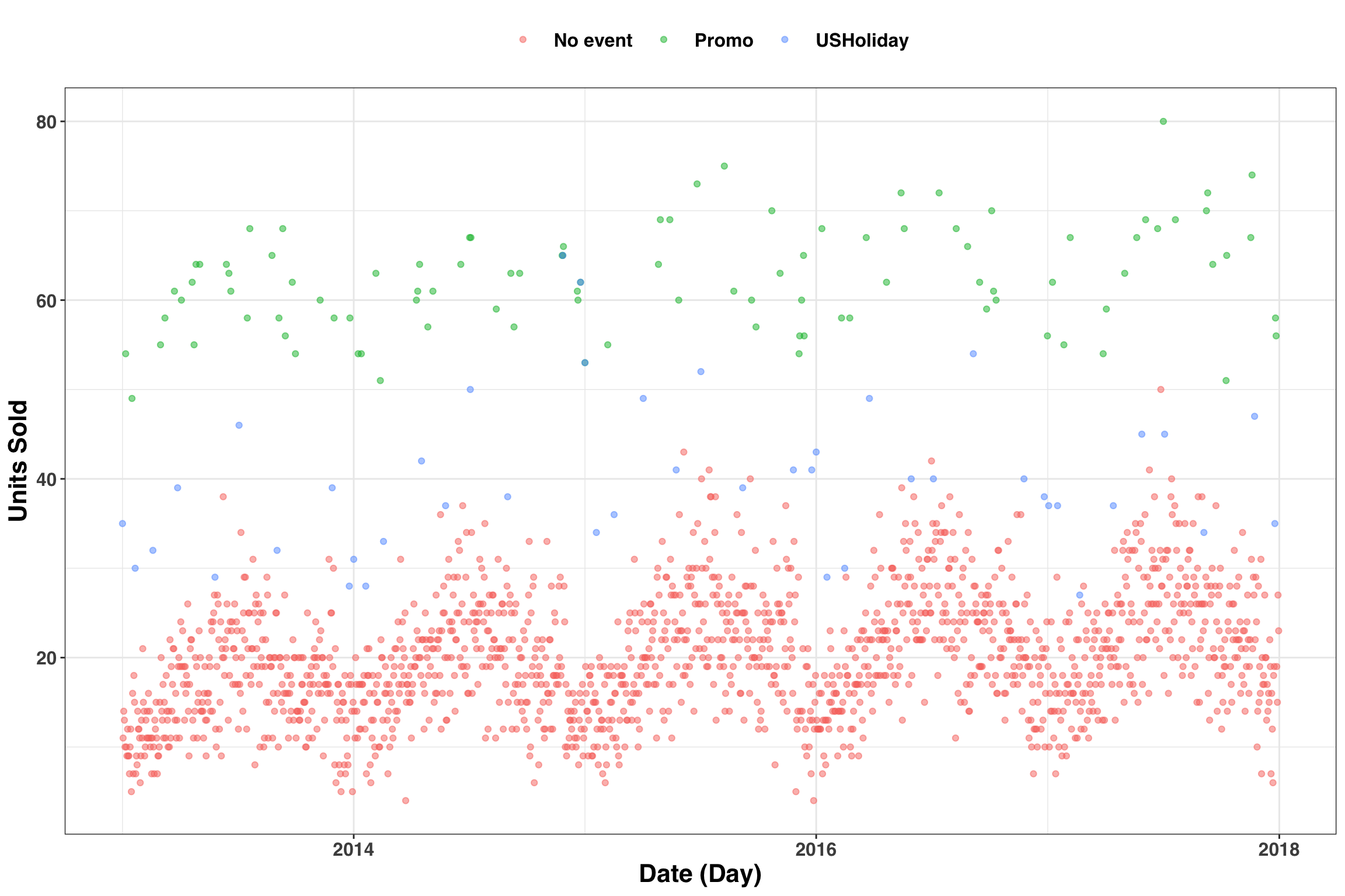
Great! We can see the simulated effects resulting from our promotional events and holidays. Now we need to ensure that xreg_df is available for each slice of our data when running cross-validation. We’ll achieve this in two parts. First, similar to the previous example, we’ll split our data and assess our model with a 90-day-ahead forecast. Here, we’re assuming the planning cycle that our forecast informs occurs at a quarterly level (i.e., 90-day periods).
train_valid <- rolling_origin(
  sales_xreg,
  initial = floor(4.5 * 365), # 4.5 years of training
  assess = 90, # assess based on 90-day ahead forecasts
  cumulative = TRUE # continue to build training set across time
) %>%
  mutate(
    train = map(splits, training), # split training
    valid = map(splits, testing) # split validation
  )

print(train_valid)
## # Rolling origin forecast resampling
## # A tibble: 95 x 4
## splits id train valid
## * <list> <chr> <list> <list>
## 1 <split [1.6K/90]> Slice01 <tibble [1,642 × 2]> <tibble [90 × 2]>
## 2 <split [1.6K/90]> Slice02 <tibble [1,643 × 2]> <tibble [90 × 2]>
## 3 <split [1.6K/90]> Slice03 <tibble [1,644 × 2]> <tibble [90 × 2]>
## 4 <split [1.6K/90]> Slice04 <tibble [1,645 × 2]> <tibble [90 × 2]>
## 5 <split [1.6K/90]> Slice05 <tibble [1,646 × 2]> <tibble [90 × 2]>
## 6 <split [1.6K/90]> Slice06 <tibble [1,647 × 2]> <tibble [90 × 2]>
## 7 <split [1.6K/90]> Slice07 <tibble [1,648 × 2]> <tibble [90 × 2]>
## 8 <split [1.6K/90]> Slice08 <tibble [1,649 × 2]> <tibble [90 × 2]>
## 9 <split [1.6K/90]> Slice09 <tibble [1,650 × 2]> <tibble [90 × 2]>
## 10 <split [1.7K/90]> Slice10 <tibble [1,651 × 2]> <tibble [90 × 2]>
## # … with 85 more rowsThere are 95 rows in total when considering the dimensions of train_valid, each row containing a separate training and validation data slice. Each row also requires xreg_df, which contains the dates of prior and future promotions and holidays. The cool thing is that despite the fact we have all of this data nested within a single tibble, we can still treat it like a regular tibble and use all of the normal dplyr verbs. Accordingly, we’ll replicate xreg_df 95 times and then join by the ID variable for each data slice.
# Replicate and 'nest' each resulting copy of xreg_df
split_ids <-
  map_dfr(1:nrow(train_valid), function(x) xreg_df) %>%
  mutate(id = rep(train_valid$id, each = nrow(xreg_df))) %>%
  group_by(id) %>%
  nest() %>%
  rename(xreg = data)

# Join by the id column
train_valid_xreg <- inner_join(train_valid, split_ids)

print(train_valid_xreg)
## # Rolling origin forecast resampling
## # A tibble: 95 x 5
## splits id train valid xreg
## <list> <chr> <list> <list> <list>
## 1 <split [1.6K/9… Slice01 <tibble [1,642 ×… <tibble [90 ×… <tibble [145 ×…
## 2 <split [1.6K/9… Slice02 <tibble [1,643 ×… <tibble [90 ×… <tibble [145 ×…
## 3 <split [1.6K/9… Slice03 <tibble [1,644 ×… <tibble [90 ×… <tibble [145 ×…
## 4 <split [1.6K/9… Slice04 <tibble [1,645 ×… <tibble [90 ×… <tibble [145 ×…
## 5 <split [1.6K/9… Slice05 <tibble [1,646 ×… <tibble [90 ×… <tibble [145 ×…
## 6 <split [1.6K/9… Slice06 <tibble [1,647 ×… <tibble [90 ×… <tibble [145 ×…
## 7 <split [1.6K/9… Slice07 <tibble [1,648 ×… <tibble [90 ×… <tibble [145 ×…
## 8 <split [1.6K/9… Slice08 <tibble [1,649 ×… <tibble [90 ×… <tibble [145 ×…
## 9 <split [1.6K/9… Slice09 <tibble [1,650 ×… <tibble [90 ×… <tibble [145 ×…
## 10 <split [1.7K/9… Slice10 <tibble [1,651 ×… <tibble [90 ×… <tibble [145 ×…
## # … with 85 more rowsNow we can do some forecasting! Below we’ll generate 95 models and forecasts using the prophet package. We’ll also introduce the map2 function, which enables us to map functions that take two arguments. The step below will take a few minutes to complete.
fcast_results <-
  train_valid_xreg %>%
  mutate(prophet_fit = map2(
    train,
    xreg,
    function(x, y)
      prophet(
        df = x,
        holidays = y,
        growth = "linear",
        yearly.seasonality = "auto",
        weekly.seasonality = "auto"
      )
       ),
    pred_prophet = map2(prophet_fit, valid, predict)
    )
Prophet offers some pretty cool built-in visualization features. Let’s have a look under the hood of one of our forecasts to see how the model is mapping the relationship between our features and output.
prophet_plot_components(
  fcast_results$prophet_fit[[1]],
  fcast_results$pred_prophet[[1]]
  )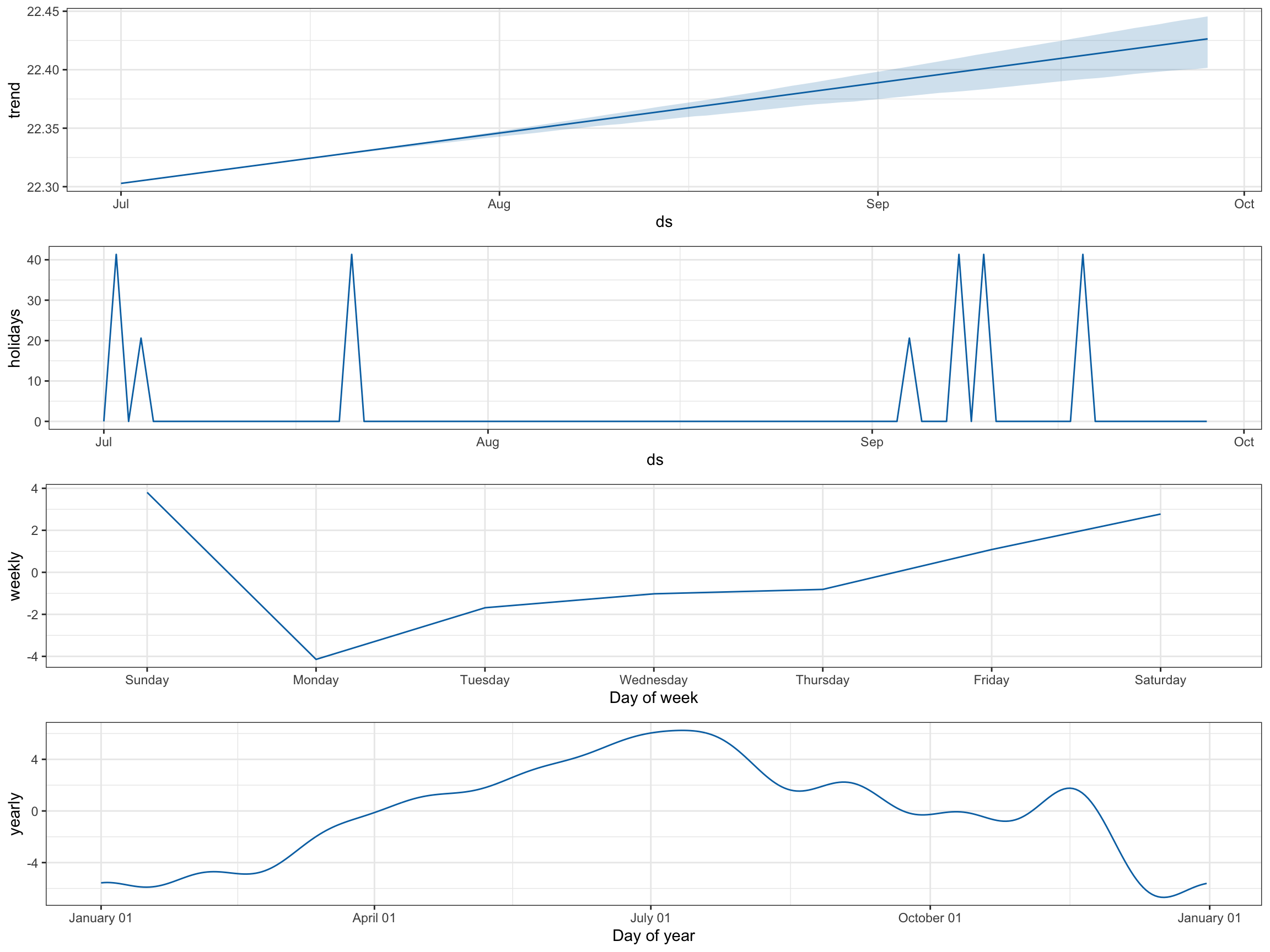
In the holiday’s tab, there are big spikes for our promotions and smaller ones for holidays over the 90-day validation period. We also see how sales change by weekday and time of year. This sort of exploratory data analysis is a great way to confirm that the model is behaving in accordance with your expectations.
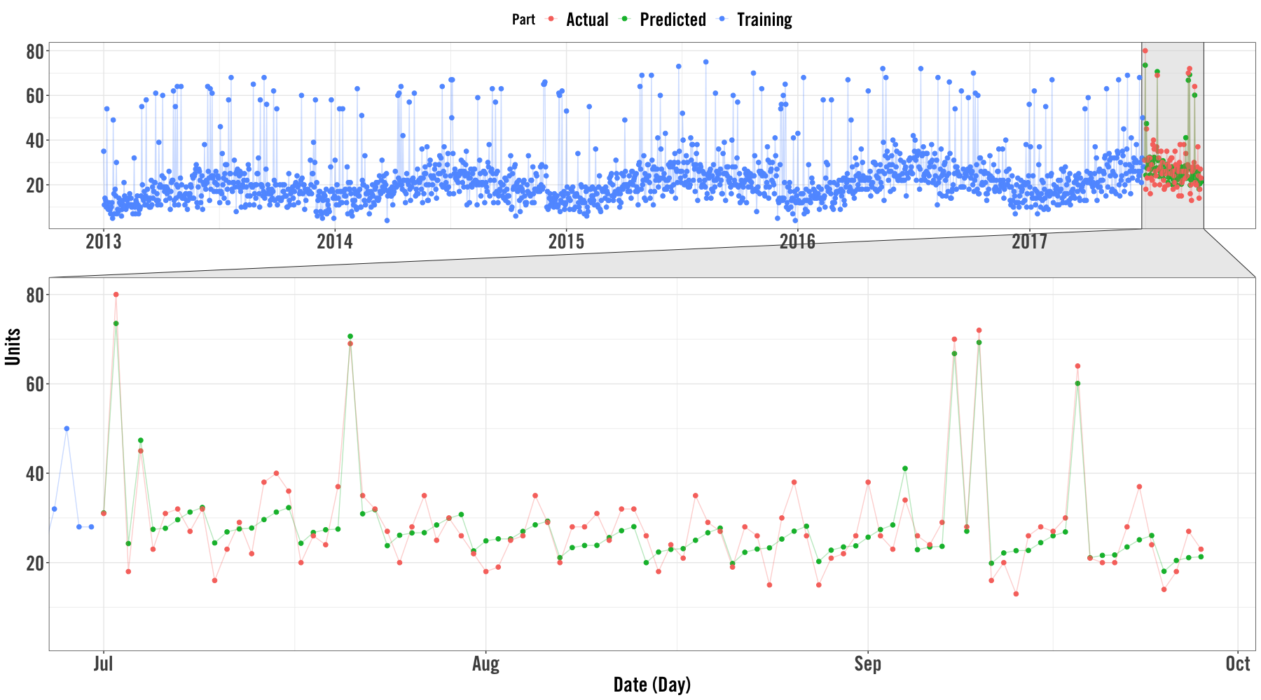
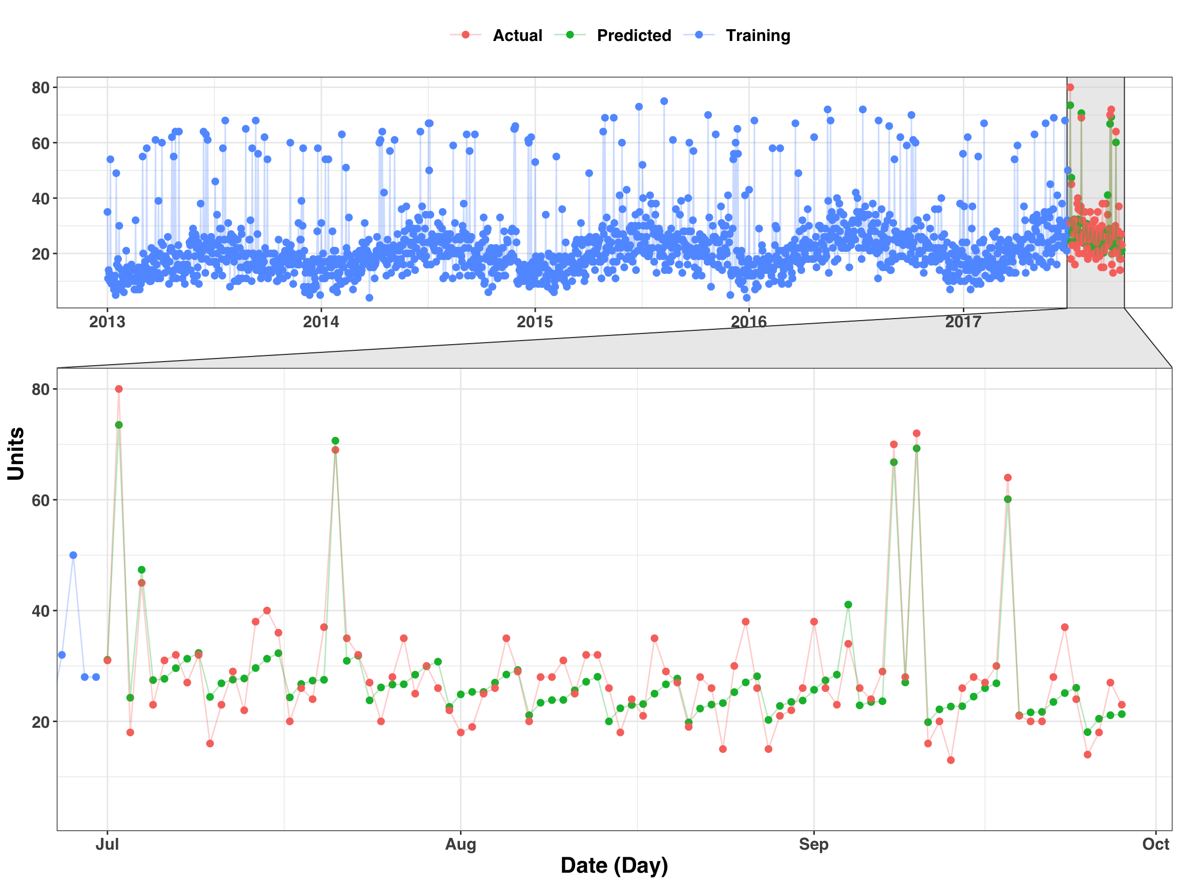
Here’s another way we can visualize the results by extracting the actual and predicted values while also including the training (historical) values as well.
cv_slice = 1

slice_training <-
  fcast_results$train[[cv_slice]] %>%
  mutate(key = "Training") %>%
  rename(value = y)

slice_validation <-
  fcast_results$pred_prophet[[cv_slice]] %>%
  transmute(
    ds = ymd(ds),
    predicted = yhat,
    actual = fcast_results$valid[[cv_slice]]$y
  ) %>%
  gather(key, value, -ds) %>%
  mutate(key = str_to_title(key))
bind_rows(
slice_training,
slice_validation
) %>%
ggplot(aes(ds, value, color = key)) +
geom_point(size = 2) +
geom_line(alpha = 0.3) +
my_plot_theme() +
facet_zoom(x = ds %in% tail(slice_validation$ds, 90)) +
labs(
x = "Date (Day)",
y = "Units",
color = "Part"
)
Finally, let’s assess the accuracy of our 90-day-ahead forecasts. There are a lot more steps we’d typically implement to check the health of our forecasts, but we’ll keep it simple and examine the error distribution of forecasts across time.
results_tidy <- fcast_results %>%
  select(id, pred_prophet) %>%
  unnest() %>%
  mutate(ds = ymd(ds)) %>%
  inner_join(sales_xreg) %>%
  select(id, ds, yhat, y) %>%
  mutate(error = y - yhat) %>%
  group_by(id) %>%
  mutate(index = row_number()) %>%
  ungroup()
results_tidy %>%
group_by(index) %>%
summarise(q50 = median(error),
q05 = quantile(error, .05),
q95 = quantile(error, .95)
) %>%
ggplot(aes(index, q50)) +
geom_point(size = 2, color = 'red') +
geom_errorbar(aes(ymin = q05, ymax = q95), alpha = 0.5) +
labs(x = 'Forecasting Horizon (Days)',
y = 'Error (Bars represent 5th/95th percentiles)'
) +
my_plot_theme() +
scale_y_continuous(breaks = seq(-10, 10, by = 2.5))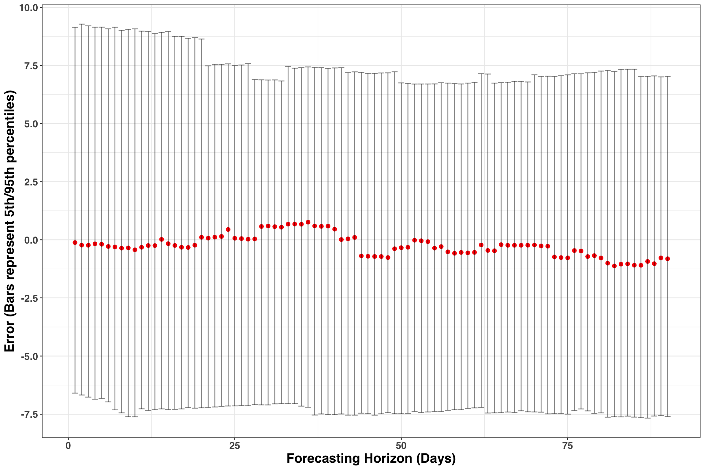 These results are encouranging. Errors fall between +-7 units at a day level and the 50th percentile remains close to zero across time. The forecasts do show some bias, such that we have long-runs where we are either over or under forecasting. Addressing bias is beyond the scope of this post but would typically involve re-specifying the existing model or adding in additional parameters to capture the source of bias. However, the accuracy is respectable and would be great starting point to implement some day-level forecasts.
Concluding Remarks
Hopefully, you enjoyed this post! If you found it useful, let me know below in the comments!